Hello!
Happy new year! This release was supposed to be just after xmas, but as usual things kept getting pushed back and pushed back, and well, here we are finally 2 months later. Apart from a huge number of bug fixes and tweaks this release will be quite a visual one, so im hoping will make for interesting reading / viewing.
New Component Explorer
One big change that isnt so much about haxeui itself, but more the haxeui eco system is that the component explorer (http://haxeui.org/explorer/) has been updated with many more examples and variants and in general, i think, is now a defacto illustration of the component set of haxeui. There maybe be tiny things missing but not large sets of components.
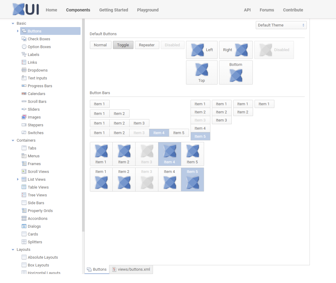
This took a fairly substantial amount of time to do, but (now its done) was totally worth doing - not only is it easier for users to see haxeui “in action” (and more fully) its good for other library type things - testing out themes and finding little bugs for example.
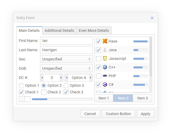
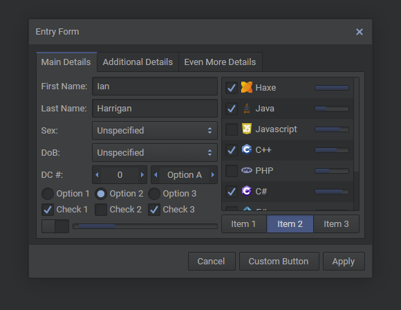
Theme Overhaul
Another big time sink in this release was that the default and dark themes have been totally overhauled! They now look much cleaner and crisper. More modern and less “win32”. Heres the new default theme:
the new dark theme:
and the old default theme (for comparison):
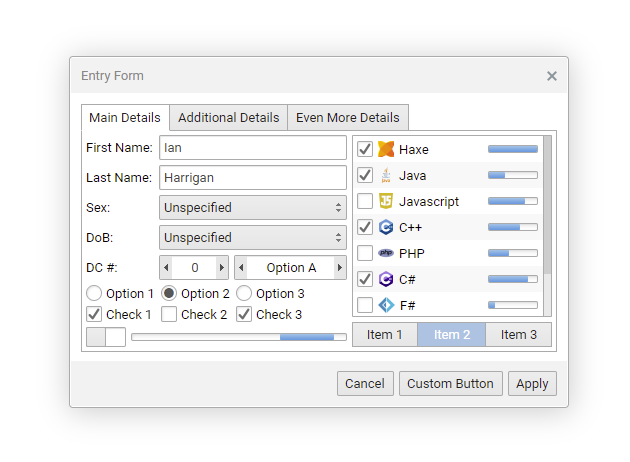
Although the changes are quite subtle, the difference when you are putting together an application is night and day. Another thing about this that took a huge amount of time is that the default theme has been “variablised” now, which I’ll tall about next
CSS Variables
One huge pain when working with the default themes (and any theme really) is the sheer number of selectors, colours, files you need to have a fairly decent working knowledge of.
Lets saying you wanted to make all the components have a red border. Well, you can obviously do this by overriding things in your own css - and for simple (and moderately complex things), this is fine. However, there are certainly times when you just want to say “in the default theme change this colour to that colour”, well, this is now possible with “css vars”.
This initial implementation is NOT fancy and is NOTHING like W3C css variables - the current implementation is more like a fancy find and replace before a style sheet get parsed. This may change in the future, but the point is to have this system there as it makes things immensely simple to change huge parts of the themes with just basic knowledge of their internals. For all intents and purposes it exposes “knobs and dials” from themes to the end user to play with should they want to.
A quick example of how they work:
.button {
    color: $my-button-color;
    background-color: $my-background-color;
    border: $my-border-size solid $my-border-color;
}
Here, anything prefixed with a $ will be replaced with an appropriate value that is either in a module.xml:
<module>
...
    <themes>
        <default>
            <var name="my-button-color" value="red" />
            <var name="my-background-color" value="#00ff00" />
            <var name="my-border-size" value="rgb(0, 0, 255)" />
            <var name="my-border-color" value="5px" />
        </default>
    </themes>
...
</module>
Or defined in code:
ThemeManager.instance.setCurrentThemeVar("my-button-color", "blue");
(NOTE: that you will have to set theme vars before themes are parsed. Currently if you set a var after they are parsed it will have no effect whatsoever, this may change in the future, but currently theme style sheets are never reparsed)
These variables (more like constants curretly - though again, this may change in the future) can also be used in inline styles, and in blocks of xml, anywhere css can be used really:
<button text="Buton" style="color: $my-other-color" />
One huge (and time consuming) use of this was that the default theme now uses these eveywhere and in fact, the dark theme has been totally deleted (from a css files point of view) and has been replaced with just a set of css vars: https://github.com/haxeui/haxeui-core/blob/master/haxe/ui/module.xml#L152-L206
Another very simple test was editing just these css variables:
<var name="normal-background-color-start" value="#fdcccc" />
<var name="normal-background-color-end" value="#f6bbbb" />
<var name="normal-border-color" value="#d26666" />
<var name="normal-border-size" value="2px" />
<var name="normal-border-radius" value="6px" />
<var name="normal-text-color" value="#444444" />

<var name="selected-background-color" value="#d28888" />

<var name="disabled-background-color-start" value="#fdeeee" />
<var name="disabled-background-color-end" value="#f6cccc" />
<var name="disabled-text-color" value="#cc9999" />
<var name="disabled-border-color" value="#d2aaaa" />
Can lead to fairly big changes:

Obviously in this case i havent put any effort into making things look nice - but the point is that by just playing with a few variables you can change the look of all haxeui components.
Keep in mind this an ZERO effect on the way haxeui css / styles / themes function normally. If you want to override each and every part, or tweak groups of controls based on css selectors you still can, this is literally just a shortcut that makes organizing things that little less of a headache.
One final thing this brings to the table is cohesion. Whilst migrating the themes i found various places where i used one border color for one component and slightly different one for another. It wasnt a huge deal, and would have been easy to fix, but now i just use the variable and never even care what the colour was set as. This of course, also applies to any user custom components, you can now just use a variable (from a theme for example) and be done with it.
New Component: TreeView
HaxeUI has finally got a tree view in core! Ive been using various iterations of this for a while, but thought it was about time it went into core since i get a fair amount of questions about it.
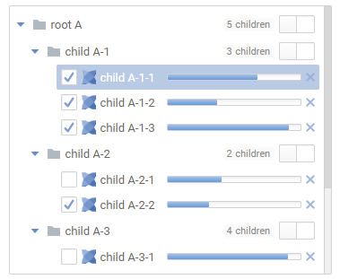
Note that this is considered an experimental version, there currently limitations and no native counterpart.
One of the limitations is that it MUST be populated by code. This means that currently datasources dont work with it. This will be fixed in a coming release, but that the moment you must populate it with something like:
var root = tv1.addNode({ text: "root A", icon: "haxeui-core/styles/default/haxeui_tiny.png" });
root.expanded = true;
    var child = root.addNode({ text: "child A-1", icon: "haxeui-core/styles/default/haxeui_tiny.png" });
        child.addNode({ text: "child A-1-1", icon: "haxeui-core/styles/default/haxeui_tiny.png" });
        child.addNode({ text: "child A-1-2", icon: "haxeui-core/styles/default/haxeui_tiny.png" });
        child.addNode({ text: "child A-1-3", icon: "haxeui-core/styles/default/haxeui_tiny.png" });
It supports item renderers so you can get very creative with the contents (examples can be found on the new component explorer - Component Explorer - HaxeUI)
Number Stepper Rewrite
Number stepper default styles have changed! These look (at least to me) a little more modern and are easier to use.
You can still use the old steppers if you wish by adding classic-steppers to any component, or using the css property layout: classic.
The number steppers have actually been totally rewritten from scratch as there was a number of bugs and oddities with them, though the outward facing api has remained untouched.
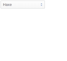
New Component: OptionStepper
During the number stepper rewrite a very simple version of an “option stepper” was added, this is basically just a list of items that can be changed in the same way a number stepper changes the numbers:
<option-stepper width="100">
    <data>
        <item text="Haxe" />
        <item text="Java" />
        <item text="Javascript" />
        <item text="C++" />
        <item text="PHP" />
        <item text="C#" />
        <item text="F#" />
        <item text="OCaml" />
        <item text="Assembler" />
    </data>
</option-stepper>
There is very little to this component, but it feels nice and is a useful alternative to a dropdown box.
New Variant: ButtonBars
ButtonBars have been in HaxeUI for a while
however, now you can use them as a sort of “menu”:
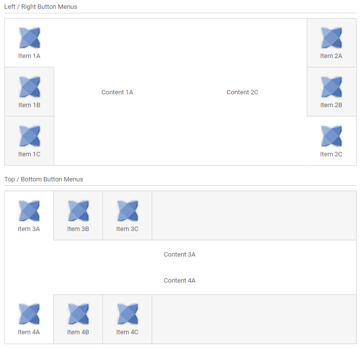
This can be achieved very simply by adding styleName="left-menu" to any of your button bars (valid options are left-menu, right-menu, top-menu, bottom-menu)
New Variant: ListView
Very similar to the new button bar variants is a new variant of the listview:
Adding styleName="left-menu" to any list view will apply the above styles. It worth clarifying that these style variants do nothing except change the way the listview (or button bar) look they to do nothing to internal functioning of the component, and its easy enough to achieve all of this yourself using css (its all these styles are). I just found myself using these things over and over in different projects so decided that they should go into core as style variants.
New Component: Card
Another very simple component addition is the “Card” component:
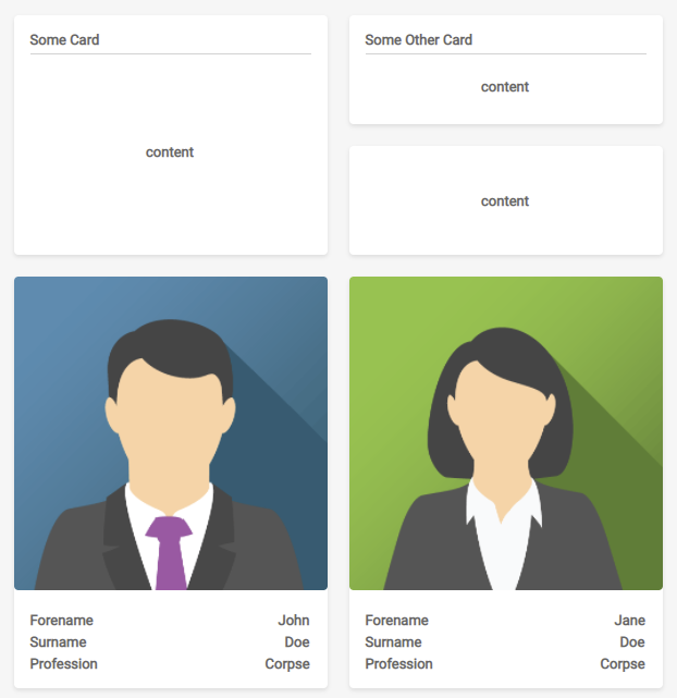
There isnt much to say about this except that its also very easy to apply this to any “box” (its really just a box with a title and a dropshadow) but having it as self contained component makes it semantically nicer.
New Component: Link
Another component that there isnt much to say about is the new link component:
Underlined text you can click on… what else could there be?
New Feature: Searchable DropDowns
One thing that is usually a bit of a pain when working with large lists (specifically in dropdowns, but really in anything) is the ability to filter items to find what you are looking for. With that in mind HaxeUI dropdowns can now be searched:
<dropdown width="150" dropdownWidth="200" searchable="true" searchPrompt="Search Me!">
...
</dropdown>
New Feature: Dialogs.selectFile
Very often an application wants to select some external file. HaxeUI now comes with a solution baked in:
Dialogs.selectFile(function(button, files) {
    switch (button) {
        case DialogButton.CANCEL:
            trace("file selection cancelled");
        case DialogButton.OK:
            trace("file(s) selected - " + files.length);
            for (f in files) {
                if (f.isBinary) {
                    trace(f.name, f.bytes.length);
                } else {
                    trace(f.name, f.text);
                }
            }
    }
}, {readContents: true});
This will popup a native file selection dialog allowing the users to select files. This isnt yet implemented on ALL backends, and some i dont think will ever support it, but where it is possible it should be working (hxwidgets, openfl, html5, heaps, etc).
Notable mentions
There have been, as usual, a huge amount of fixes, tweak and additions that have made there way in, too many to talk about in fact, but some of the more notable ones are:
- stack component was improved with
selectedIndexandUIEvent.CHANGEDevents -
TextAreanow honours autosizing meaning you have have a text area that grows as you type - A number of PRs have been merged that add more locales in different languages (for dialogs etc) - thanks PR’ers!

-
ButtonBarscan now have their selection unselected by clicking on it again, this isnt the default behaviour and must be activated withallowUnselection=true - you can now use
rgb(...)in your style sheets / inline styles
Didnt make it in: ActionManager
One of the things that ive been sitting on for a while that didnt make it into this release is the “ActionManager” this is a new sub system that allows navigation (and use) of a UI through a variety of “input sources” - the ground work is essentially done at this point but a few things need to be thought out and all interactive components need to be made to be “action aware” which needs to be evaluated case by case. Im hoping to get this into the next release (or maybe even a minor release!)
http://haxeui.org/shared/actionmanager2.mp4
Pushed Back: native Android backend
Another thing that has been pushed back is the native android backend release. This is working for the most part, and with simple UIs is fine, but more complex UIs cause issues - nothing i think is show stopper but certainly work to do!
Memory Issues
A project ive been helping with (VCR) noticed some memory issues while stress testing their application (haxeui-openfl), it would grow and grow and grow and eventually after a day or so would crash. Its worth prefacing this with that fact that this was NOT standard usage, the automation system was hammering the application - but still a noticeable memory issue was there.
In order to track this down I created a simple haxeui openfl application that would create and destroy 200 text fields every 100ms… obviously also not a normal use but it showed the issue very clearly:
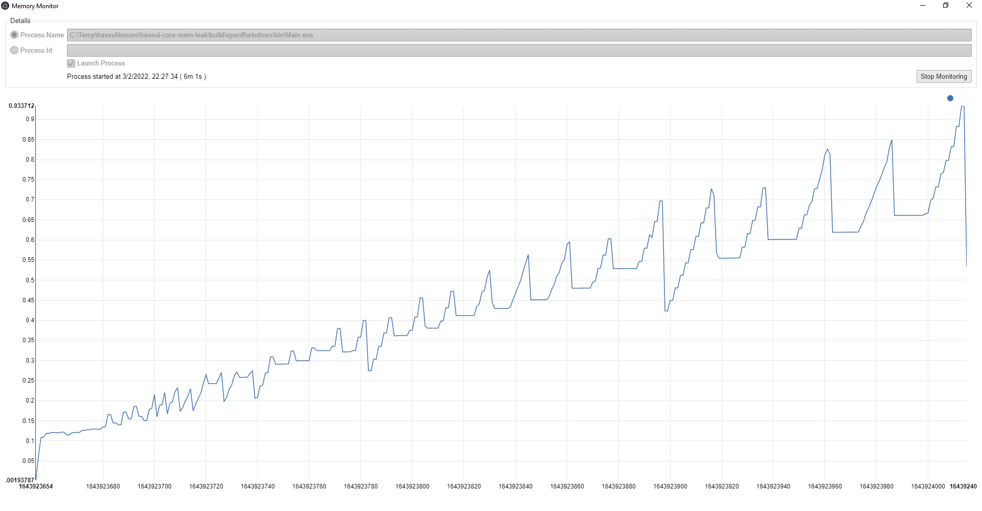
After a number of fixes in haxeui-core this is now working much nicer:
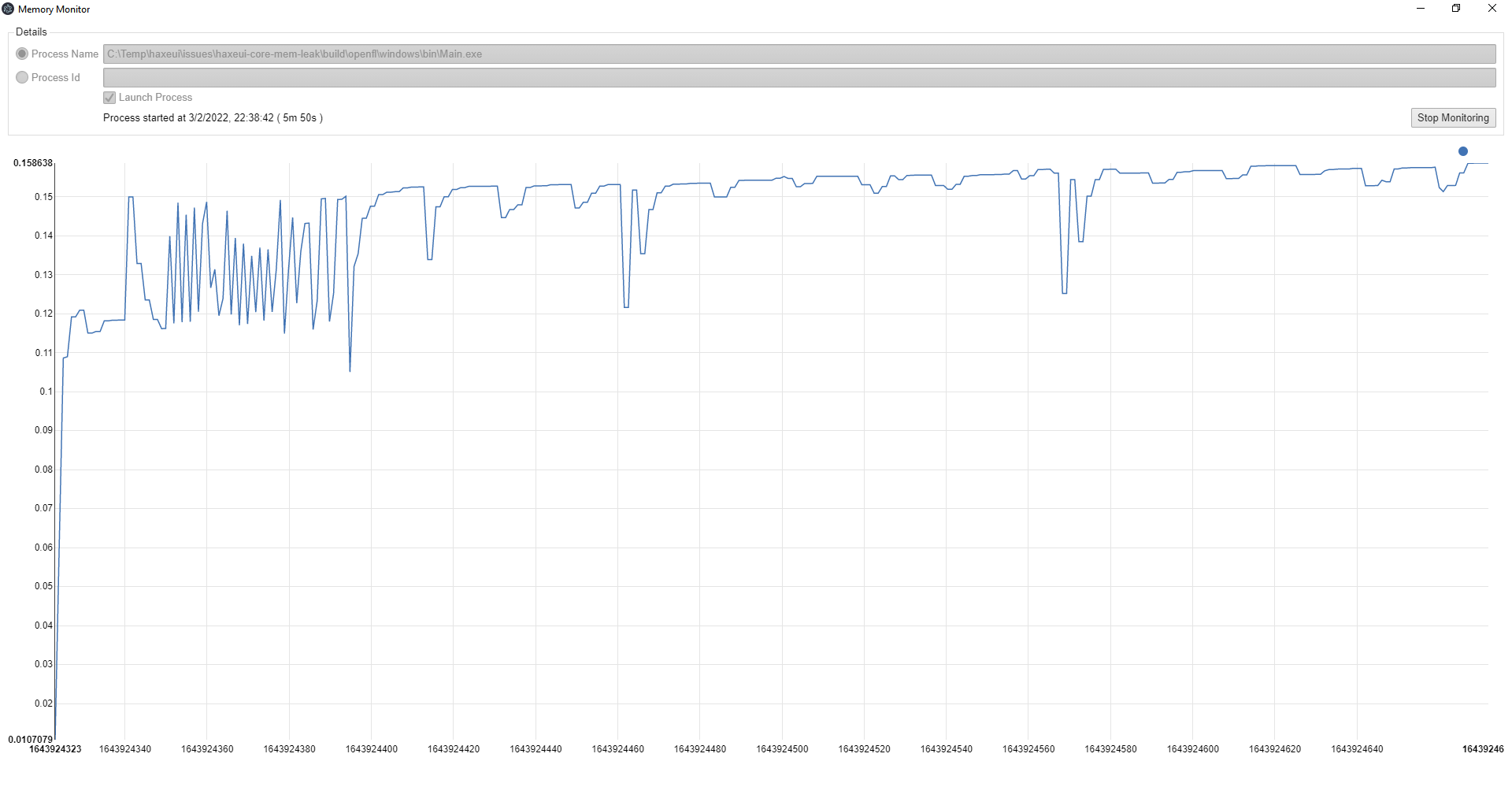
there is still a very slight upward trend if you leave it running long enough (days and days), though never enough to crash - so there is still something not being released, though i am starting to suspect that might be openfl itself (i still havent gotten round to verifying other backends), but the initial LARGE mem leak is gone.
Chances are most people would never have noticed the leak, hell, i didnt even notice it until i hammered a test app, but its gone now, so thats good.
Those with a keen eye might have noticed that as part of this investigation ive written a “memory monitor” application. I couldnt find any decent mem monitors that would allow me to monitor memory over days and weeks so i wrote a really simple C++ application to do that and spit out csv data to stdout. I would then take that and put that in excel to see the graph. This in itself became a chore so i wrote a really simple haxeui application that would take that csv data and graph it in realtime… et viola! At some point ill release all this as it really has been invaluable with the investigation.
OpTex
The final thing i wanted to mention is "OpTex", this is a clinical trials data analytics platform that is using haxeui. Its a very interesting project, and a great testbed for haxeui - very recently it had a UI overhaul (to make it look less "out the box haxeui"), and the process was pretty effortless. You can see a video below:http://haxeui.org/shared/optex/optex_new_dashboards.mp4
You’ll be hearing more and more about this as time goes on!
So i think that wraps this up for this release! There are countless things i havent mentioned (and likely a bunch ive forgotten completely) but the main (or interesting) ones are outlined above.
Enjoy HaxeUI 1.4 and let me know if you find any issues, or what you are working on in general!
Cheers!
Ian