How to create a more complex list/dropdown from code?

Thank you again for your time!
I will try to create a a little bit more complex Itemrender using only HaxeUI components .
If anything goes wrong I will post here .

So as @rationaldecay points out (thanks! :slight_smile: ), addChild isnt the right call to use, you must use addComponent since that means that where you add it (in this case probably an item renderer) will know about it, otherwise its just some unsolicited openfl sprite / bitmap / display object.

So you could do something like this:

var renderer = new ItemRenderer();
var hbox = new HBox();
var image = new Image();
image.id = "some_image_id";
hbox.addComponent(image);
renderer.addComponent(hbox);

myList.itemRenderer = render;
myList.dataSource.add({some_image_id: myBitmapData});

note that you can build this code, pretty much exactly, by using haxeui xml :wink:

How to show the text (from Label ) in ListView ? Currently showing [object Label] (openfl / html5)
image

Here is my source code:

var roomName:Label = new Label();
roomName.id = "roomName";
var roomPoints:Label = new Label();
roomPoints.id = "roomPoints";

var itemRender:ItemRenderer = new ItemRenderer();
itemRender.height = 78;
itemRender.addComponent(roomName);
itemRender.addComponent(roomPoints);

commonList = new ListView();
commonList.width = 635;
commonList.height = 555;
commonList.itemRenderer = itemRender;
		
var rname = new Label();
rname.text = "Room_name";
var rpoints = new Label();
rpoints.text = "500 K";

commonList.dataSource.add({roomName:rname, roomChips:rchips });

Another question: How to control the selected color ? At the moment of selecting a row, the text [object Label] turns white. I want to remove this ie. not color the text at all (and maybe stop selection altogether)

OK, so you are adding the label to the data source, where as you should be adding the data to the data source:

commonList.dataSource.add({roomName: "room1" ... });
commonList.dataSource.add({roomName: "room2" ... });
commonList.dataSource.add({roomName: "room3" ... });

http://haxeui.org/builder/?wbkpvg

I still don’t understand something:
What is the purpose of ItemRenderer then ?
My understanding was that: we first init the components which we want to add to a listview using the itemrender.
After that we add these components via dataSource. Obviously this is a wrong assumption.
But then how I will control the label properties ? What if I want each row to have different size and color for the label text ?
And why to use ItemRenderer when all data is string, int or other standard type.
Obviously I could use css for set even/odd row ( not each row differently), but why to use addComponent(…).

So an item renderer is exactly that, it is a renderer of an item (ie, a bit of data). So you define an item renderer with its sub components, then that renderer gets cloned and its data get set for each item in a data source. So if you have a component in the renderer called “bob” and a field in the data called “bob” then the .value of the component “bob” will be set to the value that is present in the data source.

example: Builder - HaxeUI

So with that example, the item renderer is cloned for each item in the data source and each cloned item renderer has its data set (the data would be each item in the data source). This then looks for components from the fields in the data that was set and and calls their “.value”

So, with the default item renderer (ItemRenderer) its not really possible to control all properties of a sub component, i think eventually it will be possible, but i have to think about how to do it properly, however, you can always create your own item renderer (by sub classing ItemRenderer) and do anything you want there, for example:

import haxe.ui.core.ItemRenderer;
import haxe.ui.util.Color;

@:xml('
<item-renderer width="100%" layoutName="horizontal">
    <checkbox id="isComplete" verticalAlign="center" />
    <label id="someText" verticalAlign="center" width="100%" />
    <slider id="someValue" verticalAlign="center" />
    <switch id="isOn" verticalAlign="center" />
</item-renderer>
')
class MyCustomItemRenderer extends ItemRenderer {
    public override function onDataChanged(data:Dynamic) {
        super.onDataChanged(data);
        if (data != null && data.theRowColor != null) {
            this.backgroundColor = Color.fromString(data.theRowColor);
        }
    }
}
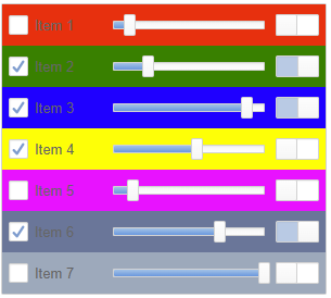
<listview width="300">
    <my-custom-item-renderer />
    <data>
        <item isComplete="false" someText="Item 1" someValue="10" isOn="false" theRowColor="red" />
        <item isComplete="true" someText="Item 2" someValue="22" isOn="true" theRowColor="green" />
        <item isComplete="true" someText="Item 3" someValue="88" isOn="true" theRowColor="blue" />
        <item isComplete="true" someText="Item 4" someValue="55" isOn="false" theRowColor="yellow" />
        <item isComplete="false" someText="Item 5" someValue="12" isOn="false" theRowColor="#ff00ff" />
        <item isComplete="true" someText="Item 6" someValue="70" isOn="true" theRowColor="#667799" />
        <item isComplete="false" someText="Item 7" someValue="100" isOn="false" theRowColor="#99aabb" />
    </data>    
</listview>

image

Obviously im using alot of xml here, but the same thing is perfectly possible with just using haxe code also. :slight_smile:

Hope that helps?

Cheers,
Ian

I’ll do some test. One more question. How to set data/item from the source code on the listview ?

<data>
        <item .... />
       <item .... />
</data>

My understanding was to use commonList.dataSource.add(...) for that , but it’s obviously wrong.

No thats right.

myList.dataSource.add({ isComplete: false, someText: "Item 1", someValue: 10, isOn: false, theRowColor: "red" });

is perfectly fine, you can also do:

var ds = new ArrayDataSource<Dynamic>();
ds.add({ isComplete: false, someText: "Item 1", someValue: 10, isOn: false, theRowColor: "red" });
myList.dataSource = ds;

Thank you . That makes sense.
One question about layout . Could i set relative postion of one element against the previous one ( or absolute postion) in pixels ?
At example:

<item-renderer width="100%" layoutName="horizontal">
    <checkbox id="isComplete" verticalAlign="center" />
    <label id="someText" verticalAlign="center" width="100%" />
    <slider id="someValue" verticalAlign="center" />
    <switch id="isOn" verticalAlign="center" />
</item-renderer>

For the label idsomeText to set .x = 30; ( which should be relative or absolute positon) or I need to use vbox / hbox for that ?

So you can position things absolutely, but only if you are using an absolute layout, but imo its not ideal to do things like this as they are very brittle… that said, you certainly can (and you can mix and match), eg: Builder - HaxeUI

My, personally preferred, method would be to let haxeui handle the layout, so you can use grids for example: Builder - HaxeUI

You can also just use boxes (vbox, hbox) to achieve the same.

1 Like

Grid looks like as a nice options. I will try it.
Thank you again!

1 Like

@ianharrigan what would be the best way to arrange the following elements ?

(1)Image (2)text            (6)Small user photo     (7)image (8)text         (11/12) Button
(3)Image (4)Image (5)text   (6)name of the user 	(9)image (10)text 		 (13)     Text

where
6) will be a user’s photo and the name of that user just below the photo (center position)
11/12) is a button that takes up more than half of the row and 13) text below the button (center position)

Using grid is a good solution, but only if you have the same element height and width i.e at example if I can separate the row on 4 columns.

In my case the small user photo takes up more than half of the row; it is similar for the button.

Here is an example image, where I draw the horizontal red line for more easy visualization.
image

I would probably go with something like this: http://haxeui.org/builder/?cbodxt

image

(i added borders just so you can see the “seperate” of what i would consider discrete “components”)

<vbox style="padding: 5px;">
    <style>
        .bordered {
            border: 1px dashed #CCCCCC;
            padding: 5px;
        }
    </style>
    <hbox styleName="bordered">
        <vbox verticalAlign="center">
            <hbox styleName="bordered">
                <image resource="haxeui-core/styles/default/haxeui_tiny.png" />
                <label text="R_559..."  />
            </hbox>
            <hbox styleName="bordered">
                <image resource="haxeui-core/styles/default/haxeui_tiny.png" />
                <image resource="haxeui-core/styles/default/haxeui_tiny.png" />
                <label text="$1K"  />
            </hbox>
        </vbox>

        <vbox styleName="bordered">
            <image resource="haxeui-core/styles/default/haxeui_small.png" />
            <label text="name" horizontalAlign="center" />
        </vbox>
        <vbox styleName="bordered">
            <image resource="haxeui-core/styles/default/haxeui_small.png" />
            <label text="name" horizontalAlign="center" />
        </vbox>
        <vbox styleName="bordered">
            <image resource="haxeui-core/styles/default/haxeui_small.png" />
            <label text="name" horizontalAlign="center" />
        </vbox>

        <vbox verticalAlign="center">
            <hbox styleName="bordered">
                <image resource="haxeui-core/styles/default/haxeui_tiny.png" />
                <label text="3 / 4"  />
            </hbox>
            <hbox styleName="bordered">
                <image resource="haxeui-core/styles/default/haxeui_tiny.png" />
                <label text="0 / 0"  />
            </hbox>
        </vbox>

        <vbox verticalAlign="center">
            <button text="Enter" />
            <label text="Watch" horizontalAlign="center" />
        </vbox>
    </hbox>
</vbox>

Obviously, in reality (in a real project), that would probably be made out custom components and (from an xml perspective) would more like this:

<hbox>
    <vbox>
        <balance />
        <balance />
    </vbox>
    <avatar />
    <avatar />
    <avatar />
    <vbox>
        <count />
        <count />
    </vbox>
</hbox>

Hope that helps,

Cheers,
Ian

1 Like

I created a custom component by extending VBox. Then I added some other components in it and used that component in ListView .
After adding new data (via .dataSource.add(…) ) the data for my custom component is not visible at all. To be clear, here is an example:
Custom component AvatarListView

class AvatarListView extends VBox 
{
    public var avatarImage:Image;
    public var avatarName:Label;
    
    public function new() 
    {
        super();
        styleNames = "bordered";
        width = 80; 
        avatarImage = new Image();
        addComponent(avatarImage);
        avatarName = new Label();
        avatarName.horizontalAlign = "center";
        avatarName.text = "";
        addComponent(avatarName);
    }
}

Main class

  var iHbox:HBox = new HBox();
  iHbox.styleNames = "bordered";
  
  
  var avatar1:AvatarListView = new AvatarListView();
  avatar1.avatarImage.resource = "haxeui-core/styles/default/haxeui_small.png";
  avatar1.avatarName.text = "name";
  avatar1.avatarImage.id = "avatarImage1";
  avatar1.avatarName.id = "avatarName1";

  var avatar2:AvatarListView = new AvatarListView();
  avatar2.avatarImage.resource = "haxeui-core/styles/default/haxeui_small.png";
  avatar2.avatarName.text = "name";
  avatar2.avatarImage.id = "avatarImage2";
  avatar2.avatarName.id = "avatarName2";
  
  var secondColumn:HBox = new HBox();
  secondColumn.addComponent(avatar1);
  secondColumn.addComponent(avatar2);
  
  var enterButton:Button = new Button();
  enterButton.text = "Enter";
  //enterButton.registerEvent(MouseEvent.CLICK,enterClickOn);
  enterButton.id = "enterButton";
  
  var fourthColumn:VBox = new VBox();
  fourthColumn.verticalAlign = "center";
  fourthColumn.addComponent(enterButton);
  
  iHbox.addComponent(secondColumn);
  iHbox.addComponent(fourthColumn);
  
  var itemRender:ItemRenderer = new ItemRenderer();
  itemRender.height = 78;
  itemRender.addComponent(iHbox);
  
  commonList = new ListView();
  commonList.width = 635;
  commonList.height = 555;
  commonList.itemRenderer = itemRender;
  
  commonList.dataSource.add({avatarImage1:"haxeui-core/styles/default/haxeui_tiny.png",avatarImage2:"haxeui-core/styles/default/haxeui_tiny.png",avatarName1:"name1",avatarName2:"name2" });
  commonList.dataSource.add({avatarImage1:"haxeui-core/styles/default/haxeui_tiny.png",avatarImage2:"haxeui-core/styles/default/haxeui_tiny.png",avatarName1:"name1",avatarName2:"name2" });

Other question:
How do I get the current row data when I click the button on that row ? For example ,when click on the buton ‘Enter’ on the third row, I want to get all other components of that row ?

Also is there a way to get the data for the fourth row components without clicking on the row ?

Ok, so as mentioned previously, item renderers (well, the default one) works off of “values”, that is to say, the .valueof a component. This is a Variant and can mean different things to different different components, for example:

  • in Image the .value is .resource
  • in Slider the .value is .pos
  • in Button the .value is .text

etc, etc. So The item renderer will find a matching component and set its .value. In your custom component there is no overridden .value so it will use the default (which is .text).

So what you need to do is specify what the .value means:

class AvatarListView extends VBox {
    public override function get_value():Variant {
        return avatarImage:Image.resource;
    }
    public override function set_value(value:Variant):Variant {
        avatarImage.resource = value;
        return value;
    }
}

I think you might still be a little confused by item renderes and things like that, so ill knock up a quick (and ugly) example of what i think you are trying to do :slight_smile:

Cheers,
Ian

Hm, in that case what to do if have two or more components in my custom AvatarListView ?
For example, I have Label and Image and override get_value will use only image, but not a Label

What I do is th following :
For that image each row is separate room in the game server :

image

  1. The vip and lock image could be changed ( with unlock image and grey vip image) i.e. each row could have different combination for each of those images.
  2. R_5559… will be different for each row , samo for $1K text
  3. Avatar image - they should be loading asynchronously from the web server and could be replaced with other image , if player leave the room
  4. The label 3 /4 show the current players in the room and 0 / 0 the current watchers
  5. Enter button will put the player in the room ( i.e. should add the player image as the avatar in the list)
  6. Watch is link url, which wll add the user as a watcher in the game ( and change the count of the watchers 1 / 1)
    This is what I tried to recreate using the HaxeUI

I see. So the path is custom item render , listen for event X ( add item event ?) , check the added data for that row and set the correct Image and name for avatar cusom component.
If the avatar image and name is changed , again need to listen for event Y ( change item event ?) and set new image and name.

Ok, so here is a (very ugly) example of a complex item renderer (well, custom one really).

complex-list-view

Obviously i dont know your data model, or anything like that, so ive just invented it. Also, im using xml all over the place (of course!) but, as usual, this isnt anything you can do it pure code (it will just be much uglier and harder to maintain imo :slight_smile: )

I can only upload image here it seems, so the file had to be a pastebin :slight_smile:

Note: if you actually want to run that file, you’ll need very latest haxeui-core. I found a couple of issues while writing it, but none relating to what you are doing (it was about having loads of custom components in the same file and then trying to use them from xml - all fixed now anyway)

Hopefully that will help alot more?

Cheers,
Ian

EDIT: just noticed the theList.itemRenderer = new MyItemRenderer(); line in the pastebin, thats not needed technically since i do it in xml :slight_smile: