Ok, so the scrollbar default styles have changed. The poll didnt get alot of votes, but enough that i think the new direction is a good one. The new styles (i think) are simply cleaner and less “in the way”.
Ive also changed som other little bits (like the progress bar height and made the text less bright on dark theme - also square “switches” are the default now).
All the backends look pretty similar, haxeui-html5 and haxeui-raylib below:
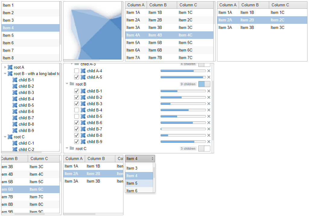
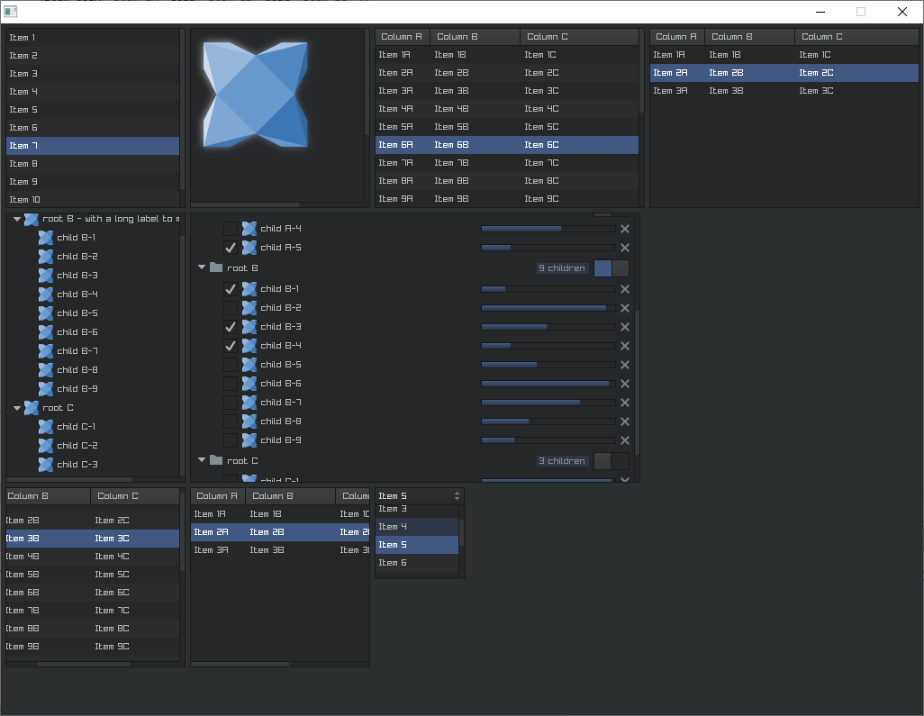
Its worth noting - especially for the people who voted “classic” - that the “classic” scrollbar styles are still there, you can add them in two ways:
- adding “classic-scrolls” to any scrollview (or scrollview derived class):
<tableview styleName="classic-scrolls">
</tableview>
- adding a property in
module.xml. Create amodule.xmlanywhere on your classpath and add the following:
<module>
    <properties>
        <property name="haxe.ui.components.scroll.style" value="classic-scrolls" />
    </properties>
</module>
This is actually a pretty neat little (new) feature. It means you can automatically add styleNames to any class that matches the part before .style, for example:
<property name="haxe.ui.components.button.style" value="big red" />
Will inject:
addClass("big");
addClass("red");
Into the haxe.ui.components.Button class at compile time meaning all buttons will have those style names, so providing those styles exist all buttons will get the properties associated with them.
Anyways, i realise there were two people who voted “classic” and although its a small fraction of a small vote i hope this means that switching back to the old scrollbars is painless if you still arent convinced. I think this property feature is useful in many other ways too regardless.
Cheers,
Ian