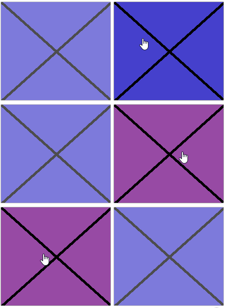
I was recently asked in the haxeui discord (https://discord.gg/RhvtrW) if haxeui was capable animating a button background from a set of images. This was a pretty interesting question, haxeui does have animation capabilities, but they take the form of css, and can be fairly limiting. Version 1.2 was supposed to be an overhaul to the style system (using typedefs and such) and part of that was vastly improving how the animation capabilities of haxeui, in the end that was pushed back to v1.3 (hopefully) and 1.2 ended up being general release.
So given the current animation system, I decided to try to tackle this question. With an extremely tiny change, it was more than possible to “animate” the background image property given a set of animation points, similar to this:
@keyframes animateButton {
    0%     { background-image: "img/test_1.png"; }
    5%     { background-image: "img/test_2.png"; }
    10%    { background-image: "img/test_1.png"; }
    15%    { background-image: "img/test_2.png"; }
    20%    { background-image: "img/test_1.png"; }
    25%    { background-image: "img/test_2.png"; }
    30%    { background-image: "img/test_1.png"; }
    35%    { background-image: "img/test_2.png"; }
    40%    { background-image: "img/test_1.png"; }
    45%    { background-image: "img/test_2.png"; }
    50%    { background-image: "img/test_1.png"; }
    55%    { background-image: "img/test_2.png"; }
    60%    { background-image: "img/test_1.png"; }
    65%    { background-image: "img/test_2.png"; }
    70%    { background-image: "img/test_1.png"; }
    75%    { background-image: "img/test_2.png"; }
    80%    { background-image: "img/test_1.png"; }
    85%    { background-image: "img/test_2.png"; }
    90%    { background-image: "img/test_1.png"; }
    95%    { background-image: "img/test_2.png"; }
    100%   { background-image: "img/test_1.png"; }
}

#anim1 {
    background-color: #FF0000;
    background-image: "img/test_1.png";
    opacity: .7;
}

#anim1:hover {
    opacity: 1;
    background-color: #FF0000;
    animation: animateButton 1s linear 0s infinite forward forwards;
}

This works, but as you can see from the css, its an pretty bad way of having to go about things. Firstly you have to kind of calculate what step you want the %'s to be and then you have to manually set each background image property - which in the case of something more real can be a real pain (you can use discrete timesteps too, but it doesnt help much with the css - especially if you later decide you want to speed up or slow down the animation).
So this was “fine”, it was possible and the engine and ui could process things “fine”… but “fine” isnt “good”, so haxeui now supports the ability to interpolate string values as part of animations!
Note: this is not a css3 feature and is unique to haxeui css. So now it is possible to something like this in the css:
@keyframes animateButton2 {
    0%   { background-image: "img/image_[[0]].png"; }
    100% { background-image: "img/image_[[54]].png"; }
}

#anim2 {
    opacity: .7;
    background-image: "img/image_0.png";
}

#anim2:hover {
    opacity: 1;
    animation: animateButton2 1s linear 0s infinite forward forwards;
}
Notice the [[ and ]], this tells the haxeui animation actuator to interpolate between these two values, which in this case make up the background image. And thats all there is to it!
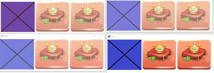
Below is the result of some tests on haxeui-kha, haxeui-html5, haxeui-openfl and haxeui-flixel, and indeed any composite backend should behave exactly the same:
The very end of this is a dump of the whole .xml file that was used to create the .gif above (for completeness)
Cheers,
Ian
<vbox style="padding: 5px;">
    <style>
        /*************************************************************************
        CRAPPY METHOD OF ANIMATION
        *************************************************************************/
        @keyframes animateButton {
            0%     { background-image: "img/test_1.png"; }
            5%     { background-image: "img/test_2.png"; }
            10%    { background-image: "img/test_1.png"; }
            15%    { background-image: "img/test_2.png"; }
            20%    { background-image: "img/test_1.png"; }
            25%    { background-image: "img/test_2.png"; }
            30%    { background-image: "img/test_1.png"; }
            35%    { background-image: "img/test_2.png"; }
            40%    { background-image: "img/test_1.png"; }
            45%    { background-image: "img/test_2.png"; }
            50%    { background-image: "img/test_1.png"; }
            55%    { background-image: "img/test_2.png"; }
            60%    { background-image: "img/test_1.png"; }
            65%    { background-image: "img/test_2.png"; }
            70%    { background-image: "img/test_1.png"; }
            75%    { background-image: "img/test_2.png"; }
            80%    { background-image: "img/test_1.png"; }
            85%    { background-image: "img/test_2.png"; }
            90%    { background-image: "img/test_1.png"; }
            95%    { background-image: "img/test_2.png"; }
            100%   { background-image: "img/test_1.png"; }
        }

        #anim1 {
            background-color: #FF0000;
            background-image: "img/test_1.png";
            opacity: .7;
        }

        #anim1:hover {
            opacity: 1;
            background-color: #FF0000;
            animation: animateButton 1s ease 0s infinite forward forwards;
        }

        /*************************************************************************
        INTERPOLATED FAST ANIMATION
        *************************************************************************/
        @keyframes animateButton2 {
            0%     { background-image: "img/image_[[0]].png"; }
            100%   { background-image: "img/image_[[54]].png"; }
        }

        #anim2 {
            border: none;
            background-color: none;

            opacity: .7;
            background-image: "img/image_0.png";
        }

        #anim2:hover {
            opacity: 1;
            animation: animateButton2 1s linear 0s infinite forward forwards;
        }

        /*************************************************************************
        INTERPOLATED SLOW ANIMATION
        *************************************************************************/
        @keyframes animateButton3 {
            0%     { background-image: "img/image_[[0]].png"; }
            100%   { background-image: "img/image_[[54]].png"; }
        }

        #anim3 {
            border: none;
            background-color: none;

            opacity: .7;
            background-image: "img/image_0.png";
        }

        #anim3:hover {
            opacity: 1;
            animation: animateButton3 4s linear 0s infinite forward forwards;
        }
    </style>

    <hbox>
        <button id="anim1" width="218" height="195" />
        <button id="anim2" width="218" height="195" />
        <button id="anim3" width="218" height="195" />
    </hbox>
</vbox>
