Using basic haxeui-openfl, in the barebones project, replace the button with an image, set height and width to 100%. Make sure the parent vbox has 100% width and height set as well. Run. No image visible. Now resize the app by maximizing, turning the phone, whatever. You’ll notice how the image appears, though it resizes to the size before the resize. Very obvious on Android phone. Flash build shows this as well, though it may be less obvious.
I am on the latest version in haxelib. Am I doing something wrong or is nobody resizing apps?
Could you possibly use the latest master branch of haxeui-core and haxeui-openfl? These are much more up to date. Im hoping to get a haxelib release out soon.
The first thing to note is that the parent vbox now also needs the width set, otherwise stuff gets messed up. Easily fixed.
But after fixing that and putting the same xml into a basic custom component the same issue occurs. So I’m guessing there’s another box thrown in somewhere behind the scenes.
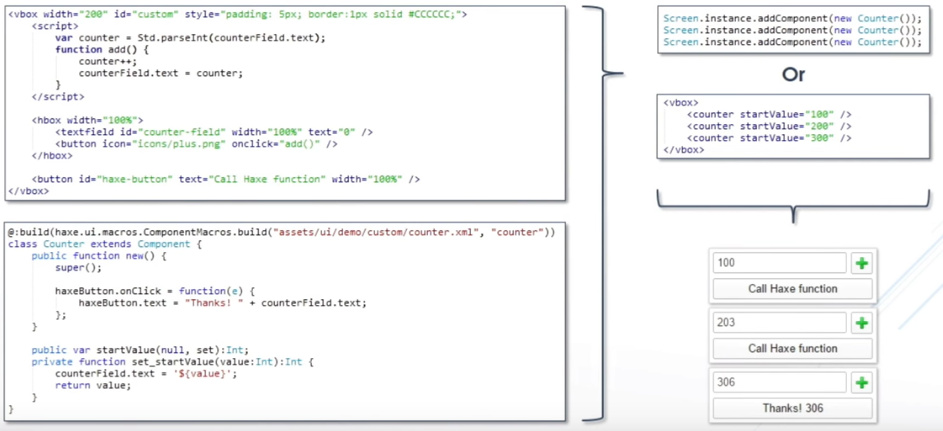
I had a lot of custom XMLControllers in V1, and from one of your talks I understood they had to become Custom Components.
So the most basic custom component would be something like:
package;
import haxe.ui.core.Component;

@:build(haxe.ui.macros.ComponentMacros.build("assets/main.xml"))
class CustomView extends Component {
    public function new() {
	super();
    }
}
And here’s the Main.hx adapted to use the custom component. You can easily switch between the basic one and the custom component version. They use the same xml shown above.
package;
import haxe.ui.HaxeUIApp;

class Main {
    public static function main() {
        var app = new HaxeUIApp();
        app.ready(function() {
            app.addComponent(haxe.ui.macros.ComponentMacros.buildComponent("assets/main.xml"));
	    //app.addComponent(new CustomView());
            app.start();
        });
    }
}
So as long you correct the vbox width, the basic one is useable. With the custom component however, things get messed up.
Yup, that is exactly right. When you are using a custom component there is an additional component, ie, the actual component class (CustomView in your case), then the components in the xml are all children of that. So you could use percentWidth = 100 in the CustomView constructor, or you could set on the same on the CustomView instance. You could also do:
.customview {
    width: 100%;
}
or
CustomView {
    width: 100%;
}
in a style somewhere.
Finally you could also use the custom view in xml and set the width there: <customview width="100%" /> but in this case, since you are replacing the main view with a custom component that doesnt make much sense (as you’d need another main.xml - or something - to load that view).
FYI: if you were using the custom views in xml, you’ll additionally need a module.xml to let haxeui know about it. You can get some more info here:
Thanks, that fixed it. I completely overlooked the custom component itself as I was hunting for parents and stages and scenes etc.
All info is welcome. I’m migrating a relatively big application and it’s sure to come in handy.
I ran into another issue. I’ll add all the sizing related issues I run into to this thread.
This is basically a horizontal scrollview containing a row of images. No vertical scrolling is needed so contentHeight=100%. I want the images to be the height of the scrollview and that’s where I run into trouble.
When you resize the window containing the scrollview horizontally so that it needs to switch between having a scrollbar and not having a scrollbar, it hangs in a validation loop. I haven’t pinpointed the exact problem, but it does get fixed by ensuring the child of the scrollview has no percent height.
It does make some sort of sense as a scrollview provides infinite size. But with the content set to 100% it should work I think.
Removing the height percentage from the hbox with id HERE fixes the issue. But now the images are their original height.
–Edit: There used to be a variable showHScroll in V1. That no longer seems to be supported. If I hack it in so the HScroll is invisible, the validation loop is also no longer an issue.
In this case there’s a button to the left and right of a vbox. These buttons scale dynamically. The goal is to have the vbox take up the leftover width.
With the xml above, the vbox pushes the right image “offscreen” because it’s set to 100% width. Lowering the percentage does not properly adapt to the scaling of the buttons. So I’ve been adjusting the size manually in code onResize.
Is there a way V2 can deal with this through XML only (preferably without xml script)?
Howdy, your usecases all sound sensible, and should work, i dont think you are trying to do anything strange or “crazy”, ill have to have a play and see… maybe its a bug with the layouts. Ill let you know.
Also as a sidenote I was wondering if it’s still possible to import xml files into an xml file. There used to be the import tag, but it seems that’s now being used for scripts.
Am I correct in assuming the V2 way is to turn the xml file into a custom component?
Oh right. Thanks! I already turned a few xmls into custom components, and that worked like a charm. But the importing will still come in handy.
However I did run into the following error message as soon as I added a basic custom xml component to module.xml:
haxe/ui/macros/ModuleMacros.hx:334: characters 30-34 : On static platforms, null can't be used as basic type Float
I got a bunch of those. Not exactly sure why this seems to trigger only in my case apparently. (I did notice the custom component declaration keyword in module.xml can be either component or class. The error remained the same. I just hacked it out for now.)
(Also I added a pull request to change the links for the haxeui tutorials on openfl from V1 to V2)
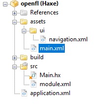
I’m not quick with github, so I’ll post it here. It’s really just the basic project with a very simple custom xml component added. Perhaps it’s the location of the module.xml.
package;

import haxe.ui.HaxeUIApp;
import haxe.ui.core.Component;
import haxe.ui.macros.ComponentMacros;

class Main {
  public static function main() {
    var app = new HaxeUIApp();
    app.ready(function() {
        var main:Component = ComponentMacros.buildComponent("assets/main.xml");
        app.addComponent(main);

        app.start();
    });
  }
}
Anyway to get back on track, I do have another sizing issue similar to the previous one, but this is vertical instead of horizontal. This may turn out to be a feature request.
In this case both groups change height dynamically. But in case the upper group gets too small, the minimum size remains at least 50 pixels. Sort of similar to the buttons in the example above that are tied to the height. However, in case this happens you’d ideally want the lower group to still fill up the left over space.
I think the layout logic of a group should be to first set the size of all children with a fixed, (or min-ed or max-ed) size. And then for the components that have variable sizes, divide up the parent size - the sizes of all the fixed children.
So assuming:
Min and max sizes in combination with percentage size can get tricky. But in case the total percentage size of all children >100% I would recalculate those percentages. In the above example if button2 was 50% instead of 50, it would result in:
25%+50%+75%=150% redivided into 16,7%+33,3%+50%
100-10=90, vbox1=15, button2=30, vbox2=45
Ok, so the error with the custom component should be fixed. The one about the horizontal scrollview with icons is a tough one, i can see whats happening but not sure how to fix yet.
I can confirm the error with the custom component is fixed, thank you!
Also the horizontal sizing issue with the group and two images is no longer there, it functions exactly as you just showed. Not sure why I encountered it, sorry about that.
I should have made the third example slightly more elaborate, like so:
Resizing the height shows how the blue group on the bottom gets cut off once the min-size restriction kicks in. Ideally you’d want the layout to adapt imho.
So i think i have a fix for the min size + percent size issues. Its all a little messy and just a test at the moment, but before i implement it properly, just wanted to run this by you, so with this layout: