Better Binding in HaxeUI

I recently had an issue (explained later in detail) that i thought would be good to solve with HaxeUI’s binding system, in the process ive made a few little updates to it.

So, HaxeUI’s binding system has always been able to do things like this with little effort:
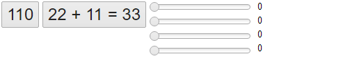
binding1

<hbox>
    <button text="${100 + 10}" style="font-size: 24px;" />
    <button text="22 + 11 = ${22 + 11}" style="font-size: 24px;" />
    
    <vbox>
        <slider id="mySlider1" />
        <slider id="mySlider2" pos="${mySlider1.pos / 2}" />
        <slider id="mySlider3" pos="${mySlider1.pos / 3}" />
        <slider id="mySlider4" pos="${mySlider1.pos / 4}" />
    </vbox>
    <vbox>
        <label text="${mySlider1.pos}" />
        <label text="${mySlider2.pos}" />
        <label text="${mySlider3.pos}" />
        <label text="${mySlider4.pos}" />
    </vbox>    
</hbox>

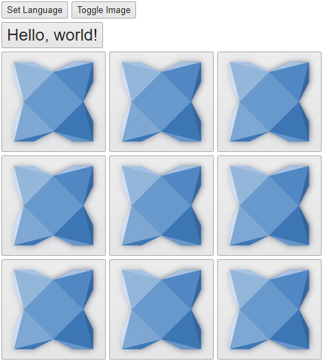
That is, it can calculate values and interpolate them to other components properties - all fine. However, I had need to have this type of behaviour that wasnt tied to components, for example, a language manager, or an image manager or something along those lines. Basically, i wanted a component to recalculate its bound properties after a change had taken place and reflect those changes, heres a very simple example:

<vbox>
    <hbox>
        <button text="Set Language" id="toggleLanguage" />
        <button text="Toggle Image" id="toggleImage" />
    </hbox>
    <button text="${MyTool.getString('hello')}, ${MyTool.getString('world')}" style="font-size: 24px;" />
    <grid columns="3">
        <button icon="${MyTool.getImage()}" />
        <button icon="${MyTool.getImage()}" />
        <button icon="${MyTool.getImage()}" />
        <button icon="${MyTool.getImage()}" />
        <button icon="${MyTool.getImage()}" />
        <button icon="${MyTool.getImage()}" />
        <button icon="${MyTool.getImage()}" />
        <button icon="${MyTool.getImage()}" />
        <button icon="${MyTool.getImage()}" />
    </grid>
</vbox>

In this silly example for illustrative purposes i wanted the text of the button and the icons of the buttons to come from an external, non-component based, place (MyTool), moreover, i wanted these properties to update when something changed without me having to manually keep track of anything. This is now possible in latest HaxeUI!

There are a couple things to be aware of, the first is that there is a manual step to let the binding manager know something has changed and to refresh any bound properties, this can be seen by looking at the MyTool class:

class MyTool {
    private static var _lang = "en";
    public static function toggleLanguage() {
        if (_lang == "en") {
            _lang = "es";
        } else {
            _lang = "en";
        }
        BindingManager.instance.refreshAll();
    }
    
    public static function getString(id:String):String {
        switch [_lang, id] {
            case ["en", "hello"]:
                return "Hello";
            case ["es", "hello"]:    
                return "¡Hola";
            case ["en", "world"]:
                return "world!";
            case ["es", "world"]:    
                return "mundo!";
            case _:    
                return id;
        }
    }
    
    private static var _image:String = "haxeui-core/styles/default/haxeui.png";
    public static function getImage():String {
        return _image;
    }
    
    public static function toggleImage() {
        if (_image == "haxeui-core/styles/default/haxeui_small.png") {
            _image = "haxeui-core/styles/default/haxeui.png";
        } else {
            _image = "haxeui-core/styles/default/haxeui_small.png";
        }
        BindingManager.instance.refreshAll();
    }
}

Specifically the call to BindingManager.instance.refreshAll() lets any bound component properties be refreshed. Eventually, with some macro magic, it might be possible to do this automatically, but initially, i think this is fine.

The second thing to be aware of is that the MyTool has to be exposed to the binding manager explicitly, this could be done via the modules, or even simpler via the binding manager itself:

BindingManager.instance.addStaticClass("MyTool", MyTool);

This is also something that could fairly trivially be solved in the future with macros.

Ok, so now to the original problem! I had a toolbar that had some icons, this toolbar could change theme from light to dark and vice versa, the problem was that the icons that worked for the light theme didnt work for the dark theme, heres what it used to look like:

binding3

As you can see, in the dark mode the icons actually make the buttons look disabled, which was a bit of a pain. There was a few ways to solve this but most included writing specific code to listen to theme changes and the such, none of which i liked the sound of, with this change now, my toolbar markup looks something like this:

<button icon="${IconUtil.getThemeIcon('open')}" />
<button icon="${IconUtil.getThemeIcon('save')}" />
<button icon="${IconUtil.getThemeIcon('folder-tree')}" />
<button icon="${IconUtil.getThemeIcon('console')}" />

And the result is much more palatable:

binding4

So this was quite a long post to explain quite a small feature, but its a useful one, and will save me (and hopefully others) spending ages writing and maintaining code.

Cheers!
Ian

4 Likes

So a little bit of an update on this, ive now added additional functionality into core regarding images / icons.

Firstly you can now define icons / images in themes (note the difference between “image” or “icon” is purely semantic), an example from one of my modules.xmls:

<themes>
    <light parent="default">
        <style resource="css/common.css" />
        <style resource="css/light/main.css" />
        <style resource="css/light/lists.css" />
        <style resource="css/light/trees.css" />
        <style resource="css/light/tabs.css" />
        <icon id="save" resource="icons/light/save.png" />
        <icon id="open" resource="icons/light/opened_folder.png" />
        <icon id="folder-tree" resource="icons/light/folder_tree.png" />
        <icon id="cog" resource="icons/light/services.png" />
        <icon id="console" resource="icons/light/console.png" />
    </light>
    <dark parent="default">
        <style resource="css/common.css" />
        <style resource="css/dark/main.css" />
        <style resource="css/dark/lists.css" />
        <style resource="css/dark/trees.css" />
        <style resource="css/dark/tabs.css" />
        <style resource="css/dark/menus.css" />
        <style resource="css/dark/textinputs.css" />
        <style resource="css/dark/checkboxes.css" />
        <style resource="css/dark/dialogs.css" />
        <icon id="save" resource="icons/dark/save.png" />
        <icon id="open" resource="icons/dark/opened_folder.png" />
        <icon id="folder-tree" resource="icons/dark/folder_tree.png" />
        <icon id="cog" resource="icons/dark/services.png" />
        <icon id="console" resource="icons/dark/console.png" />
    </dark>
</themes>

Secondly a “theme” instance is automatically added to the binding manager, meaning (at least for icons/images) you dont have to add anything yourself. This means that I can achieve the same result with only markup now (and the icon entries above of course):

<button icon="${theme.icon('open')}" />
<button icon="${theme.icon('save')}" />
<button icon="${theme.icon('folder-tree')}" />
<button icon="${theme.icon('console')}" />
<button icon="${theme.icon('cog')}" />

Also, when the theme changes (via Toolkit.theme) then the binding manager automatically refreshes, so with literally the two snippets above I can achieve the exact same results as before, and not needing to remember to manually refresh anything, or update my IconUtils with the new entries (i would still of course have to update the icons in the module).

Finally, as a bonus, ive also added two new calls that can be made in haxeui style sheets that use these features:

#test1 {
    icon: theme-icon("cog");
}

#test2 {
    icon: theme-image("save");
}

I dont personally use them yet (i prefer the standard binding method inside the xml) but either way would work. Again, note that the difference between theme-icon and theme-image is purely semantic - they do the exact same thing.

Cheers,
Ian

2 Likes

Dear Ian, thanks for such great feature.

But could you explain, is the a real reason to use the hscript? I think it would be nice to get rid of it at all. Compiled expressions would me much better, I suppose.

Moreover, assigning initial value is achieved by compiled expression. But next assignments are done through hscript. So, why not to do both in the same way?

Hi,

Yeah, for the most part i do agree - this is something that could be handled at compile time - the initial reason to go down the script route was so that UI’s (and bindings) could also be loaded at runtime, ie, you could grab an .xml via http (or such) and inject it into your UI with Toolkit.componentFromString at run time and the binding would work.

However, i actually think it would be possible to get the best of both worlds and have compile time and runtime (if needed) removing the hscript dependency if you didnt need it, which i think most people wouldnt (ie, ive never used Toolkit.componentFromString once in any of my projects! But i also think its a useful option) .

Ill certainly have a think / play about implementing this better at compile time, but for now its going to fairly low priority - thankfully once fully compile time is working nothing in the UI’s should change - things should “just work”. (Famous last words! :smiley: )

Cheers,
Ian

Thanks for the answer. Should I create feature request on github?

1 Like

Sure, that’d be good :slight_smile: