Hey Ian,
is there a way for a custom style for the stepper?
For example the increment button on the left side of the textfield and the deincrement button on the right side of the textfield.
Cheers,
Domi
Hey Ian,
is there a way for a custom style for the stepper?
For example the increment button on the left side of the textfield and the deincrement button on the right side of the textfield.
Cheers,
Domi
Something like this? My 133t design skills in action 
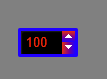
<box style="padding: 5px;background-color:grey;" width="100%" height="100%">
    <style>
        .number-stepper {
            border: 3px solid blue;
            color: red;
            background-color: black;
            padding: 3px;
        }

        .number-stepper .textfield {
            background-color: black;
        }

        .number-stepper .stepper-inc {
            icon: "haxeui-core/styles/default/up_arrow_white.png";
            background: red blue vertical;
        }

        .number-stepper .stepper-inc:down {
            background: blue red vertical;
        }

        .number-stepper .stepper-deinc {
            icon: "haxeui-core/styles/default/down_arrow_white.png";
            background: red blue horizontal;
        }

        .number-stepper .stepper-deinc:down {
            background: blue red horizontal;
        }
    </style>
    <number-stepper value="100" verticalAlign="center" horizontalAlign="center" />
</box>
link to playground version: http://haxeui.org/builder/?rwjdic
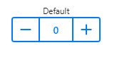
No i meant something like this:
Hmmm, right
Currently i dont think its possible to do something like that, however, i do like the idea so i might see if i can make the button location a little more customization.
Ill have a think.
Cheers,
Ian
That sounds good.
Thanks.
Cheers,
Domi