Hi,
It’s been a while. I’ve got back to adding more features to my editor and was wondering if it’s possible to customize the sliders value color based on a starting value. Through code if possible.
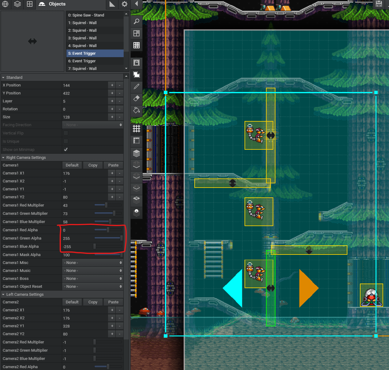
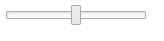
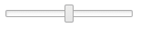
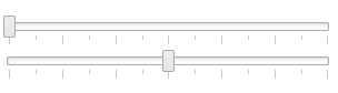
The sliders marked in red below goes from -255 to 255 with default point at 0.
I would like the blue color to go from the middle point and out. So at 0 value there wouldn’t be anything selected and if I move the slider then the color highlight goes from 0 to the value.
Something like this?
    @:bind(slider1, UIEvent.CHANGE)
    private function onSlider1(e:UIEvent) {
        slider1.findComponent("range-value").backgroundColor = rgb(slider1.pos, 0, 0);
    }

    @:bind(slider2, UIEvent.CHANGE)
    private function onSlider2(e:UIEvent) {
        slider2.findComponent("range-value").backgroundColor = rgb(0, slider2.pos, 0);
    }

    @:bind(slider3, UIEvent.CHANGE)
    private function onSlider3(e:UIEvent) {
        slider3.findComponent("range-value").backgroundColor = rgb(0, 0, slider3.pos);
    }

    private static inline function rgb(r:Float, g:Float, b:Float) {
        return (Std.int(r) & 0xFF) << 16 | (Std.int(g) & 0xFF) << 8 | (Std.int(b) & 0xFF);
    }
oh, hang on… completely misread the whole thing 
Haha. The color switching is a neat idea too.
If what I’m asking is not possible the other solution would be to add a gradient background to the whole slider or just leave it without a selection color so it looks more like a value picker.
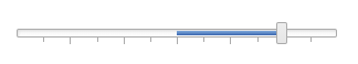
So yeah, this isnt possible at the moment, however, i do really like the idea, so i think i might implement it (or play with it anyway)… i think “center” might be a good property? eg:
<slider min="-255" max="255" center="0" />
Open to other suggestions though… i think it could be a really nice addition, hopefully its not too hard to do.
Cheers,
Ian
Sounds good and yes this would be really good addition and make sliders a bit more intuitive for the user.
Another good property for it to have is Step, so it increments at specific amounts. I can probably get this to work with onChange and rounding but it just seems like there should be an option for it.
If you feeling more adventurous  , adding minor/major tick marks would greatly enhance the visuals and usability.
Thanks,
John
1 Like
fyi, kinda working:
bit hacky at the moment, but as a PoC its working alright 
1 Like
Looks great.
Did you add the center property or some other way?
Yeah,
<slider min="-255" max="255" center="0" />
Few niggly things to work out… will try and add step and ticks while im here, quick aesthetic question, what do you think about this line i added at the center point:
Its pretty subtle and, ofc, its a style so can be turned off but im wondering if it looks right as a default?
Cheers,
Ian
That is something I would expect when you turn on tick marks if you go through with it.
sure, but the tick marks and the “center line” are separate things - so in isolation (regardless of “ticks” property) in your opinion do you think a single center line looks “off”? Im undecided…
EDIT: the two gifs above show it with and without
I think it looks better without it for the clean look. I’m fine either way though, it’s a very small detail.
Agreed, it is a tiny detail… easy to get hung up on those things… at least i tend to
Thoughts on the slider so far?
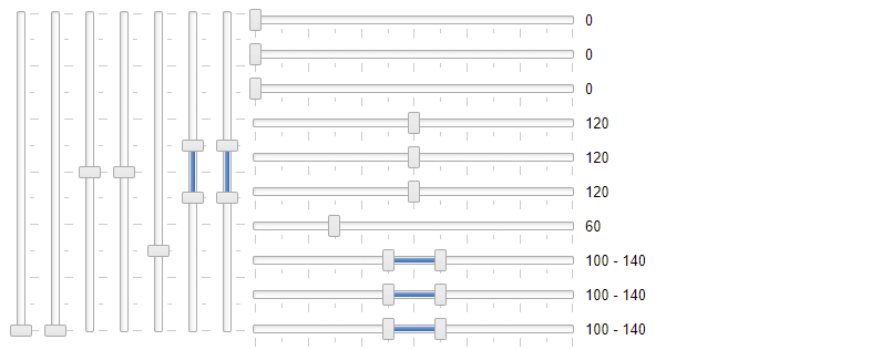
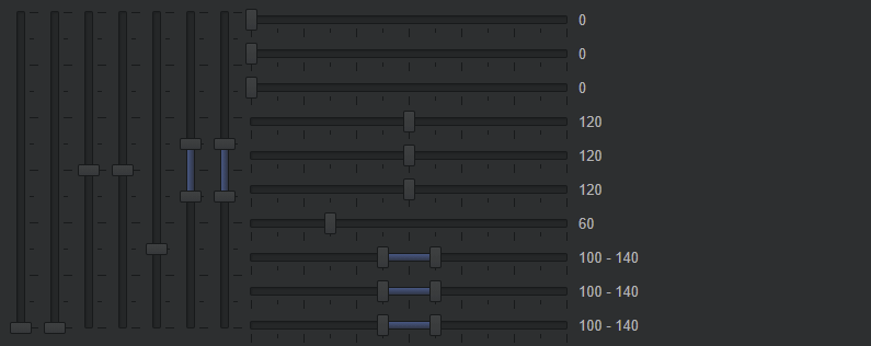
<slider width="300" min="0" max="240" center="120" step="20" minorTicks="20" majorTicks="40" />
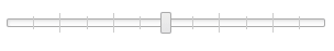
alternate tick style:
FYI, ive settled on this style of ticks for now:
1 Like
Nice job! It looks great.
I just pulled the latest git and there seems to be some issues:
haxe/ui/components/HorizontalSlider.hx:79: characters 30-44 : Constraint check failure for findComponents.T
haxe/ui/components/HorizontalSlider.hx:79: characters 30-44 : { left : Float } should be haxe.ui.core.Component
haxe/ui/components/HorizontalSlider.hx:61: characters 30-44 : Constraint check failure for findComponents.T
haxe/ui/components/HorizontalSlider.hx:61: characters 30-44 : { left : Float } should be haxe.ui.core.Component
haxe/ui/components/VerticalSlider.hx:81: characters 30-44 : Constraint check failure for findComponents.T
haxe/ui/components/VerticalSlider.hx:81: characters 30-44 : { top : Float } should be haxe.ui.core.Component
haxe/ui/components/VerticalSlider.hx:63: characters 30-44 : Constraint check failure for findComponents.T
haxe/ui/components/VerticalSlider.hx:63: characters 30-44 : { top : Float } should be haxe.ui.core.Component
What version of haxe are you on?
nevermind, got it… can you pull and try again?