Hi,
I’m having some issues with a dropdown list that is downscaling when I open it. Sometimes it fixes it self when I scroll down.
Any ideas why this happens?
Using openfl and just code to build the menu(no xml). Some snippets of code I’m using to build this:
public var dropDown:DropDown = new DropDown();
public function new() {
dropDown.height = 30;
dropDown.percentWidth = 100;
dropDown.dropdownSize = 25;
dropDown.onChange = ondropDownChange;
this.addComponent(dropDown);
}
// Add tileset to Drop Down
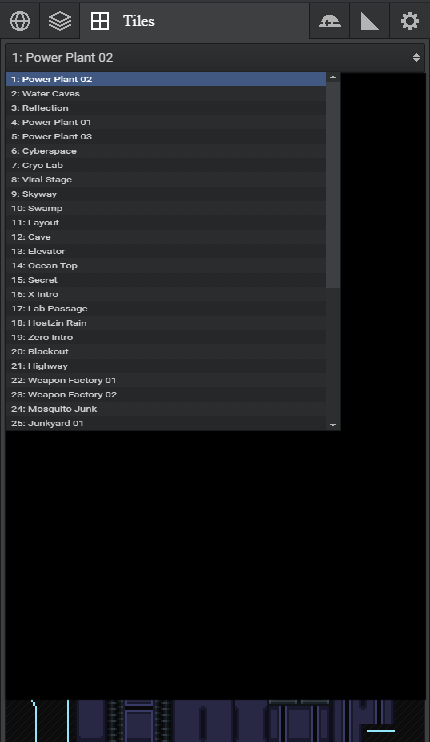
public function addTileset(id:Int):Void {
dropDown.dataSource.add({
text: (id + 1) + ": " + sheetName });
}
Hi,
Yeah, there is an issue with openfl and filters currently (something to do with cacheAsBitmap or something similar). Unfortunately this doesnt seem to be anything to do with haxeui so its not something i can readily fix, there is however a flag (added recently) to turn off all filters which should fix your problem the flag is: “haxeui_nofilters”
Let me know if that fixes it (hopefully this will be sorted in a later release of openfl)
Cheers,
Ian
Thank you for the quick reply.
That seemed to have done the trick. Thank you so much!
1 Like
Out of interest, is that a haxeui tabview at the top of your UI? How did you get the text to appear only on the selected tab? Its a nice effect, but i dont remember adding it… though i might now 
Cheers,
Ian
Yes it is a TabView. It was a lot of trial and error and the main reason why I like to only use code so I have full control of the components.
This is the function for the onChange for the tabbar.
public function onMenuChange(e) {

    for (i in 0...menuTabBar.numComponents) {

        if (i == menuTabBar.selectedIndex) {

            menuTabBar.getComponentAt(i).width = menu.width - (menuTabBar.numComponents - 1) * 40;

            switch(i) {

            case 0:

                menuTabBar.getComponentAt(i).text = " World";

                cast(menuTabBar.getComponentAt(i), Button).icon = "menus/Icon_World_ON.png";

            case 1:

                menuTabBar.getComponentAt(i).text = " Maps";

                cast(menuTabBar.getComponentAt(i), Button).icon = "menus/Icon_Maps_ON.png";

            case 2:

                menuTabBar.getComponentAt(i).text = " Tiles";

                cast(menuTabBar.getComponentAt(i), Button).icon = "menus/Icon_Tilesets_ON.png";

            case 3:

                menuTabBar.getComponentAt(i).text = " Objects";

                cast(menuTabBar.getComponentAt(i), Button).icon = "menus/Icon_Objects_ON.png";

            case 4:

                menuTabBar.getComponentAt(i).text = " Terrain";

                cast(menuTabBar.getComponentAt(i), Button).icon = "menus/Icon_Terrain_ON.png";

            case 5:

                menuTabBar.getComponentAt(i).text = " Config";

                cast(menuTabBar.getComponentAt(i), Button).icon = "menus/Icon_Config_ON.png";

            }

            menuTabBar.getComponentAt(i).customStyle.iconPosition = "left";

        } else {

            switch(i) {

            case 0:

                cast(menuTabBar.getComponentAt(i), Button).icon = "menus/Icon_World.png";

            case 1:

                cast(menuTabBar.getComponentAt(i), Button).icon = "menus/Icon_Maps.png";

            case 2:

                cast(menuTabBar.getComponentAt(i), Button).icon = "menus/Icon_Tilesets.png";

            case 3:

                cast(menuTabBar.getComponentAt(i), Button).icon = "menus/Icon_Objects.png";

            case 4:

                cast(menuTabBar.getComponentAt(i), Button).icon = "menus/Icon_Terrain.png";

            case 5:

                cast(menuTabBar.getComponentAt(i), Button).icon = "menus/Icon_Config.png";

            }

            menuTabBar.getComponentAt(i).customStyle.iconPosition = "center";

            menuTabBar.getComponentAt(i).width = 40;

            menuTabBar.getComponentAt(i).text = "";

        }

    }

}
Cool… You could ofc wrap that up into its own custom component and use it from anywhere… but sure, code vs markup seems like an endless “debate” that just comes down to personal pref. (fyi, you could handle the different icons in css styles too btw)…
Regardless, i do like the effect, and i think ill add it to core… something like <tabview hideUnselectedTabLabels /> or something (crappy name)
Cheers!
Ian
I see. And not here to debate anything just not too used to markup.
Anyways, that would be a nice option to have. I like it a lot because it helps make menus very compact.
Since I have you here.
Any ideas why the following doesn’t work?
var image:Image = new Image();
image.scaleMode = ScaleMode.FILL;
image.horizontalAlign = HorizontalAlign.CENTER;
image.verticalAlign = VerticalAlign.CENTER;
A lot of these styling get/set attributes for components don’t seem to work.
Very cool! Im not sure about that scaleMode stuff, ill have to check it out… i dont suppose you have a minimal (non functioning) sample do you? If not, its fine, ill check it out - but small repros are always useful.
That app looks great… any chance i could share it on twitter / facebook? If yes, do you have a twitter account to link credit to?
Im actually looking at doing those tabs with a pure css solution, its working so far (though i did have to make some subtle changes to core).
Cheers,
Ian
I just figured it one out.
I was using .backgroundimage instead of the .resource to load the image. 
And yes, you can share it if you want. I don’t use twitter that much but here it is https://twitter.com/JKBGames/
Thanks!
1 Like
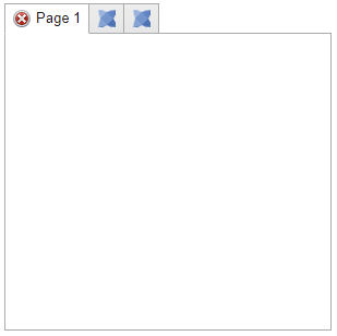
ok, pure css solution: Builder - HaxeUI
<vbox style="padding: 5px;">
    <style>
        #myTabView .tabbar-button {
            icon: "haxeui-core/styles/default/haxeui_tiny.png";
        }

        #myTabView #page1_button.tabbar-button-selected {
            icon: "haxeui-core/styles/default/dialogs/cross-circle-small.png";
        }

        #myTabView #page2_button.tabbar-button-selected {
            icon: "haxeui-core/styles/default/dialogs/exclamation-small.png";
        }

        #myTabView #page3_button.tabbar-button-selected {
            icon: "haxeui-core/styles/default/dialogs/information-small.png";
        }
    </style>
	<tabview styleName="collapsible-labels" id="myTabView" width="300" height="300">
        <vbox id="page1" text="Page 1" />
        <vbox id="page2" text="Page 2" />
        <vbox id="page3" text="Page 3" />
	</tabview>
</vbox>
collapsible-labels is in core now and is just:
.collapsible-labels .tabbar-button .label {
    hidden: true;
}

.collapsible-labels .tabbar-button-selected .label {
    hidden: false;
}
I did have to fix a couple of bugs in core, well, oversights really for this to work properly, so totally worth doing… thanks for the inspiration! 
Cheers,
Ian
2 Likes
Its a cool, and really useful, effect… so, glad i added it… 
Cheers,
Ian