Howdy!
So heres a “quick” (and, as usual, horrendously overdue) overview of the just released v1.7.0!
You can find the previous write up (for v1.6), in case you missed it, here: https://community.haxeui.org/t/haxeui-v1-6-released
This release brings a ton of bug fixes, some really nice css enhancements and a bunch of QoL features. It will also be the penultimate release before work starts on version 2.0 (which is likely to contain a lot of breaking changes – more about that later). Let’s get to it!
Remove Absurd Class Hierarchy
Lets start nice and simple! Previously HaxeUI implemented this absurdly verbose (and completely unnecessary) class hierarchy:Component → ComponentImpl (backend) → ComponentBounds → ComponentLayout → ComponentValidation → ComponentEvents → ComponentContainer → ComponentCommon → ComponentSurface (backend)
Yikes! Even just typing that out hurt! 
The idea here was to have a sort of “separation” between things in an effort to keep each class nice and short. And to some degree it worked. But nowhere near enough to justify this type of inheritance tree. So, its all been dumped now. Apart from adding bloat (arguably minimal) to the output, it also just added “mental burden” when you were working on the guts. The new inheritance tree is saner:
Component (core) → ComponentImpl (backend) → ComponentBase (core) → ComponentSurface (backend)
This does mean that things like Component and ComponentBase are bigger (line wise), but they were pretty big anyway, and the burden of looking through “a mountain” (maybe slightly dramatic) list of files was becoming problematic – Ive been using this much shorter class tree for a while now, and its just superior (not to mention will knock off a small amount of size from the final app, and a perf increase too – albeit negligible).
CSS “thangs”:
There has been a number of enhancements and QoL features added to the CSS engine.
Extensibility
The first thing to mention is that a lot of the css additions can be extended by backends, apps and libs (modules basically). As usual, haxeui-core comes with a “standard” set, but other modules can add new “bits” to the css engine.
CSS Functions
HaxeUI supports a number of css functions (including some new ones, namely “lighten” and “darken”), before these were effectively hardcoded into haxeui-core but now they come from a module.xml, and since they come from a module.xml, they can come from any module.xml – which includes backends, libraries, your apps, anywhere. It would be completely feasible to have a tiny library “my-haxeui-css-functions” that would just expose a bunch of css functions to anyone who included it. Heres what haxeui-core’s module.xml looks like now (with respect to css functions):
<cssExtensions>
    <cssFunction name="calc" call="haxe.ui.styles.CssFunctions.calc" />
    <cssFunction name="min" call="haxe.ui.styles.CssFunctions.min" />
    <cssFunction name="max" call="haxe.ui.styles.CssFunctions.max" />
    <cssFunction name="clamp" call="haxe.ui.styles.CssFunctions.clamp" />
    <cssFunction name="platform-color" call="haxe.ui.styles.CssFunctions.platformColor" />
    <cssFunction name="theme-icon" call="haxe.ui.styles.CssFunctions.themeIcon" />
    <cssFunction name="theme-image" call="haxe.ui.styles.CssFunctions.themeIcon" />
    <cssFunction name="rgb" call="haxe.ui.styles.CssFunctions.rgb" />
    <cssFunction name="lookup" call="haxe.ui.styles.CssFunctions.lookup" />
    <cssFunction name="lighten" call="haxe.ui.styles.CssFunctions.lighten" />
    <cssFunction name="darken" call="haxe.ui.styles.CssFunctions.darken" />
    ...
</cssExtensions>
CSS Filters
Keeping the same vein, and working in a very similar way (not in impl, but conceptually) is the css filters. Once again, there used to be a finite list of filters that you could use in haxeui css. Like css functions this has been “externalized” to module.xml, meaning that other modules can add new ones. One very important note here (unlike css functions) is that there is NO guarantee that a backend will support the filter; css functions are 100% handled in core, but filters are 100% handled in the backend. This means that making an external module “my-haxeui-css-filters” is probably not going to work (unless you just extend existing filters) because the backend will need to ”understand” and implement them. What this does offer though is a way for backends themselves to expose new, backend specific filters. It also cleans up the filter code and stops all that “this is the fixed list of filters” stuff. Heres what filters haxeui-core’s module.xml exposes by default:
<cssExtensions>
    ...
    <cssFilter name="blur" class="haxe.ui.filters.Blur" />
    <cssFilter name="box-shadow" class="haxe.ui.filters.BoxShadow" />
    <cssFilter name="drop-shadow" class="haxe.ui.filters.DropShadow" />
    <cssFilter name="grayscale" class="haxe.ui.filters.Grayscale" />
    <cssFilter name="outline" class="haxe.ui.filters.Outline" />
    <cssFilter name="tint" class="haxe.ui.filters.Tint" />
    <cssFilter name="contrast" class="haxe.ui.filters.Contrast" />
    <cssFilter name="hue-rotate" class="haxe.ui.filters.HueRotate" />
    <cssFilter name="saturate" class="haxe.ui.filters.Saturate" />
</cssExtensions>
Those with a keen eye will notice that there are a number of new filters in this list, namely:
- box-shadow
- grayscale
- outline
- tint
- contrast
- hue-rotate
- saturate
These arent implemented on all backends (in fact some backends don’t really support any filters at all), but on the ones that do, they can be very useful (I think my fav / most used is “tint” – I often just use white icons, and then tint them on hovers, downs, etc to change the colour).
You can see some of the filters in action here: http://haxeui.org/explorer/#miscellaneous/filters
CSS Directives
Another (very powerful) extensibility feature added in this release is the ability for modules to add their own custom handlers for css directives. What this essentially means is that modules can define a bit of code that will run on a component when an unknown css directive has been found, a good example of this is “clip-path”… clip path isn’t supported by core because its implementation (for backends) isn’t trivial, however, on haxeui-html5 its simple (ofc), so to that end, haxeui-html5 exposes a custom handler for clip-path, meaning that backend will support it, here is what that looks like in haxeui-html5 (or the interesting parts at least):
<cssExtensions>
    <cssDirective name="clip-path" class="haxe.ui.backend.html5.css.directives.ClipPath" />
</cssExtensions>
And the implementation of that looks something like:
class ClipPath extends DirectiveHandler {
    public override function apply(component:Component, directive:Directive) {
        ...
    }
}
I don’t expect this feature to be used extensively, in fact, it shouldnt be used extensively – but its very useful for patching things. I also means lib and app writers can “go crazy” if they want and do all types of things to their components while still using the (great) css system of addressing components by structural location, id, group, etc, etc. All the goodness of css addressing with the flexibility of custom code handling. 
That it for the extensibility of css, but there a few more css related things to show!
Nested CSS Calls
With all this new “css function” stuff an important, and previously not possible, addition is the ability to properly nest function calls in css values, for example:
.foo {
    color: lighten(rgb(min(240, 255), 0, 0));
}
It seems simple, but before 1.7 that simply wasn’t possible, now you can nest functions in the way you would expect them.
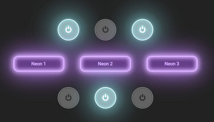
Multiple CSS Filters
Another seemingly small, but very powerful, change is the ability to have multiple filters in css. Prior to 1.7 you could have ONE css filter per component, the backend(s) already supported multiple (well, the idea of multiple at least – the backend has always received a list of filters), but the css parser would not. It allowed a single filter and that was it, that has been fixed now which means you can get very creative with filters: http://haxeui.org/explorer/#miscellaneous/filters/neon_buttons
That’s enough about CSS things for now, a lot of it is probably not that interesting, but they are actually big, significant changes (even if they don’t affect the end user much) so are certainly worth mentioning!
Lets get into something a little more interesting: new components!
New Component: Panel
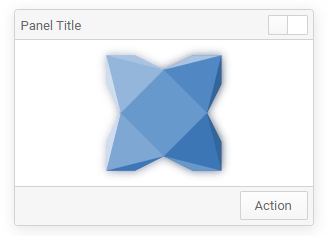
This is very much like a dialog really, except it doesn’t “popup” over your UI, its in it, apart from that it works very similar, you can see some examples here: http://haxeui.org/explorer/#containers/panels
New Component: Collapsible
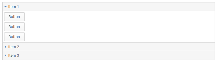
Collapsible is another pretty simple component, it’s basically a collapsible box with a button to expand / collapse it, kind of like an accordion page, but in isolation. You can see some examples here: http://haxeui.org/explorer/#containers/collapsible
New Components: ItemPickers
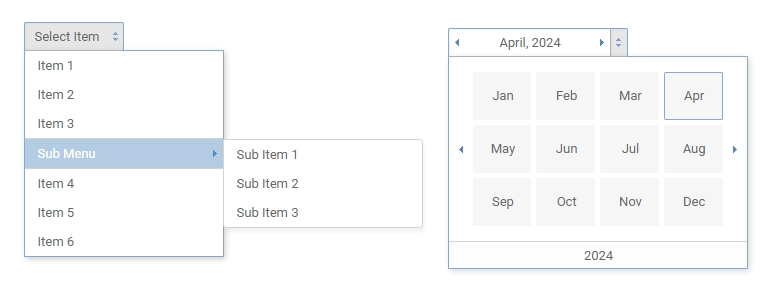
This is a new set of components. They basically allow you to “select” (pick) a value from some type of popup UI, currently there are only three: ListItemPicker, MonthPicker, MenuItemPicker.
These pickers are currently considered work in progress, but the idea is that they will be expanded upon and refined. So, eventually, ListItemPicker will supersede “DropDown” (which is doing a lot of lifting). They are also semantically nicer for things like mobile, where totally different variants can easily be created to fit that UX. (<list-item-picker> for example could popup a panel at the bottom of a mobile screen, rather than relative to the trigger - it also “sounds” more correct than “dropdown”)
You can see some examples here (again, keep in mind they are WIP): http://haxeui.org/explorer/#basic/item_pickers
New style variant: rounded menus
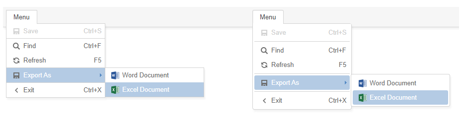
Menus have a new style: “rounded”, the backend will need to support “compound rounded borders” in order for them to work, but when they do, I think they look A LOT nicer than the default “square menu”. The screenshot above shows the “old” menus (which are still default) on the left and the new “rounded” menus on the right. In order to use these menus you’ll need to add styleName="rounded" to either your Menu or your MenuBar (and your selected backend needs to be able to address the radius of each corner of a border independently)
Note that haxeui-html5 has this activated by default now in its module.xml:
<properties>
    ...
    <property name="haxe.ui.containers.menus.menubar.style" value="rounded" />
    <property name="haxe.ui.containers.menus.menu.style" value="rounded" />
    ...
</properties>
New animations: slide
The animation builder has some new animations built in: slides.These can slide components to / from the top, left, right, or bottom, and can be really nice to add a little “snazz” to your application. Using them couldn’t be easier, simply add using haxe.ui.animation.AnimationTools to your class, build your UI as you normally would and then do things like myVBox.slideFromTop(), myHBox.slideToLeft().
You can watch a video of them here: http://haxeui.org/shared/slide_animations.mp4
New Feature: @:bind now works with IEventDispatcher
Prior to 1.7, if you wanted to use the @:bind metadata to link up events, it had to be Component, eg:
@:bind(myComponent, MouseEvent.CLICK)
function onMyComponentClick(_) {
}
This has been expanded and you can now use @:bind with anything that implements IEventDispatcher, for example:
@:bind(Screen.instance, MouseEvent.MOUSE_DOWN)
function onScreenMouseDown(_) {
}
Or even your own custom dispatchers
class MyDispatcher extends EventDispatcher<MyEvent> {
    ....
}

@:bind(myDispatcherInstance, MyEvent.SOME_EVENT)
function onMyDispatcherEvent(_) {
}
This really unifies things, and stops you having to mix and match ways of attaching events - you still can of course, but its nice that you dont have to.
New Feature: Item Renderers can address sub properties
This is an insanely powerful new feature of data sources / item renderers, which is the ability for datasources to address sub properties on named components in an item renderer.
A good (and simple) example of this is: lets say we have an item renderer that is just a button, lets say in the data source we wanted to set the text and the icon of the button. Well, previous to 1.7 you simply couldn’t – at least not easily – you would have to create a fully custom code based item renderer, override its “onDataChanged” function and do whatever you wanted to there, so it was possible, but certainly not ideal for something like setting the text and icon of a button. Well, now you can and it’s a simple as using the property, heres an xml example:
<listview ...>
    <item-renderer ...>
        <button id="theButton" />
    </item-renderer>
    <data>
        <item theButton="This is item 1" theButton.icon="icon1.png" />
        <item theButton="This is item 2" theButton.icon="icon2.png" />
        <item theButton="This is item 3" theButton.icon="icon3.png" />
    </data>
</listview>
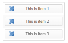
Thats really all there is to it. The result of this would be a listview, where the items are buttons with both their text and icon set. You can address any component properties in this way!
This is extremely useful and very powerful. The main reason I never implemented this before (and I and others have needed something similar on multiple occasions) is because I didn’t think having a dot in xml attribute names was valid xml, as it turns out its perfectly valid (and not just haxe xml, any xml), which means I was no longer thinking “how to address from xml” for this. The result (to me) is very clean, albeit somewhat non-stardard looking – but ill certainly take the huge boost this gives to addressing sub properties in renderers without writing any actual code.
New feature: “boxes” can have item renderers and datasources
Another crazy powerful new feature is the ability for boxes (any boxes, think hboxes, vboxes, grids, stacks, etc) to have item renderers and datasources. The best way to explain this feature is with an example:
<grid columns="3">
    <item-renderer width="100" height="100">
        <button id="theButton" width="100%" height="100%" iconPosition="top" />
    </item-renderer>
    <data>
        <item theButton="Button 1" theButton.icon="haxeui_small.png" />
        <item theButton="Button 2" theButton.icon="haxeui_small.png" />
        <item theButton="Button 3" theButton.icon="haxeui_small.png" />
        <item theButton="Button 4" theButton.icon="haxeui_small.png" />
        <item theButton="Button 5" theButton.icon="haxeui_small.png" />
        <item theButton="Button 6" theButton.icon="haxeui_small.png" />
        <item theButton="Button 7" theButton.icon="haxeui_small.png" />
        <item theButton="Button 8" theButton.icon="haxeui_small.png" />
        <item theButton="Button 9" theButton.icon="haxeui_small.png" />
    </data>
</grid>
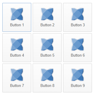
This is very very useful because now, “boxes” (and their contents) can benefit from other features of datasources, like filtering, sorting, etc. Adding / removing items to the data source will of course be reflected in the UI, as will any updates you make to items in the datasource. It also just keeps things super neat and tidy!
Notable mentions:
- labels can be selectable now (with a
.selectableproperty) .iconPositionfor textfields.isBlankproperty for textfields / textarea’s (means not null and not zero length when trimmed)- Menus use a “triangular directional aiming” system so its easier to NOT “miss” and accidentally hide the menu
- Tooltip manager can also accept “regions” not just components so you can use it with non haxeui things.
- WIP navigation manager (more about that in a subsequent release)
- Massive performance increases in colour picker (especially for hxcpp)
- ItemRenderer dispatches an
ItemRendererEvent.DATA_CHANGED - “draggable” components are now “opt in” by using
implements Draggable, if you want to drag all components the flaghaxeui_drag_any_componentcan be used. - Addressing layouts in xml is simpler, you can now do
<box layout="grid" layoutColumns="5">(<grid columns="5">could also be used in this case), but things like<box layout="mySuperLayout" layoutMyProperty="myvalue">is where it shines.
HaxeUI 2.0
I’ve mentioned a few times, but this 1.7 release will be the penultimate version before work on version 2.0 starts in vain. This 1.7 release aims to release a stable version before some breaking changes (just a few) work their way into 1.8. Version 1.8 will be all about “component consolidation”, that is, reusing components as much as possible (which doesn’t happen as often as it could inside haxeui core). This will lead to a few breaking changes (not many), but a ton of new features as well as simpler maintenance. After that 1.8 release work on 2.0 will start, this version will break a ton of things (consider yourself forewarned!  )– most systems are going to be revamped as technical debt has grown over the years – 2.0 will address that, but as with any major version change, expect breakages – it will all be worth it in the end… promise!
Community
I want to take a moment to thank the haxeui community which just keeps growing and growing. The help “old timers” provide for “newbies” is really really nice to see. The bug fixes, PRs and discussions that happen in the haxeui discord are always great and often lead to really nice changes. More and more haxeui feels like a “community project” with more and more real world uses, and although it will always be my baby – its nice to see it grow up, mature and head off to uni
Showcase
There have been a bunch of interesting things haxeui is being used for, ive collected a few that I think are the most interesting / varied. This by no means an exhaustive list, and I know for a fact there are things that aren’t in this list (because they are still WIP, or “secret”, etc), but here is a nice breakdown of some of the things happening in “haxeui-land”!
Friday Night Funkin’
The Friday Night Funkin’ crew are utilizing haxeui (haxeui-flixel specifically) with impressive results inside their own tools (that will be exposed to the player). Its been really interesting to see something so complex, and so custom, be written so effectively.
You can read more about their “chart editor” here: https://funkin.me/blog/2024-02-23/
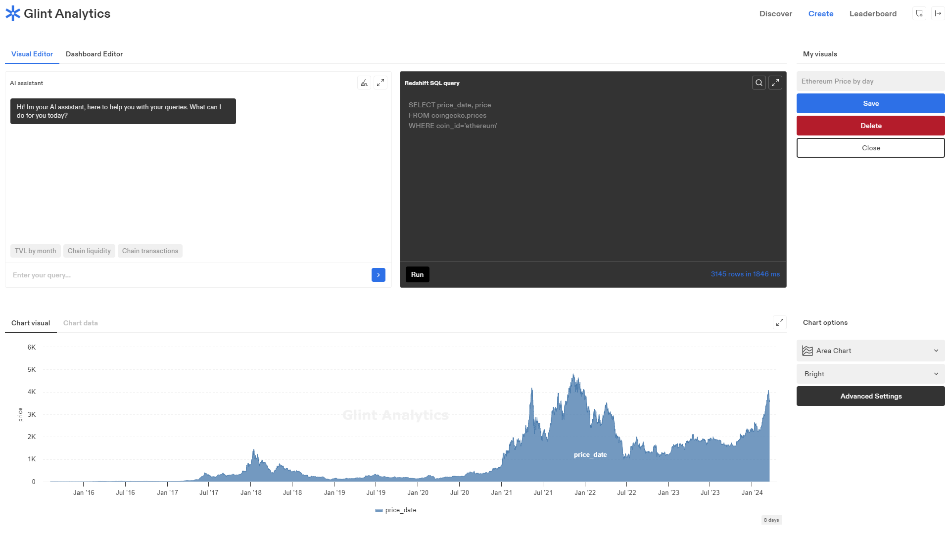
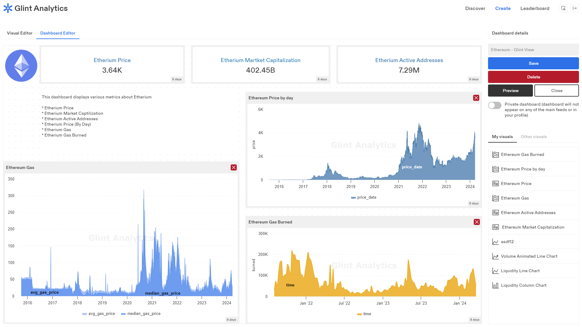
Glint Analytics
Glint Analytics is a blockchain analysis platform written 100% in haxe (and haxeui). This has been an interesting project to see develop (and be involved in) as its grown from ideation to implementation. Its currently in closed beta.
haxeui-ceramic
haxeui-ceramic keeps growing from strength to strength, the backend feels very “complete” now with the focus now seemingly about tweaking, options and performance gains (although Jeremy’s fantastic ceramic engine means its already light speed performance-wise). Note that I still havent written a single line of code for this backend! 
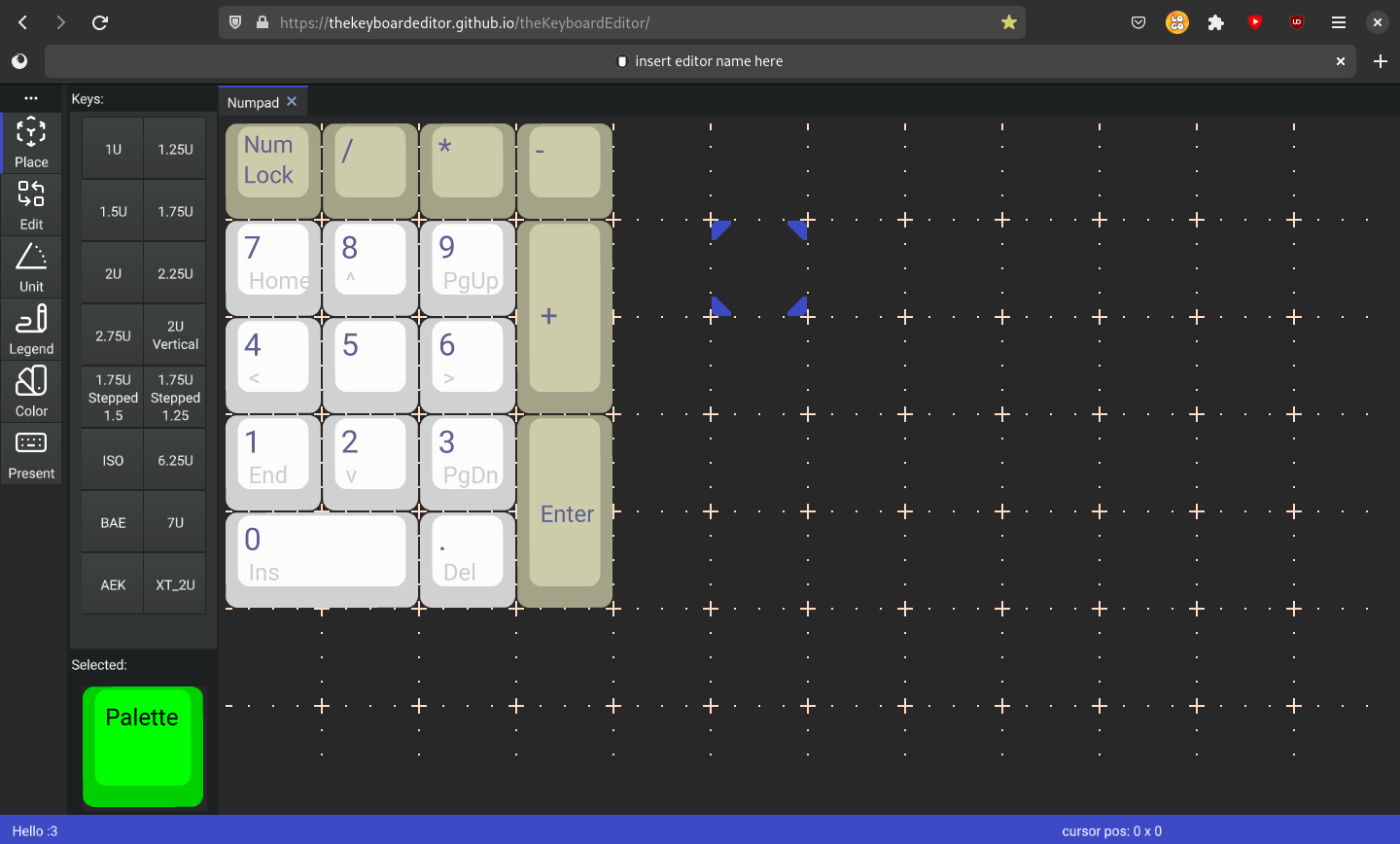
"theKeyboardEditor"
An application that is being actively written with haxeui-ceramic is the theKeyboardEditor. Its basically a replacement for another keyboard editor application that is no longer maintained. As well as being a good test bed for haxeui-ceramic, the application itself looks really neat and tidy, and probably a nice alternative to the (unmaintained) version.
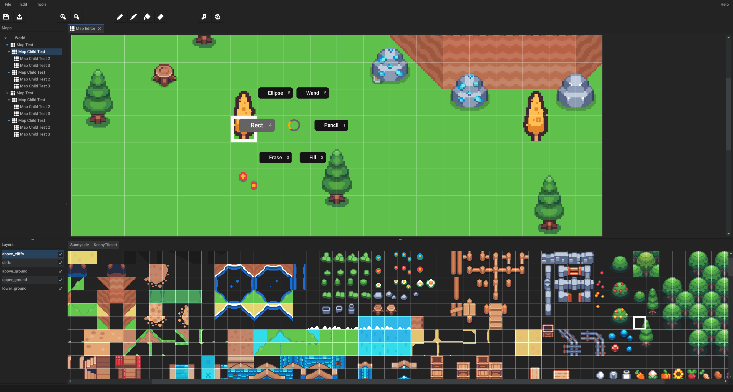
2D game engine editor
Another haxeui-ceramic creation by “inc0der” is a 2d editor for their game engine that “kind of like RPG Maker, but with the flexibility to do more than just RPG’s, but also platformers, visual novels, etc”
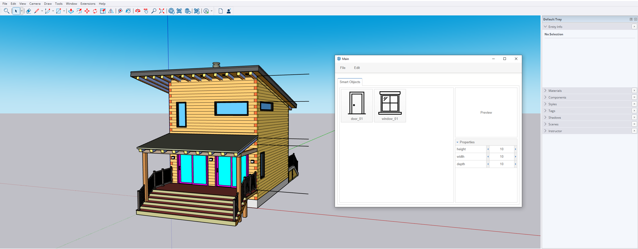
SketchUp plugin
An interesting use of haxeui is by “Redfill Production” who is using haxeui-html5 to build a plugin for SketchUp that creates smart resizable objects, like doors or windows – whats especially interesting about this is that the SketchUp is using ruby, and he has comms going from ruby → haxe → haxeui. 
Another new backend!
Another new backend (!) is currently being written, this time by “DazKind”, this backend is based on NanoVG and bgfx for his “to be announced” game engine “cortex”. Its only just started being developed but the progress that has been made has been insane to watch (and a little humbling ).
It already supports pretty much all haxeui-core features as well as hot reloading via hxcpp’s cppia! This is after about a week of development!
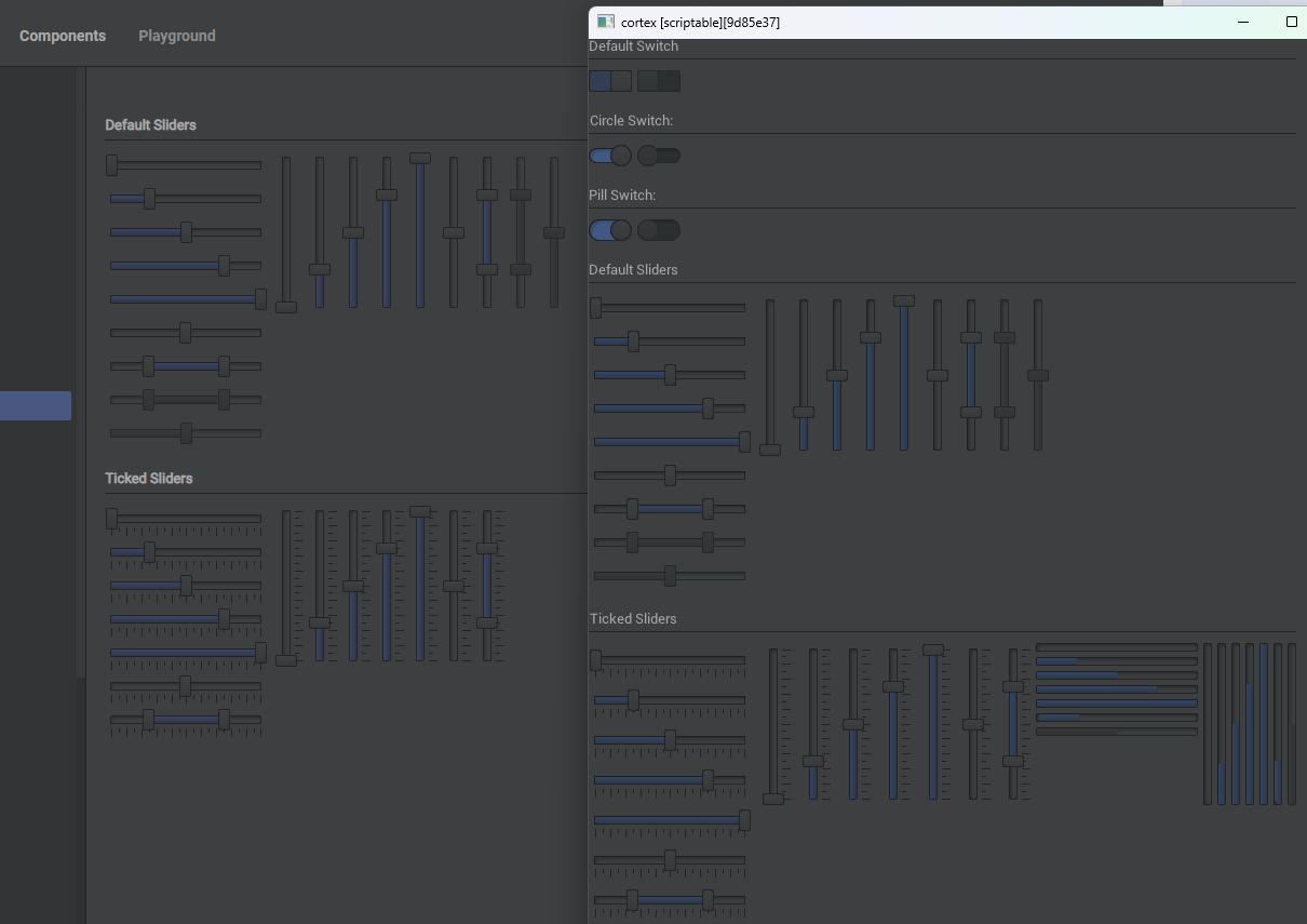
You can watch a video of its cppia hot reloading here: https://www.youtube.com/watch?v=3vQtXQlXOH8&ab_channel=MichaelBickel
Fin!
Well, all good things must come to an end, and as much as I would love to keep showing all of the varied projects that the community is creating, I cant - a line must be drawn somewhere!
Thanks for sticking around (if you did indeed get this far!), and see you next time for 1.8!
Cheers!!!
Ian