Is it possible to copy this behavior of relative positioning in HaxeUI ? It seems % based positioning is not possible in Haxe UI.
<html>
    <head>
      <style>

          .box1 {
            left: 20%; /* 20% from the left edge of the container */
            position: absolute;
            width: 100px;
            height: 100px;
            background-color: #ff0000;
          }

          .box2 {
            left: 50%; /* 50% from the left edge of the container */
            position: absolute;
            width: 100px;
            height: 100px;
            background-color: #ff0000;
          }

        </style>
    </head>
    <body>

            <div class="box1">Box 1</div>
            <div class="box2">Box 2</div>

    </body>
</html>
Yeah, % left / top / margins / padding simply arent supported currently… you might get away with “spacer” elements set to %? http://haxeui.org/builder/?e07d9aa1
This is something ive been wanting to look into tbh, ive needed it myself.
Cheers,
Ian
Ok. Thanks. But I am still not able to get desirable result.
I want a small image to always stay over it’s background image, no matter the page is stretched only by width, only by height or both.
Can spacer help me achieve something like this?
I achieved the result in html as follows. I could not do it without the help of js. So another question - if it can be done only using haxeui’s css ?
<html >
<head>
<meta name="viewport" content="width=device-width, initial-scale=1.0">
<title>Pointer always at location 30,30 of the image</title>
<style>

    #image1 {
        width: 100%;
        height: auto;
    }

    #pointer {
        position: absolute;
        width: 25%;
        height: auto;
    }
</style>
</head>
<body>

    <img id="image1" src="image.png" >
    <img id="pointer" src="pointer.png" >

<script>
    function updatePointerPosition() {

        var redDot = document.querySelector('#image1');
        var pointer = document.querySelector('#pointer');

        var rect = redDot.getBoundingClientRect();
        var redDotX = rect.left + 30/100*rect.width;
        var redDotY = rect.top + 30/100*rect.height;


        pointer.style.left = redDotX + 'px';
        pointer.style.top = redDotY + 'px';
    }

    updatePointerPosition();
    window.addEventListener('resize', updatePointerPosition);
</script>
</body>
</html>
image.png ( 100 x 100, with a dot on x=30,y=30)

pointer.png ( 25 x 25 )

Ignore the above code using Javascript.
Here is the CSS-Only version. It’s simpler than I first thought.
Can I do it in Haxe UI too?
“Left” and “Top” attributes together is something I am not able to figure out with HaxeUI
<html>
<head>
<meta name="viewport" content="width=device-width, initial-scale=1.0">
<title>Pointer always at location 30,30 of the image</title>
<style>
    #container {
        position: relative;
        width: 100%;
    }

    #image1 {
        width: 100%;
        height: auto;

    }

    #pointer {
        position: absolute;
        width: 25%;
        height: auto;
        left: 30%;
        top: 30%;
    }
</style>
</head>
<body>

    <div id="container">
        <img id="image1" src="image.png" >
        <img id="pointer" src="pointer.png" >
    </div>

</body>
</html>
I could get up to this point. But spacers don’t work as intended.
<?xml version="1.0" encoding="utf-8" ?>
<box width="100%" height="100%">
     <box id="imgcont1" width="100%" height="100%" style="background-color:blue;" >
          <image width="100%" scaleMode="fitwidth"   resource="./assets/image.png"  />
     </box>

          <vbox width="100%" height="100%" >

<spacer height="30%" />
<hbox  width="100%" height="100%"   >
          <spacer width="30%" />
               <box  width="100%" height="100%" >
               <image width="25%" height="25%"   resource="./assets/pointer.png" />
               </box>

</hbox>
</vbox>
 </box>
Is there any chance you could setup a builder (Builder - HaxeUI) example? Its a little hard to grep whats going on here, or whats not working.
Cheers,
Ian
How to do this in HaxeUI:
(The pointer image is always at the same position irrespective of the window width and height.)
I tried using “spacer” as you suggested. But that does not work.
http://haxeui.org/builder/?cf934794
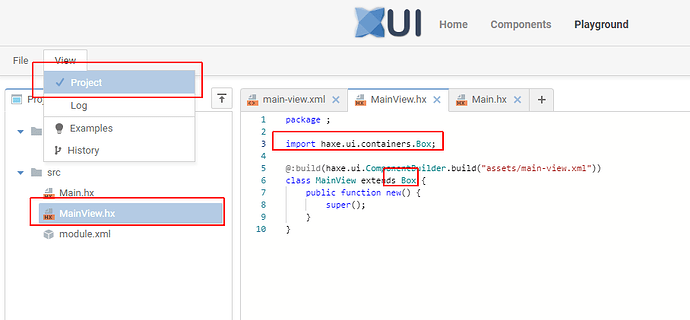
So one of the main issues there was that the xml root was <box> but the “MainView.hx” extended from “VBox”, in this case VBox takes precedence (ie, the code). I made these changes:
And a few others, and it works better, but still not 100% right imo… ie, its still not touching the black center (which i find a little odd tbh): http://haxeui.org/builder/?ce3229ea
the “easiest” thing here is to add % left / top… instead of messing around with all these spacers, its just ugly (even if it did work)… though i am a little confused as to why the %height spacer didnt work - it should end up exactly the same as if the pointer had a %top… so thats kinda weird… i think ill check this specific thing out outside the builder, just in case that is doing something weird
It works better when i make the image 100% x 100% and remove the scaling… but not sure that helps: http://haxeui.org/builder/?810bce5b
Ok. But you see the images get compressed on changing the width. That does not happen with css.
I am not strict about spacer. I thought probably that is the only way to do it. I only want to achieve how it is done in css.
So is their any better way to achieve it?
I understand that, which is why i said “im not sure if that helps”… but i was just trying to understand why it was way off before. But i think it makes sense now. You have your main viewport set to 100%x100%, which means it will always be the size of the “screen” (iframe in the builder in this case), so even if the image grows (which is will with your example), the main viewport will still be 100%x100%.
As I mentioned, the proper solution here is to allow haxeui to use %left and %top - but its simply not a thing currently - maybe next release. Ill have another crack at spacers (even if its the crappy solution - its probably the only one currently, other than DIY in code).
Ian
Thanks. But now both width and height are changing simultaneously. Responsive changes don’t behave that way.
The codepen.io link example above, I shared with you will retain
- The position of the pointer
- The aspect ratio of the pointer
No matter you change only width, only height or both width and height of the window.
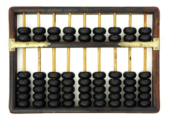
To give you a clear picture, I need this to show a responsive layout of an Abacus like device. Where the “bead” image will retain their position and proper image dimension in a responsive manner. Irrespective of how th window change it’s size. Horizontally, vertically or both together.

Ok. Fine. I will check the next release then.
