I want to create different checkboxes ( depending of the current screen where the user is ) using custom images ( similar to Bitmap buttons)
Is this possible ?
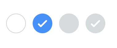
Example:
Sure: Builder - HaxeUI
<vbox style="padding: 5px;">
    <style>
        .checkbox {
            font-size: 48px;
            font-style: italic;
        }

        .checkbox .checkbox-value {
            width: 64px;
            height: 64px;
            background-color: red;
            background-opacity: .2;
            border: 4px solid blue;
            border-opacity: .5;
            border-radius: 12px;
        }

        .checkbox .checkbox-value:selected {
            icon: haxeui-core/styles/default/haxeui_small.png;
            background-color: green;
        }
    </style>
	<checkbox text="Test" />
	<checkbox text="Test" selected="true" />
	<checkbox text="Test" />
</vbox>
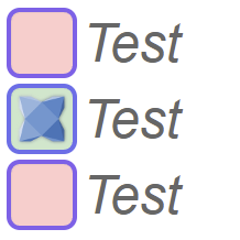
Here im using border / background colors, etc… but the you could use anything (like images)
Cheers,
Ian
1 Like
Thank you again Ian!
1 Like
Is it possible to use image as the border or only can use border-radius to change the type ?
About the icon, could I set bitmapdata similar to button ?
Just for example I could have such check box of something more complex. So my idea will be to replace the whole checkbox with image . Is it possible ?

Is it possible to use image as the border
Not sure i follow… 
So my idea will be to replace the whole checkbox with image
sure, you could just use background-image, or whatever really, as you say, the same as buttons - there is no difference from a style perspective between buttons, checkboxes, etc, etc. Its just a style that haxeui tries to “honour” as best it can.
Cheers,
Ian
Heres another example, just using background-image: Builder - HaxeUI
Thank you again Ian.
I think that’s what I’m looking for.
1 Like
Hi Ian,
I tested your solution and I have two problems
- I can’t change the style name . In your example is
.checkbox, but when I tried to change to.common-checkboxand set it ( witthmcheckBox.styleNames = "common-checkbox";, but it doesn’t works) - If I use
.checkboxthe checkbox appears only after mouse hovering. Clicking on the text does not change the status of the checkbox ( the text is also on a strange position ).
Example OpenFL project is here :
https://drive.google.com/file/d/1u6dC71yTmWwLCR7Sp_209TNMvfKDk0m9/view?usp=sharing
So, you are setting the width / height of the checkbox to 56:
		mcheckBox.width = 56;
		mcheckBox.height = 56;
However, this is the whole checkbox (which is basically an hbox with a CheckBoxValue and a Label in it). This is why you are getting the issues, the value is being squeezed (thats why its small) and the label is being pushed to the next line (since its trying to wrap it).
The fix (assuming im following what you want), is to specify the size of the value in the css:
.common-checkbox .checkbox-value {
    ...
    width: 56px;
    height: 56px;
}

FYI, since i know you like using code
You can also set it this way:
		mcheckBox.findComponent(CheckBoxValue).width = 56;
		mcheckBox.findComponent(CheckBoxValue).height = 56;
However, in order for that to work, you have to override the css with:
.common-checkbox .checkbox-value {
    ...
    width: none;
    height: none;
}
I tested findComponent and it works, but have a check box flashing at the begining. Here is example when refresing the browser page.
I also test the other solution ( with setting width: 56px; and height: 56px; in css) , but then the image change only when did mouse hover . Here is the gif:
Is this only for me ?
I didnt see anything like that, no. I wasnt testing html5 though, ill test that tomorrow - in the mean time, are you using latest (git) haxeui-core, haxeui-openfl, etc?
So, i tested with html5, and yeah, i could reproduce the flash, but i think it makes sense though - i mean, look at your code, you load create a checbox, load some images, and when those images are loaded you set a style for the checkbox - so that im assuming is where the flash comes from.
I changed your code to this:
class Main extends Sprite {
var vbox:VBox;
var mcheckBox:CheckBox;
public function new() {
super();
addEventListener(Event.ADDED_TO_STAGE, onAddedToStage);
}
private function onAddedToStage(event:Event):Void {
removeEventListener(Event.ADDED_TO_STAGE, onAddedToStage);
initStage();
drawCheckBox();
}
private function initStage():Void {
stage.align = StageAlign.TOP_LEFT;
stage.scaleMode = StageScaleMode.NO_SCALE;
stage.frameRate = 50;
Toolkit.init();
Assets.loadBitmapData("img/checkbox.png").onComplete(startLoadCheckBox);
}
private function startLoadCheckBox(bitmapData:BitmapData):Void {
StyleLookupMap.instance.set("common-checkbox-image", bitmapData);
Assets.loadBitmapData("img/checkbox-marked.png").onComplete(checkBoxLoaded);
}
private function checkBoxLoaded(bitmapData:BitmapData):Void {
StyleLookupMap.instance.set("common-checkbox-selected-image", bitmapData);
drawCheckBox();
}
private function drawCheckBox():Void {
vbox = new VBox();
vbox.x = 100;
vbox.y = 100;
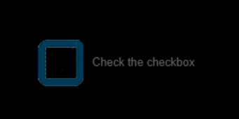
mcheckBox = new CheckBox();
mcheckBox.findComponent(CheckBoxValue).width = 56;
mcheckBox.findComponent(CheckBoxValue).height = 56;
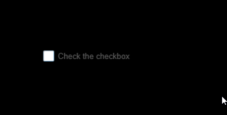
mcheckBox.text = "Check the checkbox";
mcheckBox.styleNames = "checkbox";
mcheckBox.styleNames = "common-checkbox";
vbox.addComponent(mcheckBox);
Screen.instance.addComponent(vbox);
}
}
And now it works fine, basically, im loading the images first, then creating the checkbox
Thank you for checking this.
As for my project, I will load images asynchronously and add a checkbox before the load completes.
Is there a difference between a button and a checkbox implementation?
For the buttons, I could not see such a flash with the same code.
There shouldnt be any difference between button, checkbox, or any other component. Maybe because you are styling a sub component, not sure. But regardless, logically, there is always going to be scope for a “style flash” if you are adding a component, then loading images, then applying images. There is certainly always going to be a window there for the “image version” to not show instantly (for various reasons).
Cheers,
Ian
You a right. Because the background-color: none; this is not so visible for button.
My hack is to set visible = false and after loading set to true.
My goal is to create flexible game ui framework for easy setting of button ,checkbox ,listview, dropdown etc. . For that I should set width / height from source and only have limit params described in css.
Definitely HaxeUI is very flexible , but maybe is more application oriented. That doesn’t stop me from trying
tbh, i think that this would happen with anything, haxeui or not… if a component (or anything, say a red box) is drawn, then you load an image and change it to a blue box, then there will be a potential for the box to start red and then blue (while the image is loading). If you start by not drawing the red box and change it to blue when the image loads, it will look like nothing is drawn except the blue box.
Its just a logic / timing / async “issue” as far as i can tell. Initially hiding the “box” is one option, another option (in haxeui) would be to unstyle everthing from the get go (though this may be undesirable):
* {
    background: none;
    background-color: none;
    icon: none;
    resource: none;
    ...
    ...
}
This will remove styling of all haxeui components (denoted by the *), which may be what you are looking for, but might also have some very strange effects if there are part of haxe you do want to be styled.
Another option would be to create a new theme, that doesnt extend from the default theme and does nothing (ie, doesnt style anything)… this would mean (kinda like the wildcard) that you would be responsible for styling every part of haxeui.
1 Like
Very interesting solutions. Thank you for this ideas!
1 Like