first I would like to wish an Happy New Year to Ian and all the HaxeUI community.
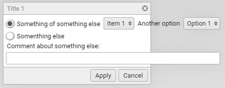
I’m using dialogs with fixed width, but because of the multi-language use I need to have dialogs with auto size to fit all the translations that have a oversize correspondent. The issue is that if I don’t use a fixed width, the dialogs assumes itself a fixed width and all the content goes out of the bounds of the dialog box. I’ve tried the autoSize=“true” and autoWidth=“true” but if gives a “ComponentMacros.hx:362: characters 37-56 : Cannot rebind this method : please use ‘dynamic’ before method declaration”.
Sorry, forgot to mention, is the openfl backend and targeting html5, and I didn’t change the style of any component including the optionboxes. Yeah, somenthing is not right with the shadows, seems that they have some portion “cutted” in the bottom…
Thanks, the initial-width: none works like a charm (the width: auto doesn’t make a difference).
By the way, how do I disable the possibility of moving the dialog around, that is, make it stationary? And is there an option to make the dialog always stay in the centre, even when resizing the stage, I mean without having to repositioning the dialog on the event.Resize by “hand”?
The haxeui-core and the haxe-openfl are the latest git version, but the openfl version is still 8.9.7 (because I have some compability issues with the latest version with an old lib that I didn’t fixed yet)
.draggable works fine, and I resort to centre it using the stage resize event for now.
A not dialog related question that I have is (and I don’t know if someone already asked this before), is there a way to make the dropdown initial width be the same as the biggest item text?
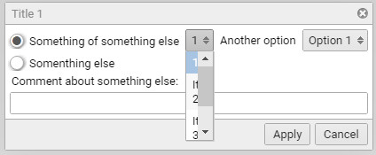
Like If I would replace the Item 1 from the first xml that I provided to just 1, like this:
is there an option for the dropdown component to set the initial width for the size of the biggest item?
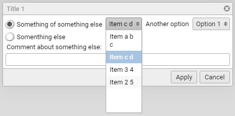
And in the search for this I believe I found a “exception” bug and a graphical bug of sorts. If I use selectedIndex="1" (or any of the other two) instead of 0, it gives an haxe_ValueException that throws a “The validation queue returned too many times during validation. This may be an infinite loop. Try to avoid doing anything that calls invalidate() during validation.”, and I think that, from my tests, this only happens when we do a selectedIndex on items with a text that has one more spaces on it, than the first item (probably internally is not related with having one or more spaces, but it triggers the exception), and the other one is related with the look of the opened dropdown list, on the follow items:
<dropdown selectedIndex="1">
	<data>
		<item text="Item a b c" />
		<item text="Item c d" />
		<item text="Item 3 4" />
		<item text="Item 2 5" />
	</data>
</dropdown>
when the selectedIndex is on a smaller item, this look like this:
Ill take a look at both of these when i get a moment, i think the exception is about wrapping… ie, its trying to wrap but its so small it cant work out how to make it fit (because it “cant”)… but thats a guess.
Ok, it’s not an urgent thing, we could always try to work around it in static UI, the only time that this is a pain is when the dropdown list is feed with data from a not so controllable list where the first item is smaller than the rest, like data generated from user content, or something.
And about my first question, set the dropdown initial width from the size of the longest item?
I don’t know how the components are rendered, but if the property hidden is true, the actual component isn’t render until the hidden property is set to true, right? I’m not sure, but I thing that in openfl we could set the visibility to false and play with the display object, collect information we need even if it not rendered on screen, then again I could be totally wrong on this, I need to do some testing to make sure, but as I’m writing this I realise that you have to mainting several backend and in some, like html, I believe that it’s not even possible. Either way I could probably make a custom component with dropdown list, and then read the with of the listview and then set the with of the dropdown list, it might make an initial visual glitch on the component but I believe it could work, I will give it a try.
I’m sorry, I probably shouldn’t be asking so different things in the same thread, but it doesn´t seem right to open, each time a new thread, for so small questions. So I have another fast one, does the numeric stepper component have a deactived state?
yes it works fine, I’ve already tried that, but when I revisited the code that I’ve used to test that, I see I’ve misspelled disabled and probably didn’t read the error properly and assume that the field doesn’t exist for that component (I see now that in the error sentence, it even has suggested the correct field name, you know, too many things to do and so little time to do them, equals too much confusion and oversighting ). Thanks.
One thing that I’ve noticed in the openfl number stepper is that in the canvas rendering the textfield for the number seems a little off comparing with the rendering in the html equivalent from the haxeUI website playground, the openfl rendering looks like this:
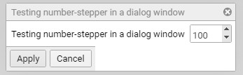
the equivalent html in playground look like this: http://haxeui.org/builder/?lawdpm
(I thing I can correct that using styles on the number textfield, I see that in the class code it has an name id called “stepper-textfield”)
In the dialog part, I’ve said that the width: auto don’t do anything, but that is not true, it needs that property set to auto, or else when we call that dialog again it will loose the autosizing. One thing that it’s not working properly in the autosizing is that it seems to not take in account the dialog buttons, and they stick out of the dialog when it is small or when whe use several buttons, as you could see in the previous image of the number stepper dialog. I use the initial-width:none and the width:auto styling for the dialog component. I don’t know if the others backends share the same behavior.
So ive made two updates, they dont help out completely but may be of use:
firstly, ive fixed the dialog buttons thing, that should be working now.
second for the dropdown, maybe you could add a “min-width” in a style (you’ll need latest haxeui-core as i removed it in a previous commit and forgot to readd it)… Its not the most ideal, but the issue still remains that we have no idea how big the biggest string is until we show the list as its only created when the button is clicked. Creating all the lists as hidden objects is one solution but im not keen on it, as it 90% of the cases you are creating a load of lists for no reason (potentially)… what would be ideal would be some (backend friendly) way to say “how big is this string in this font”, but ill have to have a think about that.
Hope this helps somewhat
Ian
PS: for the number stepper: i think you should use styles for now, text fields change all the time in openfl and im constantly tweaking things, until it normalises, or you move to latest openfl, its probably better to “fix” it with styles
The dialog now works in the autosizing of the window, but it introduces now another issue:
the dialog buttons and its bar don´t extend to the full length of the dialog window.
Yes, the min-width helps to control a little better the menu width, but in a app/game with localisation is dificult to predict the width of some language menu equivalent. But I agree, it’s not a easy one, and creating all the lists as hidden objects could, potentially be an hit in performance.
The number stepper is actually easy to fix with styles, and that is what I will do. Thanks.
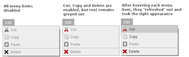
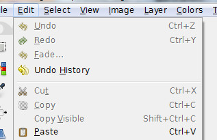
I know that I’m pushing a little bit too much on questions, but I use a menu bar and I want to have an menu that has some menu items disabled until some actions enable them, I’ve easly done that with the disable property and it works good, from the behaviour perpective, but graphically the menu items don’t change their appearance when they are disabled. I’ve tried using the :disabled in styiling but with no avail. Can you help in this one, I want to make the menu items look like this edit menu disabled items from gimp:
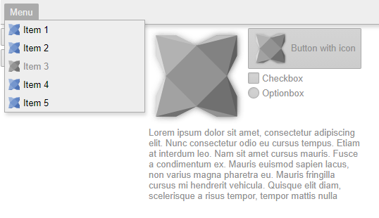
Ok, so yeah, actually, disabled images / labels would always show as “normal” (no styles setup for them) - ive added these styles now to haxeui-core and also added a new “grayscale” filter, so now images should also show as greyed if disabled:
The filter is only implemented on haxeui-html5 & haxeui-openfl currently (because it was easy) ill add it to the other backends as and when, but for now, disabled components (including menu items) should look more… … … … disabled.
haxeui-html5:
haxeui-openfl:
You’ll need latest haxeui-core and haxeui-openfl.
Cheers,
Ian
PS: can you paste me the xml of your dialog? I thought i tested that scenario… but maybe i got it wrong in my tests…
OK, so those issues should be fixed now (the menu item and the dialog footer)… Also, you shouldnt need your .dialog style anymore… ive thought about it, and actually, there is no reason to start off dialogs as 300px, the default behaviour of “fit to contents” makes more sense.
I think the reason i did it was for the message boxes (which are ofc also dialogs) but actually, i can style them independently, so those will have an initial width of 300px and not all dialogs.
Yes, I confirm, all the tests that I’ve done on this are working great! I believe that it is a good choice to leave the general dialog use with autosizing and styling only the message boxes. Thanks!
Good to hear, btw, it seems you are doing work on internationalization support, this is something im thinking about incorporating into the core framework, i was going to use this PR as a base: https://github.com/haxeui/haxeui-core/pull/152 (with some modifications as this is no longer mergable and i want to change some things).
Out of interest, what type of internationalization do you use / require. Its always good to have a general test case to work against - that PR seems to cover alot of good points, but it’d be good to have another opinion.


 ). Thanks.
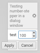

 Works great!