Does the text attribute do anything for progress bars? I had assumed that it would put the text in front of the progress bar, but it doesn’t seem to do anything. Sorry if I’m using it wrong.
<progress pos=“25”/ text=“STR” />
Also, I was curious if there was a way to make a button stay toggled off dependent on a variable, disabling the option unless certain circumstances are met. I know there’s a toggle attribute, but that seems to allow the user to untoggle at will.
So yeah, the .text attribute doesnt do anything on a progress bar… i do have an item on the list to make it do something, but its fairly low priority at the moment.
as for your second question, i was hoping something like:
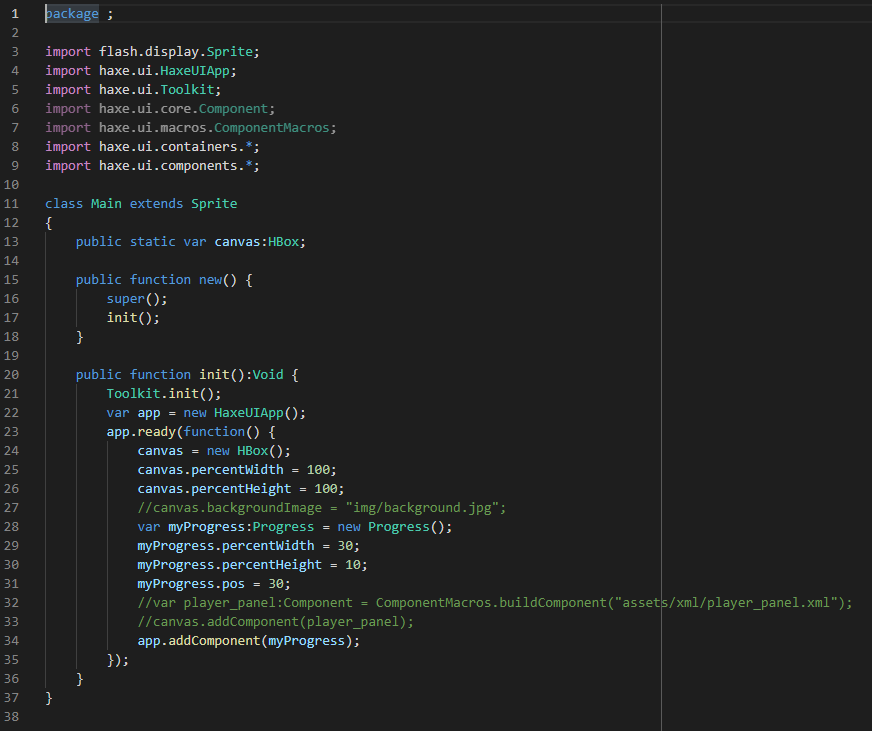
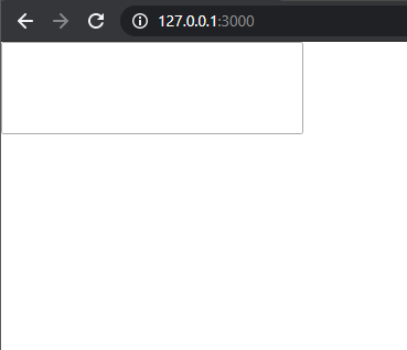
I am using the OpenFL backend. Also, this is completely unrelated, but when I set the pos attribute via Haxe code on a progress bar, it doesn’t seem to work for me. The bar is missing. It works in xml though, so I don’t know what’s up with that.
and I end up with this:
where the bar doesn’t show up.
It works if I set the pos in an xml first, and then set it via code afterwards.
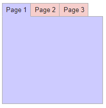
Not sure if I should ask this in another thread, but is there a way to recolor tabs (the tab itself, background-color sets the tab page color) and said progress bar? I tried setting the color attribute but it didn’t do anything.
Ok, so the issue in your code is you must use either “HorizontalProgress” or “VerticalProgress”… the “Progress” class a base class that contains shared functionality for both, but doesnt actually display anything correctly, in xml the macros figure that out based on the “direction” attribute (which defaults to “horizontal”). Ive been meaning to maybe issue a warning if you tried to create this class directly.
A haxe abstract class would be perfect, but thats only just available in haxe 4.2.
As for your tabview question, im not sure i understand… do you mean the actual tab buttons? If so, then yeah, everything in haxeui is styleable , eg:
 , eg:
, eg: