Scoped CSS has recently been added to HaxeUI.
This basically means any component can optionally have its own style sheet, and it (and its children) will use that style sheet as well as the global one. This isnt really a css3 type feature, but rather something specific to HaxeUI that i think could be useful in a number of cases. The best way to explain it is to just show an example (runnable here: http://haxeui.org/builder/?wktfyb).
<vbox style="padding: 5px;">
    <style scope="local">
    .button {
        color: red;
    }
    </style>
    <button text="Im Red" />
    <vbox>
        <style scope="local">
        .button {
            color: blue;
        }
        </style>
        <button text="Im Blue" />
        <vbox>
            <style scope="local">
            .button {
                color: green;
            }
            </style>
            <button text="Im Green" />
        </vbox>
        <button text="Im still Blue" />
    </vbox>
    <button text="Im still Red" />
</vbox>
And the result:
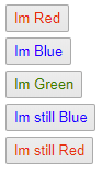
Previous to this change, all the buttons would have been green, prior to this change the result (ie, all green buttons) would have been technically correct from css perspective - but i think this change can be pretty useful in a number of cases - its worth mentioning that there are certainly other ways to achieve the same result with “standard css” but this scoped css keeps things tidy i think.
You can of course also use this from code (its all the haxeui macros do with the xml essentially):
myComponent.styleSheet = new StyleSheet();
myComponent.styleSheet.parse("...")
On a side note, ive created a new “New Features” category in this forum, which ill be adding little things like this to overtime. I doubt ill add every single new feature, but some of the more interesting ones will probably appear in this category.
Cheers,
Ian