If add component2 in component1, I only see the first letter “L”, I assume it resized my label to minimum size (50x50?).
I was expecting to see it full width and the label to resize (and line break) if too long when I resize the window…
What does I miss ?
Yeah, thats not right, for sure, your assumption is correct and certainly used to work, ill see if a regression.
EDIT: actually, think i might know whats going on here. Are you using custom components? If so your custom component class is essentially a wrapper around whatever is in the xml, so if you have:
@:build(haxe.ui.macros.ComponentMacros.build(...))
class MyComponent extends Box {
}
Then, in reality, you have another “box” around your “vbox”, and that is autosized (which doesnt play with % widths). If this is your case, then there are a few options:
size the instance of MyComponent: myComponentIntance.percentWidth = 100
size the instance in the constructor: this.percentWidth = 100
Thats fair, but there isnt really a way around it. You need that “wrapper” component to be your actual class. I would probably add that using the build macro and a custom component you get alot of features, and its certainly the way i advise writing an application of any complexity. See: https://github.com/haxeui/haxeui-guides/blob/master/custom-components.md
Heres a (very) quick overview though (keep in mind that im just mixing and matching things to show the features):
Then you could have something like this in a class:
@:build(haxe.ui.macros.ComponentMacros.build("assets/myview.xml"))
class MyView extends Box {
    public function new() {
        super();
    }

    @:bind(label1.text) var label1Text:String; // can bind vars to component props
    @:bind(slider1.pos) var slider1Pos:Float = 50; // can set initial values for bound props

    @:bind(button1, MouseEvent.CLICK) // can bind component events to functions
    function onReset(e) {
        label1Text = "Reset!";
        slider1.pos = 0; // all components with an id become correctly typed member vars of the class
    }

    @:bind(slider1, UIEvent.CHANGE)
    function onSlider(e) {
        label1Text = "pos is: " + slider1Pos;
    }
}
This is obviously a small example, but this type of custom component / view becomes invaluable for a project of any size. Of course, its up to you if you want to use it or not
Cheers,
Ian
PS: ive also added a small update to haxeui-core that now copies certainly properties from the root component of the xml to the wrapper component, meaning you dont now need to manually do the “percentWidth” stuff. If you have “100%” in your xml, then the wrapper will have percentWidth=100 automatically set.
test Case 1 :
not a single percentW/H on any layout nor component
Expected:
a window narrowed to the content of the view
Result:
a window as the smallest possible with almost nothing visible
Test Case 2
percentW/H at 100% on my main container
Expected:
a window almost full screen
Result:
a window at a default size (?) + my subview the smallest possible with almost nothing visible
Test Case 3:
percentH/W to 100% every where
Expected:
a window almost full screen
Result:
a window at a default size (?) + my subview visible
Test Case 4:
fixed h/w on my main view + percentH/W to 100% everywhere sle
Expected:
a window of HxW and all my subview visibles
Result:
a window of HxW and all my subview visibles
so
1/ what is the default size of the main window ?
2/ percentH/W is the percent of the parent or the child ?
3/ how do I make a container with a size based on its content ?
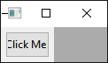
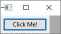
So i think something is defo up there. Im going to create a minimal example to try and understand it, but i wouldnt expect it to be such a small size (it should have been the size of the button + 5px padding)
OK, it was a bug ive introduced! Ill fix it now (once i fully understand it), but removing the “bad” code i get:
When i remove the explicit sizing of the button (which isnt recommended, esp. for native platforms), i get:
Note, there is still some “dark grey” parts, this is because wxWidgets (well, windows really) has a minimum window size it will create - yours may look different.
Anyways, let me fix this bug i added a few days ago
Ok, i think all of your scenarios work now, assuming im understanding them. Ive also added a new haxeui-hxwidgets property: haxe.ui.hxwidgets.frame.maximized, which as you would expect, maximizes the top level window on start up (not sure if thats a thing on osx though!)
Here is a break down of the properties btw:
haxe.ui.hxwidgets.frame.fit=boolean will reszie the top level frame to the contents of the UI (this should be fixed now, see above).
haxe.ui.hxwidgets.frame.title=string just the title of the frame, you dont have to set it here, but its an easy way.
haxe.ui.hxwidgets.frame.width=number the default width of the main frame (800 if not set), note, this property is ignored if haxe.ui.hxwidgets.frame.fit=true
haxe.ui.hxwidgets.frame.height=number the default height of the main frame (600 if not set), note, this property is ignored if haxe.ui.hxwidgets.frame.fit=true
haxe.ui.hxwidgets.frame.left=number the position of frame (x axis) defaults to center screen
haxe.ui.hxwidgets.frame.top=number the position of frame (y axis) defaults to center screen
haxe.ui.hxwidgets.frame.maximized=boolean whether to start the frame is a maximized state
Note: to get haxe.ui.hxwidgets.frame.maximized property working you need git versions of hxWidgets and haxeui-hxwidgets.