Howdy,
So HaxeUI v1.2 is finally here, ive been putting it off and putting off trying to cram as much as i can inside it, at this point though i think i just need to put it out into the wild! Warning this will likely be a HUGE post as there are a few things to mention, but they’ll be lots of pretty pictures, so that will hopefully take the edge off! 
Haxe 4.2
So the first thing, which is really the main reason to get this release out, is that HaxeUI now works with Haxe 4.2. In reality the git branches (which i suspect a lot of people are using) had always been working with 4.2, however, the version in haxelib (1.1.3) does break with 4.2 (as i found out here: https://github.com/haxeui/haxeui-core/issues/377). As i mentioned this is one of the main reasons to stop procrastinating and get this release out - so that the haxelib version will "just work" (as it should). Its worth noting that ive also fixed the deprecation warnings that would be given out on 4.2.Dark Theme
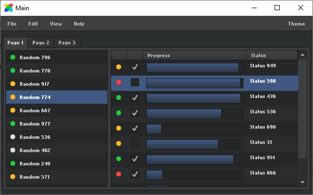
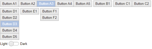
One of the more fun and visual aspects of v1.2 is the addition of the core dark theme (creatively named "dark"), this theme is parented by the default theme and, with the exception of the colours, looks and feels pretty much like the default theme, heres the dark and light (default) theme: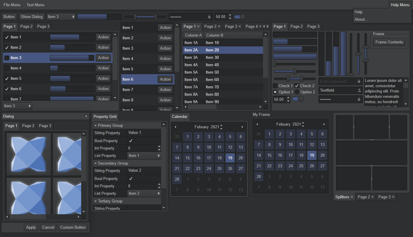
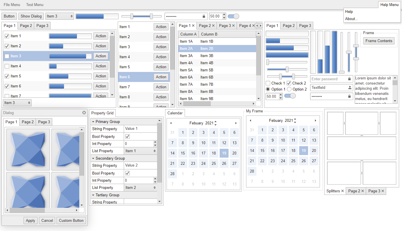
Using this theme (and indeed any theme) is as simple as: Toolkit.theme = "dark" before you init() the toolkit.
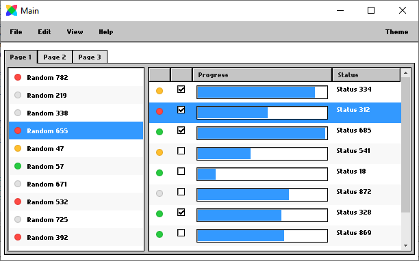
Those with a keen eye may have noticed, there have been quite a few visual changes and tweaks to both themes (namely menus, tab bars, sliders and tableviews). The new menu style i especially like as i feel it makes them “pop” more and look, well, more like menus:
Haxeui-flixel Default Theme
Whilst talking about themes, haxeui-flixel used to come with its own “special” extension of the default theme, a sort of bitmap / win95 esque theme based on flixel-ui. This theme is still there inside haxeui-flixel, however, it isnt an extension of the default theme now. This means that haxeui-flixel now uses the default theme (as default, not modified) initially. This also means haxeui-flixel users can also benefit from dark theme (which was the main driving force for this change). If you want / like the old default theme, fret not! Its still there embedded inside haxeui-flixel but under a new “flixel-ui” name, so it can be used via: Toolkit.theme = "flixel-ui" (like an other theme).
Heres some flixel screens of all three themes for comparison:
Note: im considering moving the flixel-ui theme into a separate module so that a) if you dont want to use it in a flixel app then its not taking up space and b) so that other backends can use it it (much like the kenney-ui theme)
TableView
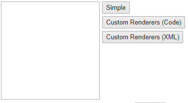
TableView had a fair amount of love put into it. As well as the previously mentioned style tweaks it also got some updates / fixes with regard to item renderers that change - meaning that you can dump your current set of renderers and “start again”. This is useful for reuse if your current set of renderers no longer make sense (think a database table editor / viewer):
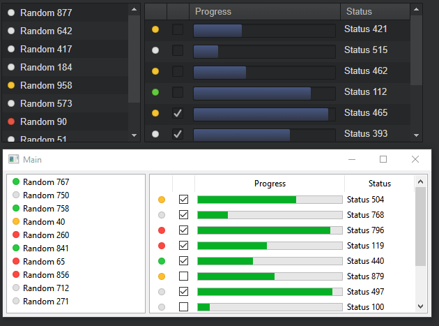
The haxeui composite TableView also has a native counter part finally (based on wxDataViewListCtrl). This is an on going effort but should be useable in its current state (haxeui-html5 shown at the top, 100% native haxeui-hxwidgets beneath):
Implementing this meant alot of additions to the hxWidgets lib, so if you are using hxWidgets without haxeui, then you get access to all of these goodies too (though obviously without all the haxeui parts)
Dialog Enhancements
Dialogs have had some tweaks too, the most important being that by default now they autosize. Previously they would have had an initial width of 300px - this could be changed in various ways, but it was not easy to say to a dialog "be as big as your contents" as it would ignore auto size styles. This is now the default (although you can of course still set a fixed size in code or using styles). Message boxes for example still start with an initial 300px width. The gif below is showing an autosized list in an autosized dialog, so as items are added to the list, the list grows (and never scrolls) and so the dialog also grows with the list (you may also notice that the dialog auto centers itself when it grows - this is a default setting for the dialog that can be turned off)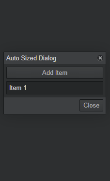
Size Constraints
Speaking of things growing another nice “little” feature is the use of min/max width/height. These have been in there for ages, but work a little better now (the sizes are constrained at a different point which makes it more reliable), however, one thing that has been added is the ability to constrain by %, this essentially means that the max, for example height, can be a % of the parent. This may initially not sound that useful, but it opens up interesting possibilities like below:
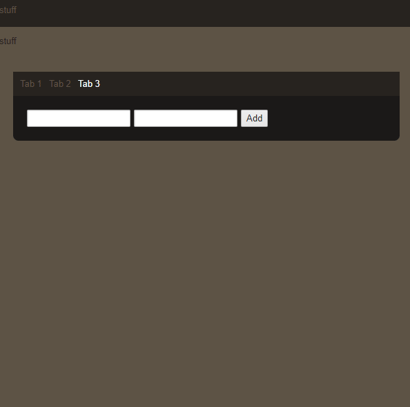
Here the container of the scrollview has a max-height of 100%, that means its happy to grow up until it fills its parent and then its “done” growing, however, the scrollview contents will continue to grow and a scrollbar will appear as required… It may not seem like too much of a big deal, but its a nice feature that can really add to the professionality of an application whilst not having to have the app developer measure things themselves!
New subsystem: Tooltips
HaxeUI now has tooltips! Tooltips can be really useful to display little bits of information to the user about what a certain button (or any component) does. HaxeUI now supports these by using the tooltip property. The tooltips are built off of ItemRenderers, which means you can get very creative, the default tooltip item renderer is just a label, so by default only displays a string (which is all you need for most use cases), however, you can setup more complex tooltip data and renderers similar to:
var renderer:ItemRenderer = ComponentMacros.buildComponent("assets/tooltip1.xml");
ToolTipManager.instance.registerTooltip(someComponent, {
    tipData: {
        icon: "haxeui-core/styles/default/haxeui.png",
        title: "title 3",
        text: "This is multiline\nLine1\nLine2\nLine3\n\nFin.",
        footer: "some footer text 3"
    },
    renderer: renderer
});
where the xml might be:
<item-renderer>
    <hbox>
        <image id="icon" />
        <vbox>
            <label id="title" style="color: #000000; font-bold: true; font-size: 18px; font-underline:true;" />
            <label id="text" style="color: #444444" />
            <label id="footer" style="color: #aaaaaa; font-italic:true;font-size:12px;" />
        </vbox>
    </hbox>
</item-renderer>
Note that currently for non-default tooltip renderers you have to set them up in code (as above). Im thinking of a way round this for xml based UIs, but havent come up with anything clean just yet.
Its probably worth noting that the tooltips will reposition themselves to make sure they fit onscreen:
And that, like everything else in HaxeUI, tooltips are fully style able so you can get very creative, or give your users epileptic fits 
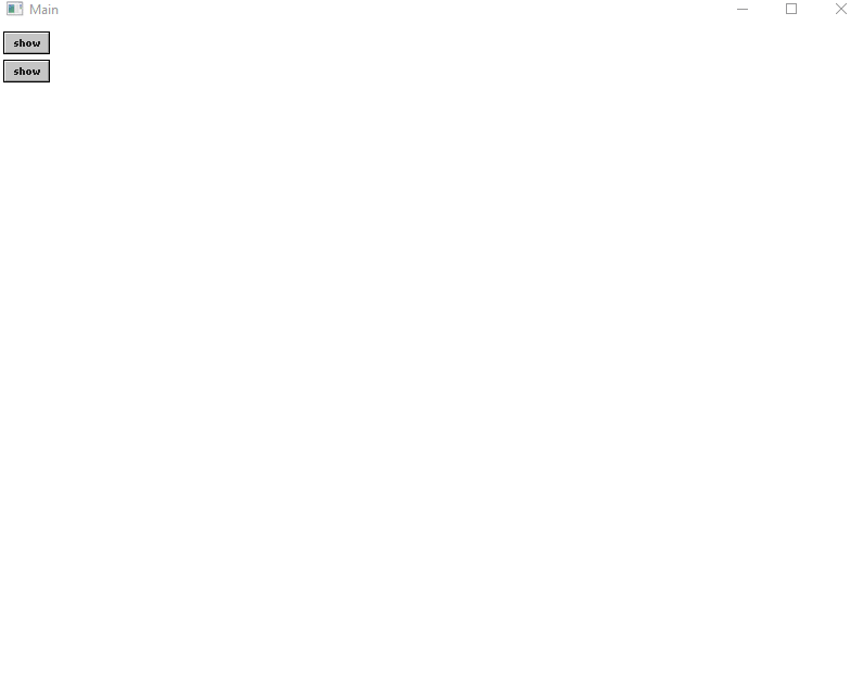
New subsystem: Drag Manager
This system is really in its infancy at the moment, but adding “draggable” to any component should allow it to be dragged and dropped, there are plans for extending this further at a later date - for now its used internally by the dialogs (which are now draggable by default);
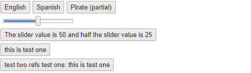
New subsystem: Internationalization
So this is another big one! HaxeUI now comes with support for internationalization, that is, the ability for strings (and other things) to be replaced at run time based on language preferences. The setup is fairly straight forward. You create a module.xml in your project with something like the following:
<module>
    <resources>
        <resource path="/assets/locale" prefix="locale" />
    </resources>

    <locales path="locale/">
        <locale id="en" resource="locale/en.properties" />
        <locale id="en_pt" resource="locale/en_pt.properties" />
        <locale id="es" resource="locale/es.properties" />
    </locales>
</module>
note: each <locale> node can also contain many <resource> nodes for multiple files. The resource files are just name value pairs, similar to:
SLIDER_VALUE_STRING=The slider value is {0}
SLIDER_VALUE_STRING_HALF=half the slider value is {0}
AND=and
TEST1=this is test one
TEST2=test two refs test one: {{TEST1}}
Then to use the strings, you simply use {{ and }}. You can use multiple strings in each property and can pass parameters to them, as well as reference them inside each other. For example:
<slider id="slider1" pos="50" precision="0" />
<button text="{{SLIDER_VALUE_STRING, slider1.pos}} {{AND}} {{SLIDER_VALUE_STRING_HALF, Math.round(slider1.pos / 2)}}" />
<button text="{{TEST1}}" />
<button text="{{TEST2}}" />
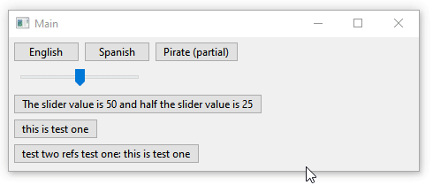
Change the language is a simple as: LocaleManager.instance.language = "es"; (note that HaxeUI will attempt to detect the system language initially)
Its certainly worth mentioning that this is not an xml feature, this works also if you are using haxeui from code: myButton.text = "{{somestring}}"
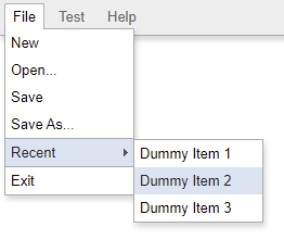
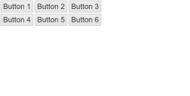
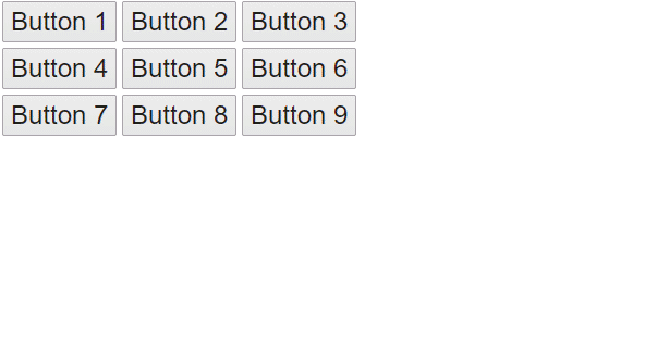
New Component: ButtonBar
A button bar was added to core, which is, quite simply a bar of either vertical or horizontal toggle buttons (though they are styled slightly different to make them look a little nicer). This is useful for options like “current tool” (i know at least one project that has benefitted from it). Its all quite simple:
<button-bar selectedIndex="3" direction="vertical" onchange="trace(this.selectedIndex)">
    <button text="Button 1" />
    <button text="Button 2" />
    <button text="Button 3" />
</button-bar>
Other notable mentions
There has been such alot in this release that its really hard to know what ive forgotten about! Lots and lots of bug fixes, thats for sure. One of the other things that comes to mind is that haxeui-heaps had some more love poured into it after a little… … feedback
It now no longer requires an “app” (though it does, for now at least, require a rootScene which is where it will put dialogs and such on) and as well as bunch of improvements to mouse handling and drawing.
Another is that using html text in labels is partially supported (it depends on the backend), flixel, openfl and (of course) html5 support them - it will also try to auto detect the content type. More style borders (following css’s border styles) are also supported in haxeui-html5 and haxeui-openfl (and maybe other backends soon)
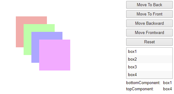
Some util functions were added too like “moveToBack” and “bringFrontward”… they dont do anything clever but can save you writing code unnecessarily:
Im 100% sure there are alot of other things im forgetting about, but this post is already HUGE so better to bring it to some type of close!
Thanks to everyone who has helped me with this release, from PRs to bugs to suggestions… I think its the most jam packed release i can remember for a while! I have some great ideas brewing for 1.3, though i think its going to be a less “visual” release
I now know of quite a few projects making use of haxeui, in very different and novel ways, which is great to see - some ill hopefully be able to share with everyone soon!
Enjoy 1.2 and, as always, drop me line if you have any issues or want to show something off!
Cheers,
Ian