So, here we are. Another long overdue HaxeUI release! This release comes with some new components (quite a few actually), some enhancements to older components, some new examples and, of course, a ton of bug fixes and QoL improvements. Lets dive in!
New Component: Canvas
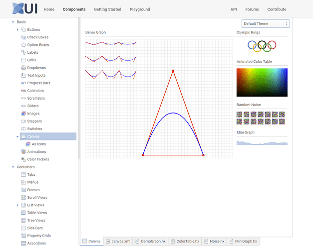
This is probably one of my favourite new components (and is actually the base of a few other new components). Its a cross platform, cross framework canvas implementation! Note that this is considered an experimental component currently (as are any components that use it).
Its quite simple really, the canvas component exposes a “componentGraphics” property, that itself is abstracted and implemented for each backend. This is usually a 1-to-1 mapping, although a few calls needed a little bit of “extra magic” to make them nice and useful. An example of one of those functions is “setPixels” which takes an RGBA byte array and, efficiently, sets the canvas pixels. This used in quite a few “canvas based” components, but also works quite nicely for little animated graphs and the such.
(The main “Demo Graph” in the screen - which is also animated - isnt using setPixels its using primitives like line, curve, etc. The “Animated Color Table”, “Random Noise” and “Mini Graph” are using setPixels)
Canvas can also be used as image resources (myImage.resource = myCanvas) which means you can use them very creatively (in item renderers for example).
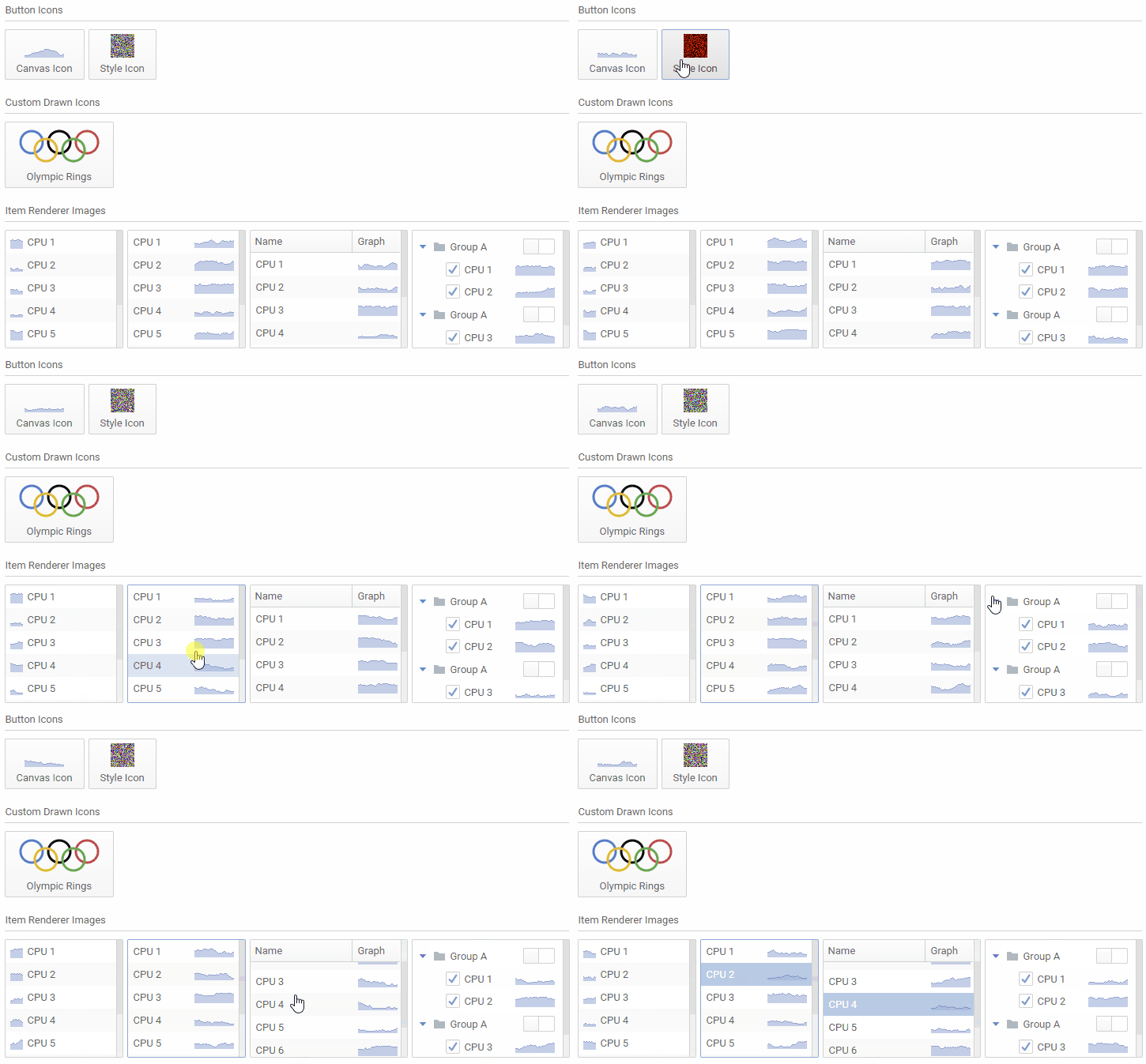
The source for this (and indeed all of the canvas examples) can be found in the explorer: http://haxeui.org/explorer/#basic/canvas
New Component: Animation
One of the more simple components based off of the new canvas is the “Animation” component.
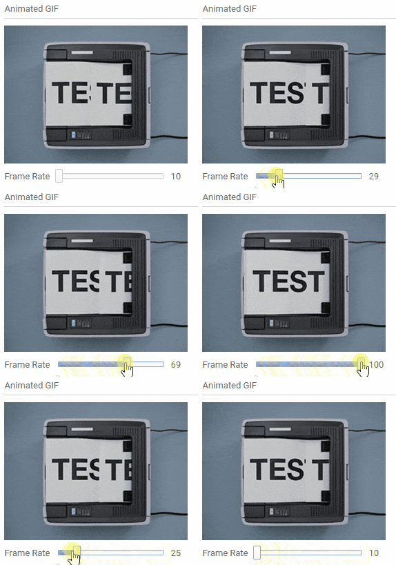
This basically takes an animated gif, decodes it (via the format haxelib - so that needs to be included for it to function) and then simply takes the pixels and paints them onto the canvas. Currently this only supports animated gifs, but the implementation is fairly flexible leaving room for additional formats down the line (like APNG for example).
Now, haxeui-html5 specifically already supports animated gifs (and animated pngs for that matter) since it uses the browsers native rendering capabilities. However, this animation component brings gif decoding and rendering to all backends that support canvas. Plus, its was a pretty good test bed for canvas, and actually, getting to work correctly (and efficiently) helped immensely in making things like setPixels work well (for things like haxeui-heaps and haxeui-raylib)
An example of the animation component rendering an animated gif can be found here: http://haxeui.org/explorer/#basic/animations
New Component: Color Picker
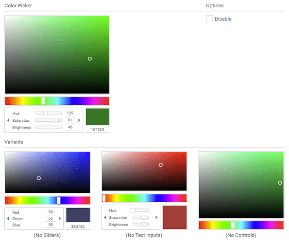
The color picker was certainly one of the bigger canvas based components, and took a fair amount of time to get right.
Outwardly this is a pretty simple component, but internally there is a lot going on (like conversions between color spaces, drawing the saturation/value graph and the hue graph - both of them being canvases of course).
This component can also be used as a popup (ColorPickerPopup):
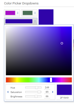
Examples of color pickers can be found here: http://haxeui.org/explorer/#basic/color_pickers
New Example App: Simple Paint
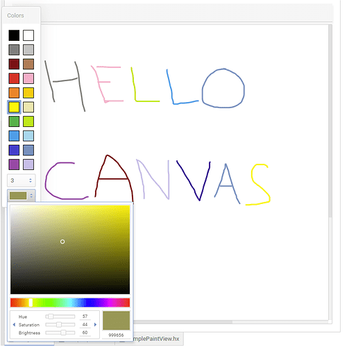
The color picker is actually quite a nice segway in a new component explorer example: Simple Paint.
As you might gather this is a very simple “paint” application example. It shows a few different things (mainly revolving around the canvas). Im going to write more of these “mini applications” in the future as i think they are a pretty great way to show how things all fit together. These “application examples” are not meant to be full featured applications, but are there to simply show a number of components / systems working together in a more interesting environment.
Simple Paint can be found here: http://haxeui.org/explorer/#examples/simple_paint
New Example App: Todos
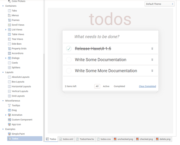
Another example that falls into this “application example” category is the “Todo” example:
This application is modelled after the ubiquitous “TodoMVC” example, however, in this example its NOT supposed to show off any type of MVC framework inside HaxeUI. The purpose of this example is to “look and feel” like TodoMVC using as little code as possible, by utilizing many of HaxeUI’s inbuilt features.
Todos can be found here: http://haxeui.org/explorer/#examples/todos
Enhancement: Buttons can have item renderers
Before this change, the only thing a button could contain was an optional icon and / or label. For the most part, this was fine, however, sometimes you might want much richer content in your buttons. A good example of this is for dropdowns (which are just buttons): You might have a really rich item renderer in the popup listvew, but once an item was selected the only thing you could show in that dropdown button was 1 icon and 1 label. This isnt the case anymore:
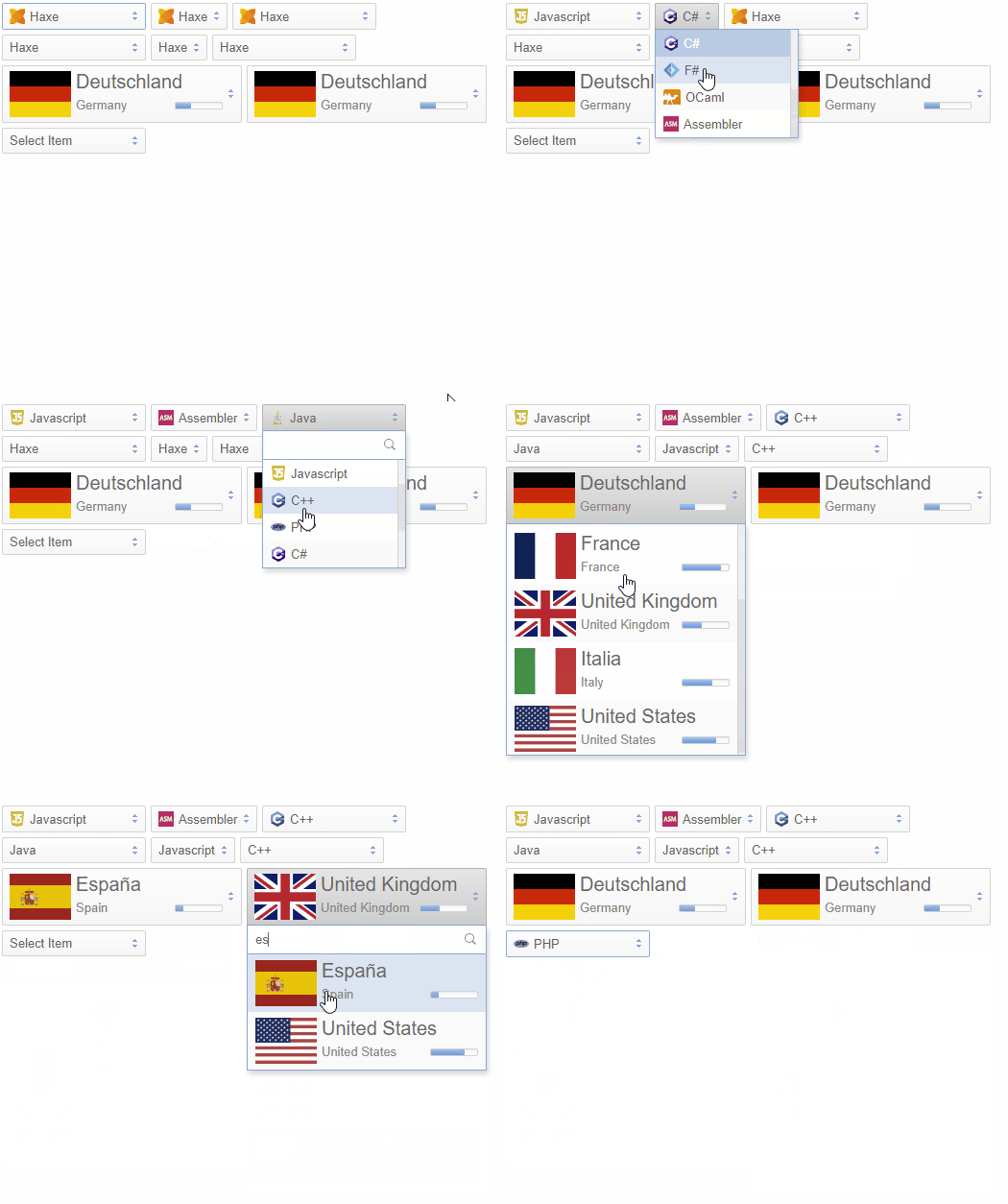
Now when you specify an item renderer for the listview in a dropdown, it also gets applied to the button (you can actually even have separate item renderers for the listview and the button!)
And of course, since this is just a button this applies to all buttons.
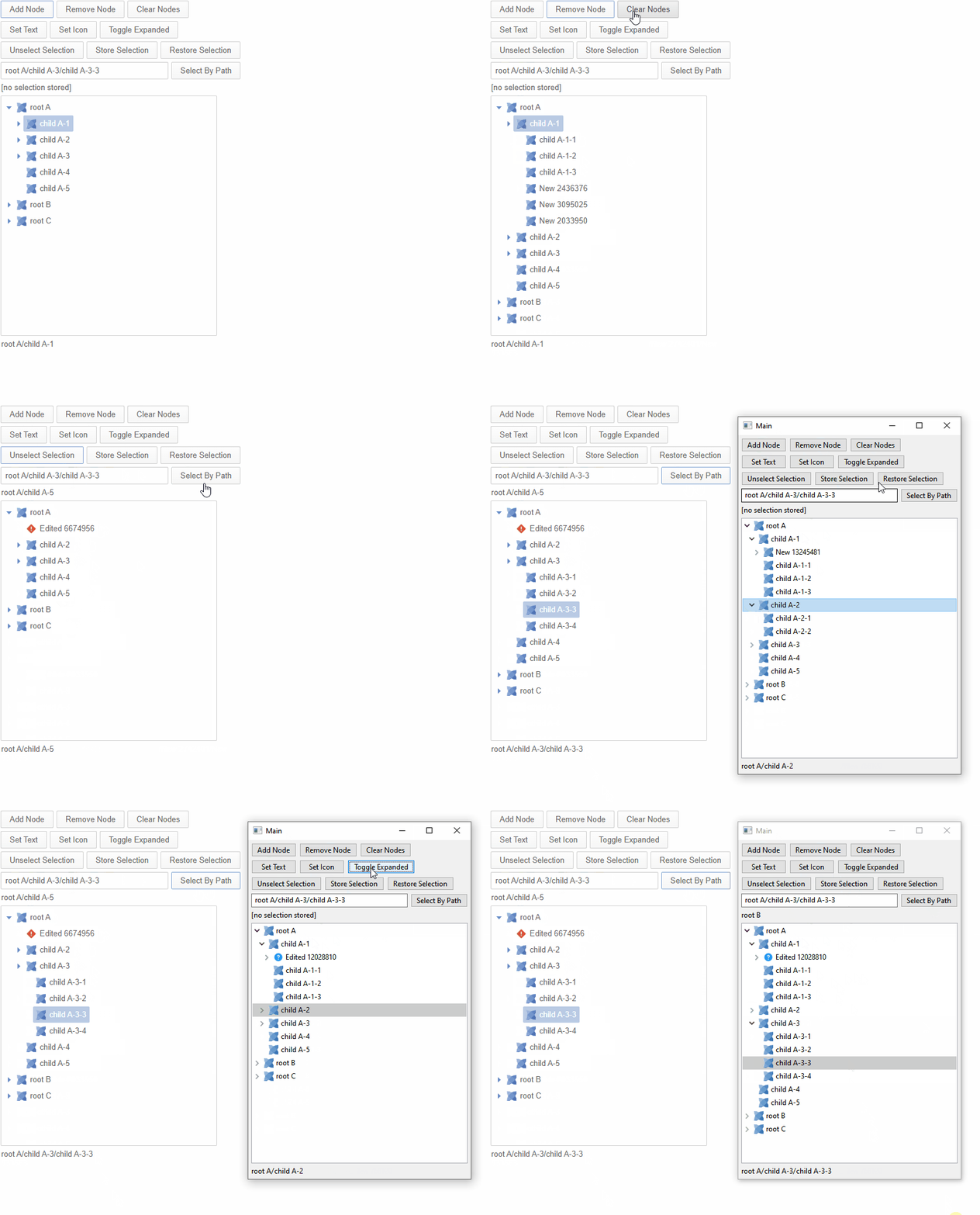
Native Counterpart: Treeview
Although the treeview is still experimental, its becoming less so. One important part of that transition is to “behaviourize” the existing composite implementation opening it up to native counterparts. This has been done now, and finally haxeui-hxwidgets has a full native treeview component! ![]()
New Example: Animations (again!)
This is another example in the explorer called animations but, this isnt the component “animaton” this is about CSS animations. CSS animations can be a little tricky (and certainly, at in my opiniona bit of a chore), so with that in mind Ive created two new examples to show how better to use them:
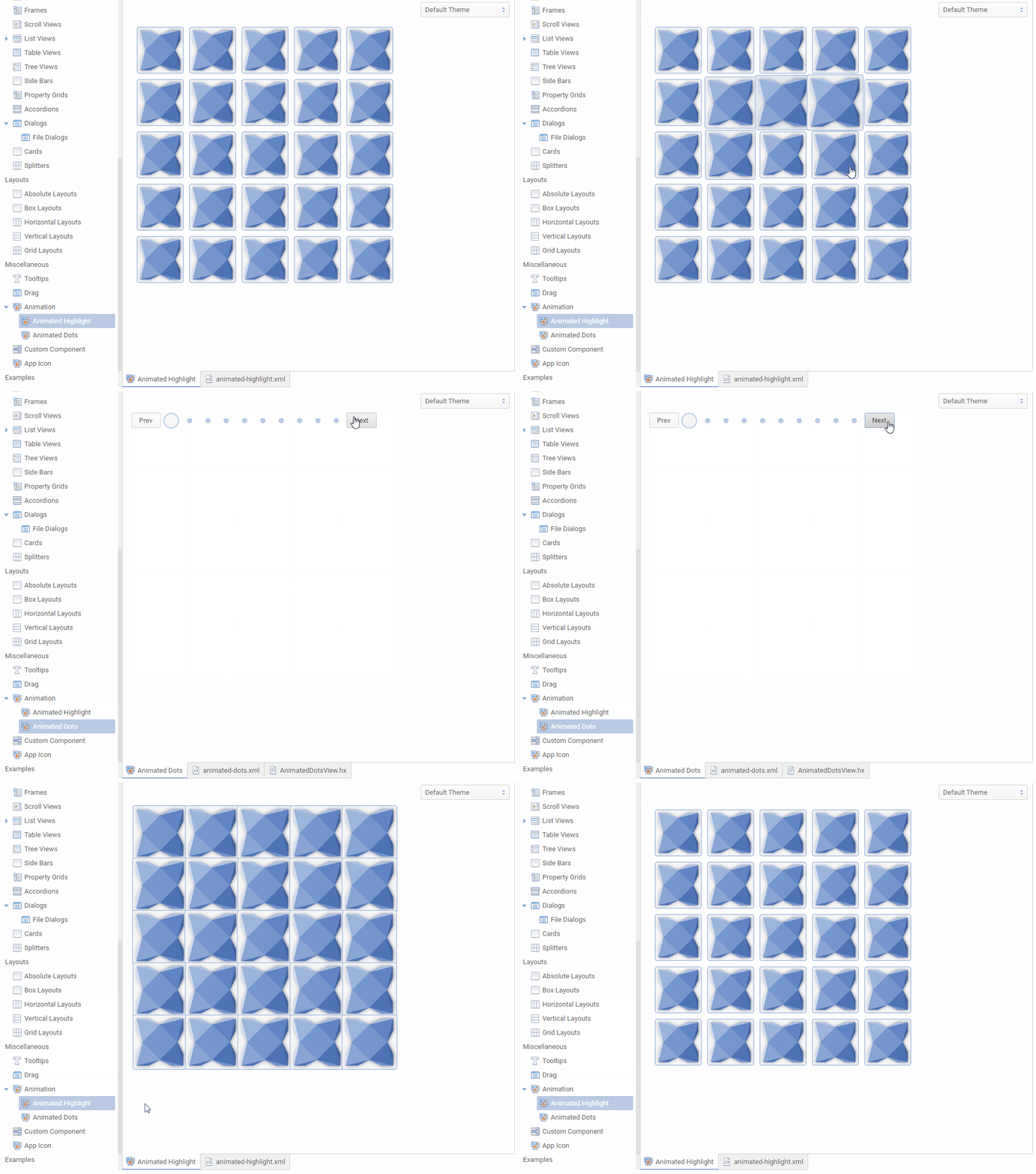
That being said, i still think css animations are less that ideal often, so there is a new sub system called “AnimationTools” which can be used as a static extension to perform some simple (and common) animations. You can also, of course, create your own, and not using css this time, but using keyframes… its a sort of “Interpolated Timeline”:
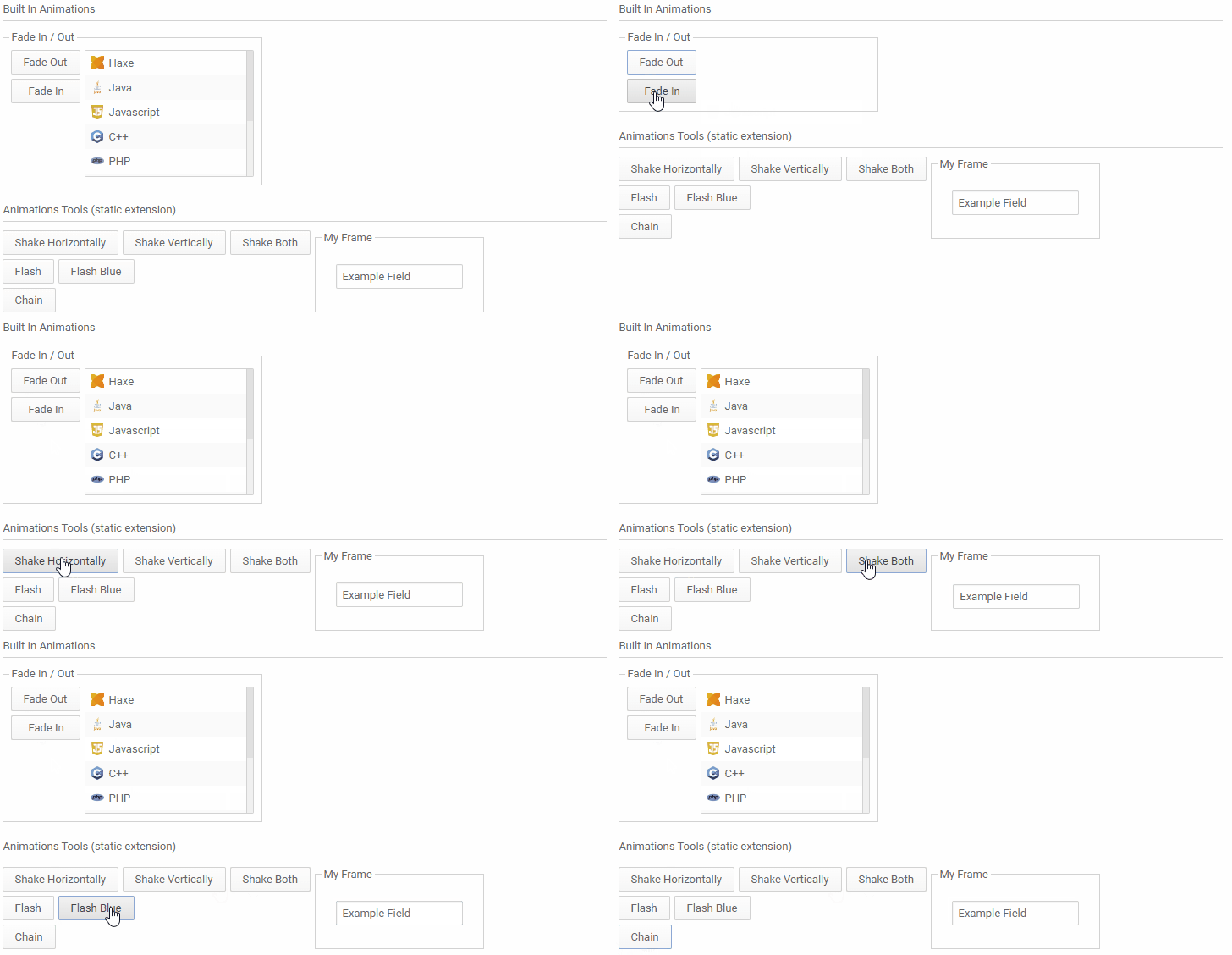
once you are using the static extension (with using haxe.ui.animation.AnimationTools) its as simple as target.shake(); or target.shake().shake("vertical").flash();.
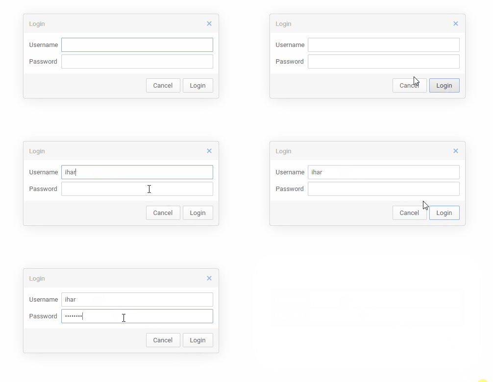
A good example of where you might want to use these is in the dialogs example:
New Feature: Setting the app title / icon dynamically
You’ve always be able to set the app title dynamically with HaxeUIApp.instance.title, however, now you can do the same with HaxeUIApp.instance.icon. This can lead to some pretty nice features, like animated app icons (as well as task bar icons):
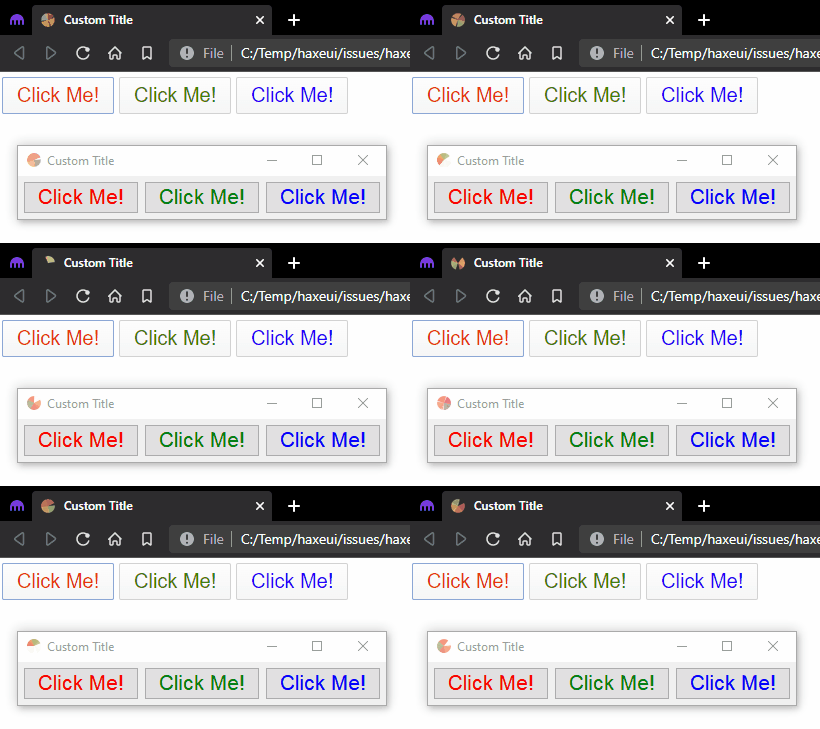

New CSS function: lookup
This is a really simple, but really poweful css function that has been added: lookup.
All this does really is allows you to create dynamic entries in a global map, that can be used later in style sheets. A good example of how powerful this can be is if you wanted to “lookup” canvases and use them in styles for different states of a button:
        var noise = new Noise();
        noise.width = 30;
        noise.height = 30;

        var redNoise = new Noise();
        redNoise.onlyReds = true;
        redNoise.width = 30;
        redNoise.height = 30;

        var greenNoise = new Noise();
        greenNoise.onlyGreens = true;
        greenNoise.width = 30;
        greenNoise.height = 30;

        // so we can use them in css "lookups"
        StyleLookupMap.instance.set("noise", noise);
        StyleLookupMap.instance.set("red-noise", redNoise);
        StyleLookupMap.instance.set("green-noise", greenNoise);
        #button2 {
            icon: lookup("noise");
        }
        #button2:hover {
            icon: lookup("red-noise");
        }
        #button2:down {
            icon: lookup("green-noise");
        }

Notable Mentions
So we are basically at the end of this release (congrats if you made if this far!) but there are a few other things that are worth mentioning:
- You may have already noticed but the explorer can now use URLs to navigate to a specific example (it will also remember the last selection on a refresh)
- Bunch of new locale strings, date and decimal formats (thanks for the PRs!)
- Scrollview::ensureVisible has been rewritten and now works much nicer.
- Style data can now be directly embedded into modules
- A load of focus enhancements
- Some new defines that can help debug certain things when they go wrong:
module_resolution_verbose,classpath_scan_verbose,resource_resolution_verbose,haxeui_schema_debug - Buttons can now be grouped (without using a buttonbar) but using
.componentGroup - ShaharMS added more docs (thanks ShaharMS!)
- A bunch of improvements that make conversion betwen xml and haxe types better / more accurate
- Headers in property grids can now contain any additional children they want
- No need to add constructors in haxeui custom components anymore, the are added on demand
- A dropdown popup will now hide itself when the dropdown moves (like if a parent view is scrolled for example)
- Stack.nextPage() / Stack.prevPage()
- The “ImageLoader” will now follow http redirects (when using http/s of course)
- Components in a module can now also be in the classpath root (
<components package="." />) - Components can use
@:buildto build components from a path relative to the haxe class -
<script>sections in haxeui xml are automatically wrapped in<![CDATA[sections to avoid parsing issues with<and>
Finally
One final thing id like to mention: So I recently (a few months ago) got married! I wanted to shout out my new wife as being one of HaxeUI’s longest supporters! For making me a coffee every(ish) morning to kick start me, to listening to me talk about “boring canvas problem X”. Mrs Fiona Harrigan… thanks! ![]()
(amusingly she isnt actually HaxeUIs longest supporter, you guys know who you are, expect an engagement ring in the post if this doesnt work out! ![]() )
)
Thanks for reading all and, as always, drop me a line with anything you are working on.
Cheers!
Ian
