Hello! So heres the write up for the just released HaxeUI v1.6.0 
You can find the previous write up for v1.5.0 here if you missed it: https://community.haxeui.org/t/haxeui-v1-5-released
This release comes with a number of new systems, a few new components and other goodies and, of course, and ton bugfixes.
This is normally where I say “I’ll try and keep it brief”, and then proceed to write pages and pages, so lets just skip that. I’m likely to write a huge amount, but I hope its interesting and somewhat visually pleasing for the reader, lets jump in! 
New System: Windows
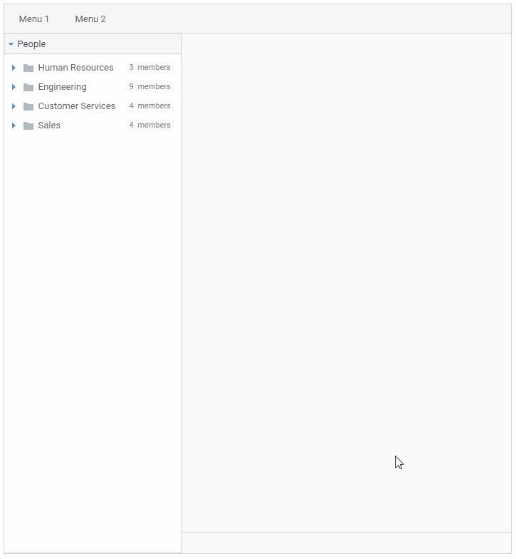
HaxeUI now comes with a windowing system! This can be very useful for MDI (multiple document interface) type applications. The outlying system is pretty simple, you create a window manager and use it to show a Window or Window derived classes, those window classes can be built in any other way HaxeUI components are built (ie, xml, code, etc). There are some simple examples of this on the component explorer: http://haxeui.org/explorer/#containers/windows
As well as a simple example of using multiple window managers: http://haxeui.org/explorer/#containers/windows/multiple_managers
And finally a new demo application that sort of shows how they might be used: http://haxeui.org/explorer/#examples/employee_app
New System: Validators
HaxeUI can now validate its components by use of Validators, these are small bits of code that get run when a component value changes, these can then validate the value and optionally apply css classes to the component (technically, you can do anything with the component, but for the most part using css classes to change the visual appearance is probably what most users want).
There are a few built in validators, and custom ones can be created (and registered in module.xml) or you can even create new ones from existing ones with preset parameters. Let take a look at how they work:
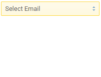
So the most basic use case would be something like validation of an email address. This is one of the built in ones, so we can just do:
<textfield validators="required, email" />
You’ll notice we are actually using two here, required and email, this means HaxeUI will run each of the validators one after each other. In the case of required it means the value has to be non-null / blank and in the case of email the value must match a regexp pattern for a valid email:
Its also possible to use an alternate style which means you can configure the properties of the validator, lets suppose we don’t want the text field to go green when we have a valid email address, well, we can just configure the validator not to do that:
<textfield>
    <validator type="required" />
    <validator type="email" applyValid="false" />
</textfield>
Using a module.xml we can actually create a predefined validator that extends and configures an existing validator for ease of use, for example, if you put the following in a module.xml:
<module>
    <validators>
        <validator id="email-no-success" class="haxe.ui.validators.EmailValidator" applyValid="false" />
    </validators>
</module>
Then we can just use this predefined validator as if it were any of the in built ones:
<textfield validators="required, email-no-success" />
(Of course you can create totally custom validator classes and use them also)
Note: you only need to register them in a module.xml if you want to use them from xml, otherwise you can just do myComponent.validators = [new EmailValidator()]
You can use validators on pretty much all components (that make sense), and the list of in built validators will grow over time.
You can see a little more about validators here: http://haxeui.org/explorer/#miscellaneous/validators as well examples of validators on some of the individual component pages
So that’s validators, but there is actually a whole validation system behind the scenes that you can hook into for more interesting validation handling.
New System: Validation Management (and Forms)
When a component has been validated, it dispatches events about the result, for example ValidationEvent.INVALID_DATA is dispatched when, you guessed it, the component data is invalid. This makes it easy to add custom error messages, or anything else you want to do.
But actually, HaxeUI goes one step further and introduces a new component: Form, this handles basic validation management for you, and means you can just worry about the form submission (once all its fields are valid):
<form columns="4" onSubmit="trace('submit');" onInvalidData="trace('there was a problem');">
    <label text="Username" verticalAlign="center" />
    <textfield id="username" validator="required" />

    <label text="Password" verticalAlign="center" />
    <textfield id="password" validator="required" />

    <label text="System" verticalAlign="center" />
    <dropdown text="Select System" id="system" width="100%" validator="required">
        <validator type="pattern" pattern="System A|System C" invalidMessage="System A or System C" />
        <data>
            <item text="System A" />
            <item text="System B" />
            <item text="System C" />
        </data>
    </dropdown>
</form>
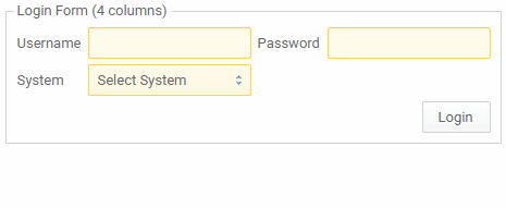
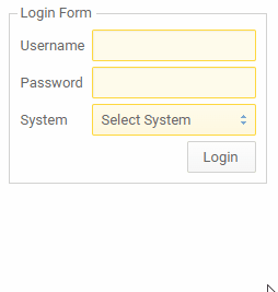
By default Form will shake and flash invalid fields, but of course, this can all be turned off. In fact, if you want to, you can handle the validation yourself in code and display error messages:
<frame text="Login Form">
    <vbox>
        <form id="form4">
            <label text="Username" style="margin-top: 6px;" />
            <vbox>
                <textfield id="username4" validator="required" />
                <label id="username4error" hidden="true" horizontalAlign="right" style="color: $error-border-color;font-size: 11px;" />
            </vbox>

            <label text="Password" style="margin-top: 6px;" />
            <vbox>
                <textfield id="password4" validator="required" />
                <label id="password4error" hidden="true" horizontalAlign="right" style="color: $error-border-color;font-size: 11px;" />
            </vbox>

            <label text="System" style="margin-top: 6px;" />
            <vbox width="100%">
                <dropdown text="Select System" id="system4" width="100%" validator="required">
                    <validator type="pattern" pattern="System A|System C" invalidMessage="System A or System C" applyValid="false" />
                    <data>
                        <item text="System A" />
                        <item text="System B" />
                        <item text="System C" />
                    </data>
                </dropdown>
                <label id="system4error" hidden="true" horizontalAlign="right" style="color: $error-border-color;font-size: 11px;" />
            </vbox>
        </form>
        <hbox horizontalAlign="right">
            <button text="Login" onclick="form4.submit()" />
        </hbox>
    </vbox>
</frame>
And then you can listen for the various events and respond to them appropriately, for example:
@:bind(form4, ValidatorEvent.INVALID_DATA)
private function onForm4InvalidData(event:ValidatorEvent) {
    if (form4.invalidFieldMessages.exists(username4)) {
        username4error.text = form4.invalidFieldMessages.get(username4).join("\n");
        username4error.show();
    }
    if (form4.invalidFieldMessages.exists(password4)) {
        password4error.text = form4.invalidFieldMessages.get(password4).join("\n");
        password4error.show();
    }
    if (form4.invalidFieldMessages.exists(system4)) {
        system4error.text = form4.invalidFieldMessages.get(system4).join("\n");
        system4error.show();
    }
}

@:bind(form4, UIEvent.SUBMIT_START)
private function onForm4SubmitStart(event:UIEvent) {
    username4error.hide();
    password4error.hide();
    system4error.hide();
}

@:bind(form4, UIEvent.SUBMIT)
private function onForm4Submit(event:UIEvent) {
    NotificationManager.instance.addNotification({
        title: "Form Submitted",
        body: "Login form submitted successfully!",
        type: NotificationType.Success
    });
}
More info can be found on the component explorer: http://haxeui.org/explorer/#containers/forms
Alright, that’s enough droning on about Validators / Validation! Lets move on!
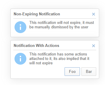
New System: Notifications
Quite often in an application you want to notify the user of some error, or warning, or simply some information. This is now possible in HaxeUI via the NotificationManager, usage couldn’t be simpler:
NotificationManager.instance.addNotification({
    title: "Basic Notification",
    body: "This is a the most basic notification, will will expire in 2 seconds"
});

There are additional options like being able to change the how long (in milliseconds) before the notification will expire (or -1 for never which means a user must dismiss it manually) as well as adding actions to the notification:
NotificationManager.instance.addNotification({
    title: "Non-Expiring Notification",
    body: "This notification will not expire, it must be manually dismissed by the user",
    expiryMs: -1
});

NotificationManager.instance.addNotification({
    title: "Notification With Actions",
    body: "This notification has some actions attached to it, its also implied that it will not expire",
    actions: ["Foo", "Bar"]
});
There are also different “flavours” of notifications, selected using “type”, for example:
NotificationManager.instance.addNotification({
    title: "Success Notification",
    body: "This notification has the success styling applied to it.",
    type: NotificationType.Success
});

And finally, of course, you can apply pretty much any styling you want to:
.notification.custom-notification {
    background-color: #fffbeb;
    border: 5px solid blue;
    border-radius: 20px;
    background: red green;
}

.notification.custom-notification #title {
    font-size: 18px;
    color: #ffff00;
}

.notification.custom-notification #body {
    color: white;
    font-style: italic;
}

.notification.custom-notification #notificationIcon {
    resource: haxeui-core/styles/default/haxeui_small.png;
}
NotificationManager.instance.addNotification({
    title: "Custom Styled Notification",
    body: "This notification has has been styled by css",
    styleNames: "custom-notification"
});

(for that web circa '90s feel )
More examples can be found in the component explorer: http://haxeui.org/explorer/#miscellaneous/notifications
Revamped System: Locale Strings
This a really interesting change, and actually one of my favourites, even though its not particularly visual.
Previously HaxeUI would handle locale strings as a set of name/value pairs in property files:
myString=something
You could then use them in components with something like <button text="{{myString}}" /> and HaxeUI would handle the rest. Now, this method is still completely supported and for a lot of translations and applications it is really all you would need. However, the new, revamped locale manager can be alot more complex.
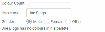
Locale strings can now use a sort of “mini language” and can be passed parameters that can totally change the string. Lets look at a simple example:
colors.count = {
    none: has no colours
    one: has one colour
    many: has [0] colours
}
Here we are changing the resulting string completely based on an input parameter ([0]), you may be wondering what “many” (or none, or one) mean, well, they actually come from the locale also:
none=[0]=0
one=[0]=1
many=[0]>1
These are effectively just short cuts, so really the actual local string would be:
colors.count = {
    [0]=0: has no colours
    [0]=1: has one colour
    [0]>1: has [0] colours
}
Originally I was just feeling around for a system that would work with plurals / masc / fem type changes, but thanks to the Haxe community (and its polyglot members) it became apparent quite fast that for some languages the rules are insanely complex. And, if a jobs worth doing, its worth doing well, so the complexity allowed in locale strings is high, lets look at a complex example:
colours.count=[1] {
    none: has no colours
    one: has one colour
    many: has [0] colours
} in {
    [2]=m: his
    [2]=f: her
    _: their
} palette
Using this string is pretty similar to the old method, except now you can also pass parameters to it:
<label text="{{colours.count, colourCount.value, username.text, gender.selectedOption.userData}}" />
Now, just to illustrate how complex things can be inside locales, here’s the Polish version:
colours.count=[1] {
    none: nie ma kolorów
    one: ma jeden kolor
    [0] in 11...14: [0] kolorów
    [0] mod 10 in 2...4: [0] kolory
    _: [0] kolorów
} w {
    [2]=m: jego
    [2]=f: jej
    _: swojej
} palecie
or the Welsh version:
colours.count= {
    none: Does
    _: Mae
} {
    none: dim lliwiau
    one: un lliw
    two: dau liw
    # technically not needed but show whats possible
    [0]=3|6: [0] lliw
    few: [0] lliw
    _: [0] o liwiau
} ym mhalet [1]
I want to take a moment to thank all the people who helped me here, I was (and still am) actually amazed at how complex something like plurals can be across languages. I mean, [0] mod 10 in 2...4, huh? How can people think at such speeds! 
Its worth mentioning that all of this is basically optional, the simple name / value pairs works exactly as it did before.
An example of locale strings can be found here: http://haxeui.org/explorer/#miscellaneous/locales
New System: Extensible Image Loaders
When loading an image in HaxeUI, it used to all be handled by one single class (ImageLoader), this has now been broken apart and loaders are called based on the prefix in the resource, these loaders are registered in a module.xml and HaxeUI comes with four out the box:
    <loaders>
        <image-loaders>
            <image-loader prefix="asset" class="haxe.ui.loaders.image.AssetImageLoader" default="true" singleInstance="true" />
            <image-loader prefix="file" class="haxe.ui.loaders.image.FileImageLoader" singleInstance="true" />
            <image-loader prefix="http" class="haxe.ui.loaders.image.HttpImageLoader" />
            <image-loader prefix="https" class="haxe.ui.loaders.image.HttpImageLoader" />
        </image-loaders>
    </loaders>
Apart from keeping things nice and tidy, this also allows HaxeUI users to rollout their own custom image loaders (should they wish to), as well as overriding HaxeUI’s internal ones. From the end users perspective this change has zero effect, everything effectively works exactly the same, its just much cleaner and much more extensible.
New Layout Property: justify-content
A new css layout property has been added: justify-content, currently there is only one layout that responds to this, its the continuous hbox layout:
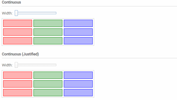
By adding justify-content: space-evenly to the components style we can tell the layout that it should add spacing between the items to keep them all justified. There is still a place for non justified content, but this is a welcomed addition that can go a long way to helping to create responsive layouts.
An example can be found here: http://haxeui.org/explorer/#layouts/horizontal_layouts
New Styling Options: TableView
Quite often in tables we want to style or format specific columns, although this was somewhat possible before, HaxeUI now makes it as easy as possible by firstly copying over relevant styles from the header (like text-align) and also add css classes to each column cell so it can be easily addressed by css:
/* Column B */
#tv1 .even .column-colB {
    background-color: #eeeeff;
}
#tv1 .odd .column-colB {
    background-color: #e0e0ff;
}

#tv1 .even:hover .column-colB {
    background-color: #ccccff;
}
#tv1 .odd:hover .column-colB {
    background-color: #c0c0ff;
}
#tv1 .column-colB:selected {
    background-color: #bbbbff;
}

/* Column C */
#tv1 .even .column-colC {
    background-color: #ffeeee;
}
#tv1 .odd .column-colC {
    background-color: #ffe0e0;
}

#tv1 .even .column-colC:hover {
    background-color: #ffcccc;
}
#tv1 .odd .column-colC:hover {
    background-color: #ffc0c0;
}
#tv1 .column-colC:selected {
    background-color: #ffbbbb;
}
    <tableview id="tv1" width="100%" height="200" contentWidth="100%">
        <header width="100%">
            <column id="colA" text="Column A" width="150" />
            <column id="colB" text="Column B" width="150" style="text-align:center;font-style:italic;color:blue" />
            <column id="colC" text="Column C" width="150" style="text-align:right;font-weight:bold;color:red" />
            <column id="colD" text="Column D" width="100%" />
        </header>

        <data>
            <item colA="A1" colB="B1" colC="C1" colD="D1" />
            <item colA="A2" colB="B2" colC="C2" colD="D2" />
            <item colA="A3" colB="B3" colC="C3" colD="D3" />
            <item colA="A4" colB="B4" colC="C4" colD="D4" />
            <item colA="A5" colB="B5" colC="C5" colD="D5" />
            <item colA="A6" colB="B6" colC="C6" colD="D6" />
            <item colA="A7" colB="B7" colC="C7" colD="D7" />
            <item colA="A8" colB="B8" colC="C8" colD="D8" />
            <item colA="A9" colB="B9" colC="C9" colD="D9" />
        </data>
    </tableview>
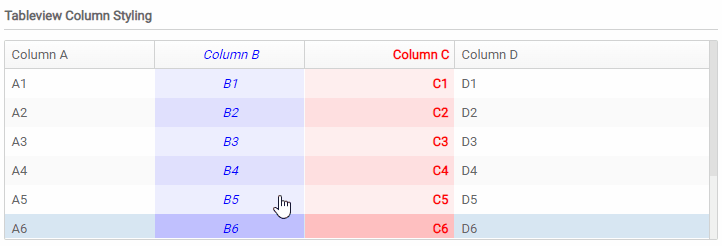
Example can be found here: http://haxeui.org/explorer/#containers/table_views/column_styling
Notable Mention: haxeui-kha rounded borders
Thanks to some help from Tizilogic (thanks!!!), haxeui-kha now supports rounded borders via SDF shaders! This is an initial implementation and will likely change over time, but the initial results were great, and it adds that little bit of polish to UIs:
We also finally have the elusive “round option box”…
Notable Mention: haxeui-heaps getting some love
Recently some haxeui-heaps users have taken it upon themselves to improve and fix some issues in haxeui-heaps. This has been great and so massively appreciated since a lot of the times, they were big changes. Although they may not be massively visual changes, they are reworks of haxeui-heaps internals which makes the backend simply work better within a heaps workflow - and who better to understand that work flow than heaps users! Thanks a bunch guys!
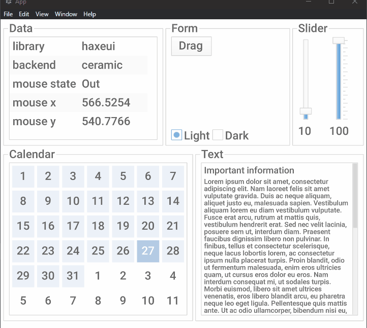
Notable Mention: haxeui-ceramic
Jarrio (aka NotBilly) has single handedly created a new backend for haxeui: haxeui-ceramic, using Jeremy’s awesome ceramic framework. This has been a really interesting backend to watch develop as i think its the first backend i had NOTHING to do with (in a coding sense), standing on the sidelines and watching Jarrio come to grips with the backend system has been interesting (and actually quite exciting!)
Im not 100% sure if the backend is considered “complete” yet, but once it is, and Jarrio is happy to do so, we can probably bring it into the HaxeUI backend family and release it with the other myriad of backends!
Other Notable Mentions:
There are a bunch of other little changes that probably aren’t worth their own sections, but are nice none-the-less, this is by no means an exhaustive list, but some top selections:
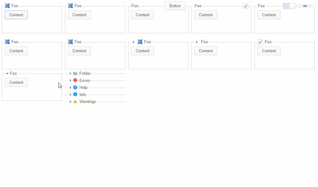
- dialogs can be collapsed now
-
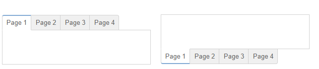
TabView can use the
rounded-tabsstyle, its subtle, but my go to style where supported (only works on backends that allow composite border radii)
-
new scrollbar policies:
auto(default),always,never, for example:myScrollview.verticalScrollPolicy = ScrollPolicy.NEVERor<scrollview verticalScrollPolicy="never" /> -
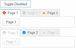
individual tabs can be disabled:
-
frames can be collapsed:
-
haxeui-kha text input selection also works with the mouse
-
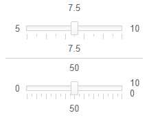
sliders now work with the action manager (meaning you can tab to them and use the keyboard - or other input sources eventually)
-
sparrow player for haxeui-flixel:
-
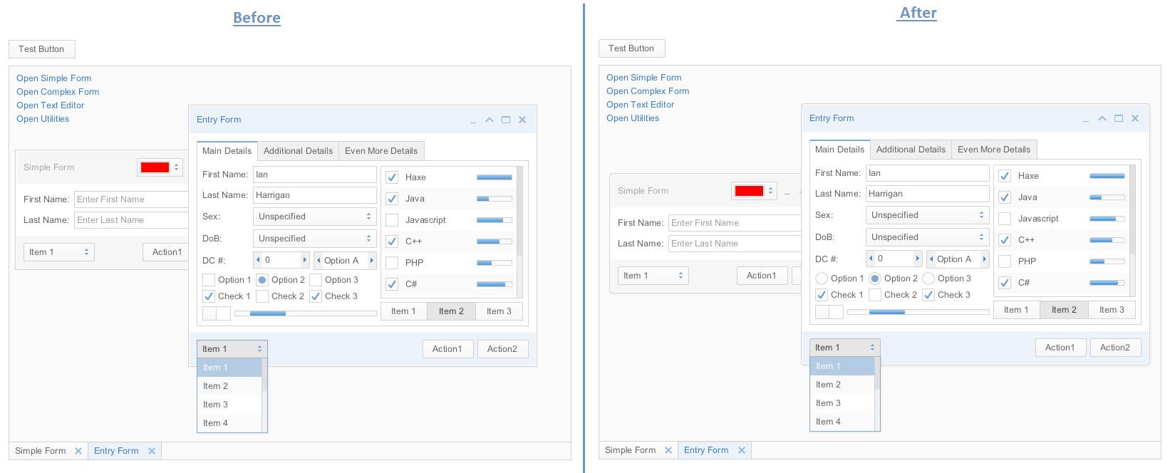
all animations now share the same “tick” meaning they are all smoother and stay in sync (previously each animation would use its own tick system)
Finally
If you’ve made it this far, congratulations! You deserve a beer! 
This has been another big release, and as usual I’m sure i missed so much stuff while waffling on!
I want to give a huge shout out to the HaxeUI community who seem to, more and more, be getting very comfortable with the internals of HaxeUI as I seem to be getting a lot more PRs that fix things (rather than simply bug reports). This has been really really great, and I hope it continues!
So that’s 1.6! Its probably worth mentioning that i think there will be maybe one more release (maybe two) before v2… and its also worth mentioning that in v2 there will be significant breaking changes, mainly fixing things that should work differently and naming things (technical debt essentially), so consider yourselves forewarned
Cheers!
Ian