No thats right.
myList.dataSource.add({ isComplete: false, someText: "Item 1", someValue: 10, isOn: false, theRowColor: "red" });
is perfectly fine, you can also do:
var ds = new ArrayDataSource<Dynamic>();
ds.add({ isComplete: false, someText: "Item 1", someValue: 10, isOn: false, theRowColor: "red" });
ds.add({ isComplete: false, someText: "Item 1", someValue: 10, isOn: false, theRowColor: "red" });
ds.add({ isComplete: false, someText: "Item 1", someValue: 10, isOn: false, theRowColor: "red" });
ds.add({ isComplete: false, someText: "Item 1", someValue: 10, isOn: false, theRowColor: "red" });
myList.dataSource = ds;
Thank you . That makes sense.
One question about layout . Could i set relative postion of one element against the previous one ( or absolute postion) in pixels ?
At example:
<item-renderer width="100%" layoutName="horizontal">
    <checkbox id="isComplete" verticalAlign="center" />
    <label id="someText" verticalAlign="center" width="100%" />
    <slider id="someValue" verticalAlign="center" />
    <switch id="isOn" verticalAlign="center" />
</item-renderer>
For the label idsomeText to set .x = 30; ( which should be relative or absolute positon) or I need to use vbox / hbox for that ?
So you can position things absolutely, but only if you are using an absolute layout, but imo its not ideal to do things like this as they are very brittle… that said, you certainly can (and you can mix and match), eg: Builder - HaxeUI
My, personally preferred, method would be to let haxeui handle the layout, so you can use grids for example: Builder - HaxeUI
You can also just use boxes (vbox, hbox) to achieve the same.
1 Like
Grid looks like as a nice options. I will try it.
Thank you again!
1 Like
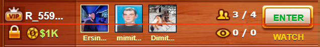
@ianharrigan what would be the best way to arrange the following elements ?
(1)Image (2)text            (6)Small user photo     (7)image (8)text         (11/12) Button
(3)Image (4)Image (5)text   (6)name of the user 	(9)image (10)text 		 (13)     Text
where
6) will be a user’s photo and the name of that user just below the photo (center position)
11/12) is a button that takes up more than half of the row and 13) text below the button (center position)
Using grid is a good solution, but only if you have the same element height and width i.e at example if I can separate the row on 4 columns.
In my case the small user photo takes up more than half of the row; it is similar for the button.
Here is an example image, where I draw the horizontal red line for more easy visualization.
I would probably go with something like this: http://haxeui.org/builder/?cbodxt
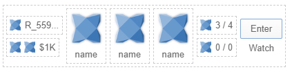
(i added borders just so you can see the “seperate” of what i would consider discrete “components”)
<vbox style="padding: 5px;">
    <style>
        .bordered {
            border: 1px dashed #CCCCCC;
            padding: 5px;
        }
    </style>
    <hbox styleName="bordered">
        <vbox verticalAlign="center">
            <hbox styleName="bordered">
                <image resource="haxeui-core/styles/default/haxeui_tiny.png" />
                <label text="R_559..."  />
            </hbox>
            <hbox styleName="bordered">
                <image resource="haxeui-core/styles/default/haxeui_tiny.png" />
                <image resource="haxeui-core/styles/default/haxeui_tiny.png" />
                <label text="$1K"  />
            </hbox>
        </vbox>

        <vbox styleName="bordered">
            <image resource="haxeui-core/styles/default/haxeui_small.png" />
            <label text="name" horizontalAlign="center" />
        </vbox>
        <vbox styleName="bordered">
            <image resource="haxeui-core/styles/default/haxeui_small.png" />
            <label text="name" horizontalAlign="center" />
        </vbox>
        <vbox styleName="bordered">
            <image resource="haxeui-core/styles/default/haxeui_small.png" />
            <label text="name" horizontalAlign="center" />
        </vbox>

        <vbox verticalAlign="center">
            <hbox styleName="bordered">
                <image resource="haxeui-core/styles/default/haxeui_tiny.png" />
                <label text="3 / 4"  />
            </hbox>
            <hbox styleName="bordered">
                <image resource="haxeui-core/styles/default/haxeui_tiny.png" />
                <label text="0 / 0"  />
            </hbox>
        </vbox>

        <vbox verticalAlign="center">
            <button text="Enter" />
            <label text="Watch" horizontalAlign="center" />
        </vbox>
    </hbox>
</vbox>
Obviously, in reality (in a real project), that would probably be made out custom components and (from an xml perspective) would more like this:
<hbox>
    <vbox>
        <balance />
        <balance />
    </vbox>
    <avatar />
    <avatar />
    <avatar />
    <vbox>
        <count />
        <count />
    </vbox>
</hbox>
Hope that helps,
Cheers,
Ian
1 Like
I created a custom component by extending VBox. Then I added some other components in it and used that component in ListView .
After adding new data (via .dataSource.add(…) ) the data for my custom component is not visible at all. To be clear, here is an example:
Custom component AvatarListView
class AvatarListView extends VBox
{
    public var avatarImage:Image;
    public var avatarName:Label;

    public function new()
    {
        super();
        styleNames = "bordered";
        width = 80;
        avatarImage = new Image();
        addComponent(avatarImage);
        avatarName = new Label();
        avatarName.horizontalAlign = "center";
        avatarName.text = "";
        addComponent(avatarName);
    }
}
Main class
  var iHbox:HBox = new HBox();
  iHbox.styleNames = "bordered";


  var avatar1:AvatarListView = new AvatarListView();
  avatar1.avatarImage.resource = "haxeui-core/styles/default/haxeui_small.png";
  avatar1.avatarName.text = "name";
  avatar1.avatarImage.id = "avatarImage1";
  avatar1.avatarName.id = "avatarName1";

  var avatar2:AvatarListView = new AvatarListView();
  avatar2.avatarImage.resource = "haxeui-core/styles/default/haxeui_small.png";
  avatar2.avatarName.text = "name";
  avatar2.avatarImage.id = "avatarImage2";
  avatar2.avatarName.id = "avatarName2";

  var secondColumn:HBox = new HBox();
  secondColumn.addComponent(avatar1);
  secondColumn.addComponent(avatar2);

  var enterButton:Button = new Button();
  enterButton.text = "Enter";
  //enterButton.registerEvent(MouseEvent.CLICK,enterClickOn);
  enterButton.id = "enterButton";

  var fourthColumn:VBox = new VBox();
  fourthColumn.verticalAlign = "center";
  fourthColumn.addComponent(enterButton);

  iHbox.addComponent(secondColumn);
  iHbox.addComponent(fourthColumn);

  var itemRender:ItemRenderer = new ItemRenderer();
  itemRender.height = 78;
  itemRender.addComponent(iHbox);

  commonList = new ListView();
  commonList.width = 635;
  commonList.height = 555;
  commonList.itemRenderer = itemRender;

  commonList.dataSource.add({avatarImage1:"haxeui-core/styles/default/haxeui_tiny.png",avatarImage2:"haxeui-core/styles/default/haxeui_tiny.png",avatarName1:"name1",avatarName2:"name2" });
  commonList.dataSource.add({avatarImage1:"haxeui-core/styles/default/haxeui_tiny.png",avatarImage2:"haxeui-core/styles/default/haxeui_tiny.png",avatarName1:"name1",avatarName2:"name2" });
Other question:
How do I get the current row data when I click the button on that row ? For example ,when click on the buton ‘Enter’ on the third row, I want to get all other components of that row ?
Also is there a way to get the data for the fourth row components without clicking on the row ?
Ok, so as mentioned previously, item renderers (well, the default one) works off of “values”, that is to say, the .valueof a component. This is a Variant and can mean different things to different different components, for example:
- in
Image the .value is .resource
- in
Slider the .value is .pos
- in
Button the .value is .text
etc, etc. So The item renderer will find a matching component and set its .value. In your custom component there is no overridden .value so it will use the default (which is .text).
So what you need to do is specify what the .value means:
class AvatarListView extends VBox {
    public override function get_value():Variant {
        return avatarImage:Image.resource;
    }
    public override function set_value(value:Variant):Variant {
        avatarImage.resource = value;
        return value;
    }
}
I think you might still be a little confused by item renderes and things like that, so ill knock up a quick (and ugly) example of what i think you are trying to do 
Cheers,
Ian
Hm, in that case what to do if have two or more components in my custom AvatarListView ?
For example, I have Label and Image and override get_value will use only image, but not a Label
What I do is th following :
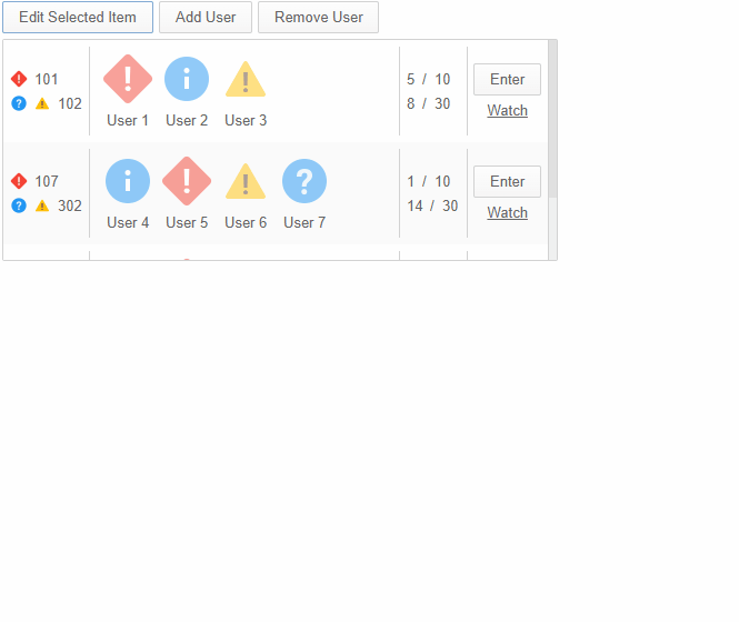
For that image each row is separate room in the game server :
- The vip and lock image could be changed ( with unlock image and grey vip image) i.e. each row could have different combination for each of those images.
- R_5559… will be different for each row , samo for $1K text
- Avatar image - they should be loading asynchronously from the web server and could be replaced with other image , if player leave the room
- The label 3 /4 show the current players in the room and 0 / 0 the current watchers
- Enter button will put the player in the room ( i.e. should add the player image as the avatar in the list)
- Watch is link url, which wll add the user as a watcher in the game ( and change the count of the watchers 1 / 1)
This is what I tried to recreate using the HaxeUI
I see. So the path is custom item render , listen for event X ( add item event ?) , check the added data for that row and set the correct Image and name for avatar cusom component.
If the avatar image and name is changed , again need to listen for event Y ( change item event ?) and set new image and name.
Ok, so here is a (very ugly) example of a complex item renderer (well, custom one really).
Obviously i dont know your data model, or anything like that, so ive just invented it. Also, im using xml all over the place (of course!) but, as usual, this isnt anything you can do it pure code (it will just be much uglier and harder to maintain imo )
I can only upload image here it seems, so the file had to be a pastebin
Note: if you actually want to run that file, you’ll need very latest haxeui-core. I found a couple of issues while writing it, but none relating to what you are doing (it was about having loads of custom components in the same file and then trying to use them from xml - all fixed now anyway)
Hopefully that will help alot more?
Cheers,
Ian
EDIT: just noticed the theList.itemRenderer = new MyItemRenderer(); line in the pastebin, thats not needed technically since i do it in xml
Thank you Ian!
That’s a lot of info. I’ll definitely need time to process the things.
Another question:
Is it possible to always have the scroll visible in ListView?
And how can I set images for the arrows on the scrollbar and also replace the slider with the image?
Currently its not no - its something ive been thinking to add, but its fairly low priority as im never sure what a good use case is for it - infinite scrolling maybe?
So the scrollbars (and its parts) are styled by css, like anything in haxeui, best option would be to check the css of the default theme to understand what parts to theme: haxeui-core/haxe/ui/_module/styles/default/scrollbars.css at master · haxeui/haxeui-core · GitHub
Thank you again.
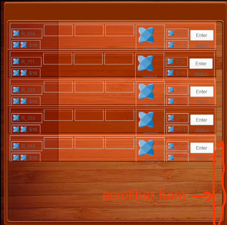
About the scroll , the idea is to hide part of the backround with the scroll.
For example, I have a list view (with a transparent background) and below the list view is another image.
Each row in the list will not reach the end of the background, and in this case, if there is no scrollbar, it looks a bit ugly.
If the scroll appears, it will cover the border ( of the image under Listview) .
Here is example:
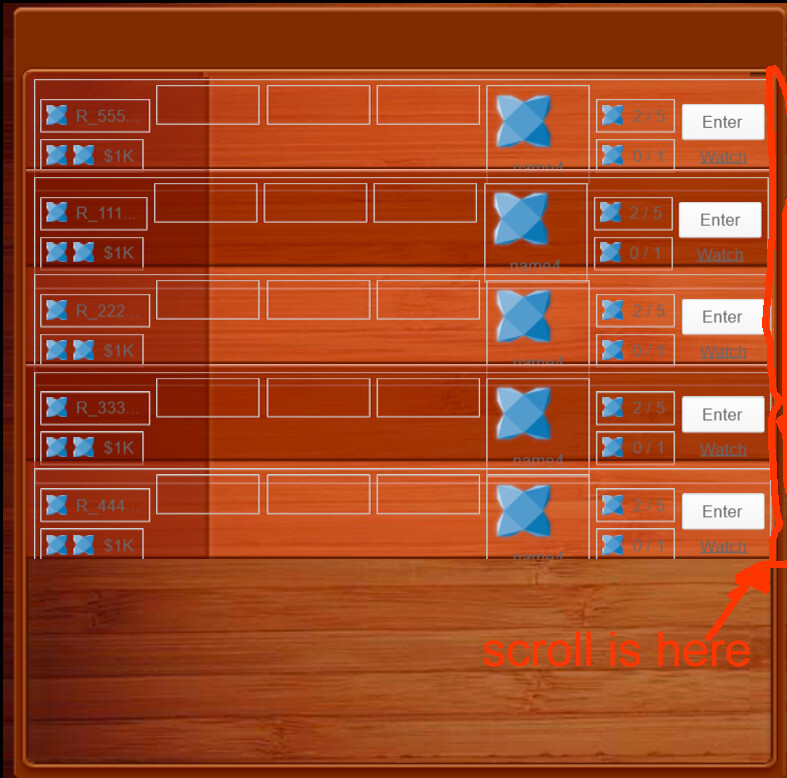
Right, yeah, i think i can see the issue. The issue is that the design kinda expects the scrollbar to always be there? If it appears on demand then the images wouldnt “line up” right even if the space was gone?
Yes, the scroll is expected to be always visible The row ( in the list view ) has a fixed width and if the row covers the entire background space, the scrollbar will cover the border on the background.
Example:
@ianharrigan
How can I check / update only the changed field in dataSource when listening for an onDataAdd(data:Dynamic) event?
For example :
	users: [
                { name: "User 1", image: "https://link_to_avatar_user_1"},
                { name: "User 2", image: "https://link_to_avatar_user_2"},
                { name: "User 3", image: "https://link_to_avatar_user_3"},
            ],
I’m using the link from the image field "“https://link_to_avatar…” to load data asynchronously, scale it and then set it to the avatar component of theImage.resource as bitmapdata.
However, in onDataAdd(...) , if I add a new user ( “User 4”), I will receive image data for the old users and load those images again.
How can I update data only for the new user and not load the images of the old ones ?
I guess you will have to cache that yourself. HaxeUI has an image cache, but im pretty sure its not used for “external” images, since the image might have changed outside of HaxeUI.